Pl. IV · Docusign · Self-service renewal
Creating a self-service subscription renewal experience in the Docusign app
How I created a new experience for scale to enable users and reduce support reliance.
01 — Problem & goals
Turning a manual customer support process into a seamless self-service experience
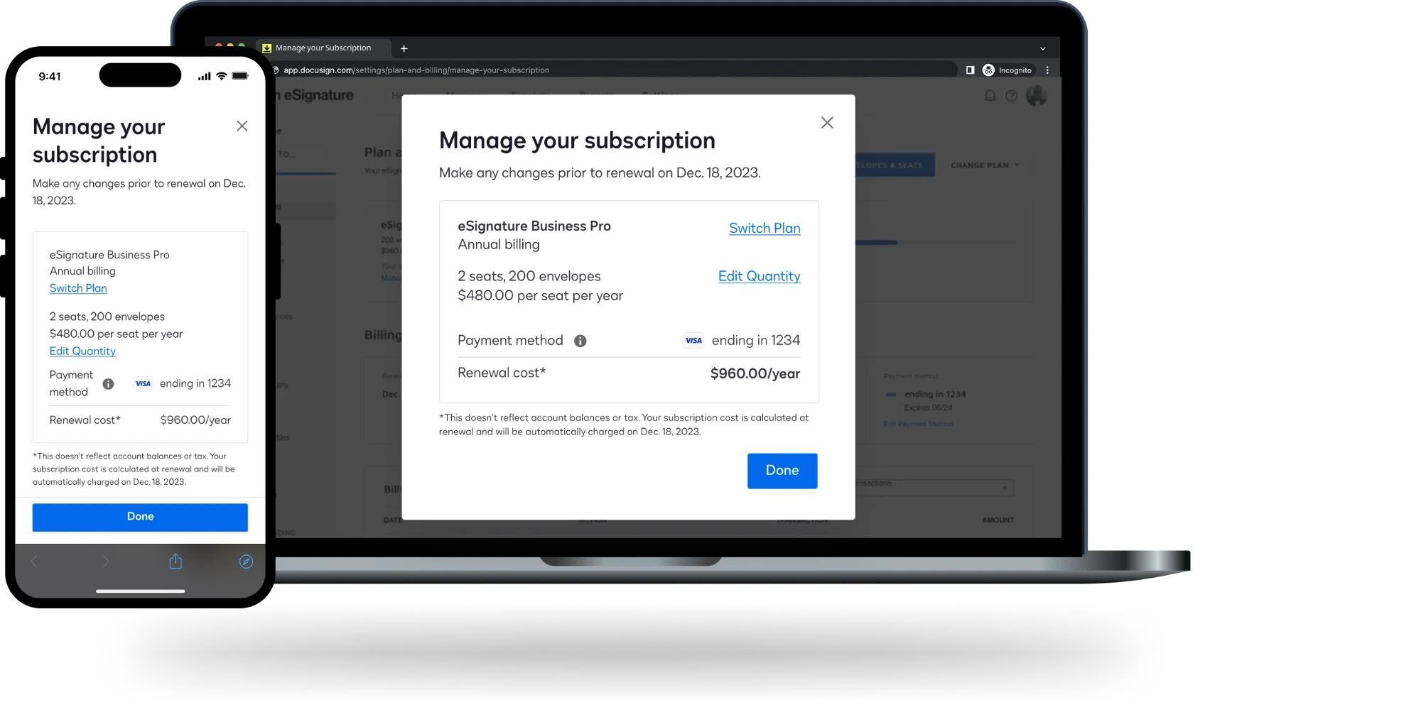
Docusign’s flagship product — eSignature — has been transitioning once-manual processes into self-service. This gradual shift has led to increased profits and an improved user experience. Application admins could purchase licenses to add team members, but before this product update, they had to contact support in order to reduce the number of licenses on their account.
Problem
The current eSignature admin experience doesn’t provide a self-service option for account administrators to decrease the number of licenses on their plan.
Hypothesis
By launching a renewal experience that allows flexibility to reduce licenses, we can reduce the strain on support center resources that currently manage this manual process.
Design goals
In addition to the project sponsor goals, I had my own design goals to improve the overall user experience:
- Create a one-stop shop for all plan information and changes, including self-service license reductions
- Allow cancelation of a pending plan change
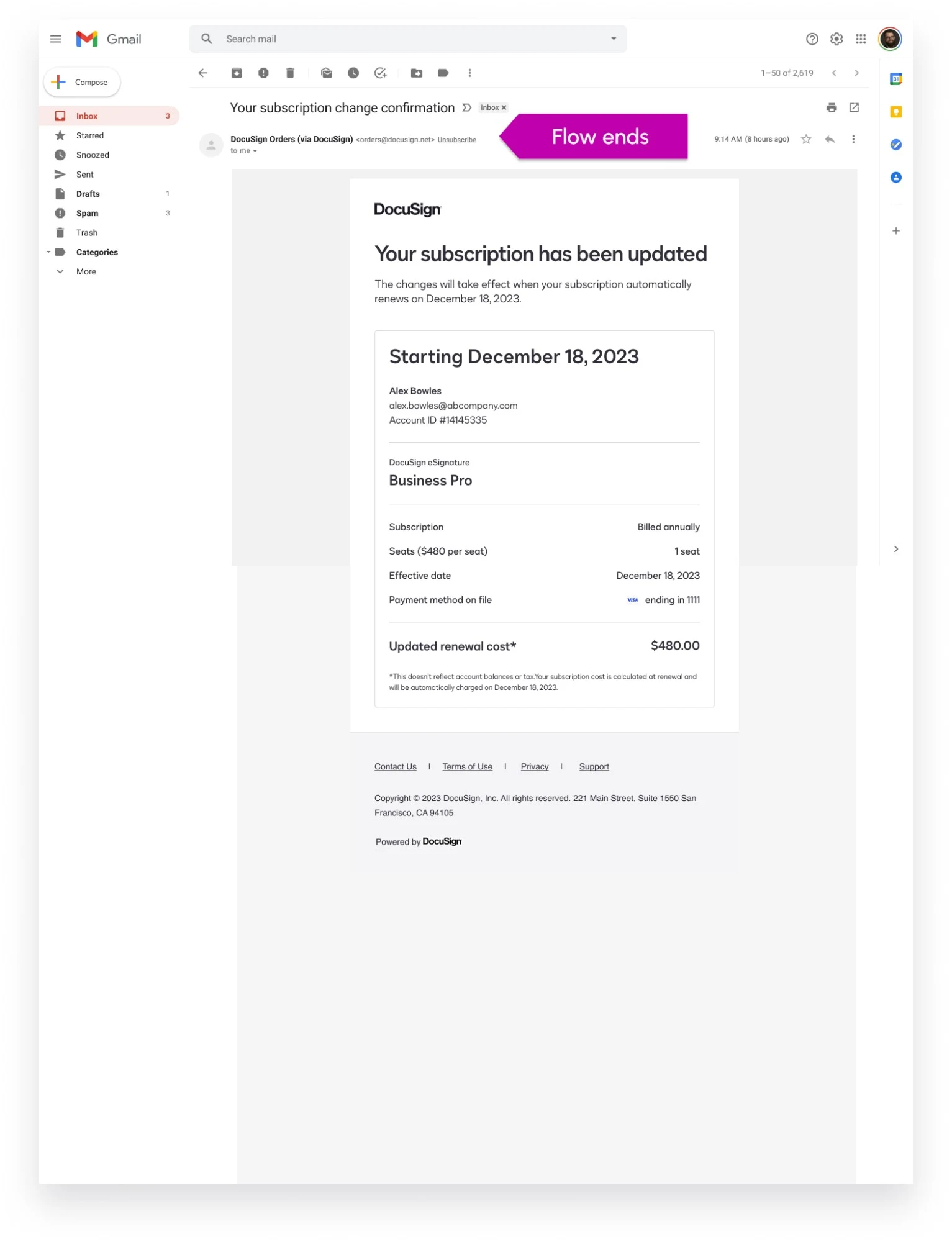
- Design email and in-product renewal notifications reflecting changes
- Create more user-friendly language in the license removal process
Key performance indicators
- Reduce support contacts for license removals
- Track traffic to the new renewal experience; create a baseline for future measurement
- Track reasons for license churn
My role
I was lead product designer overseeing the project from discovery, to concepts, to usability testing, to final design delivery. The team included a product manager (sponsor), a support product designer, a content designer, a program manager, front-end and back-end engineering teams, and analytics managers.
02 — Discovery
Current experience audit
The ability to un-assign a user from a license existed within the self-service options. That experience was reviewed to identify opportunities for improvement and note what was missing.
The current experience manages seat changes within the “Users” setting — not where the other account changes take place.
Opportunities identified while auditing
- I.
Meet user expectations
If this admin is accustomed to making plan changes in a specific place, the new experience should be housed there.
- II.
Words matter — a lot
Helping the admin find the renewal experience relies heavily on the words we use to identify it. Our extended team put a lot of effort into determining which words would best help the admin find this new space.
- III.
Lose the system terminology
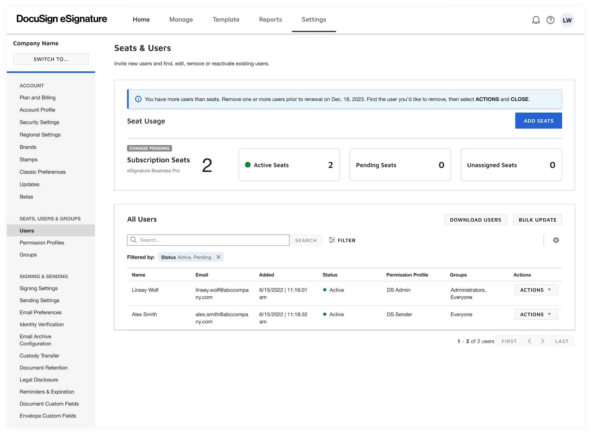
Get rid of internal system terminology wherever possible. It’s not natural to “close” a user. If you don’t say it in real life, it shouldn’t be part of a digital transaction.
Competitive analysis
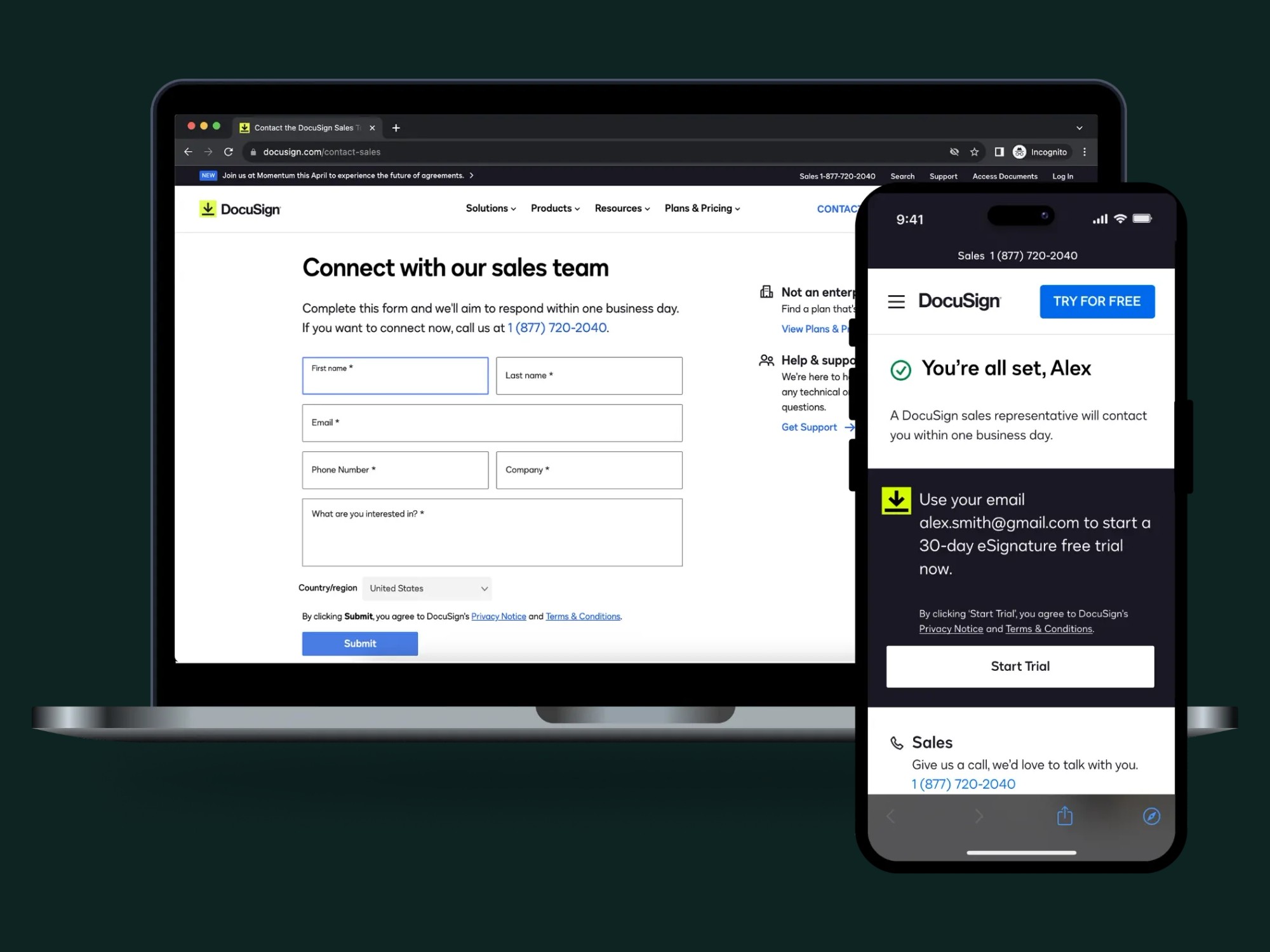
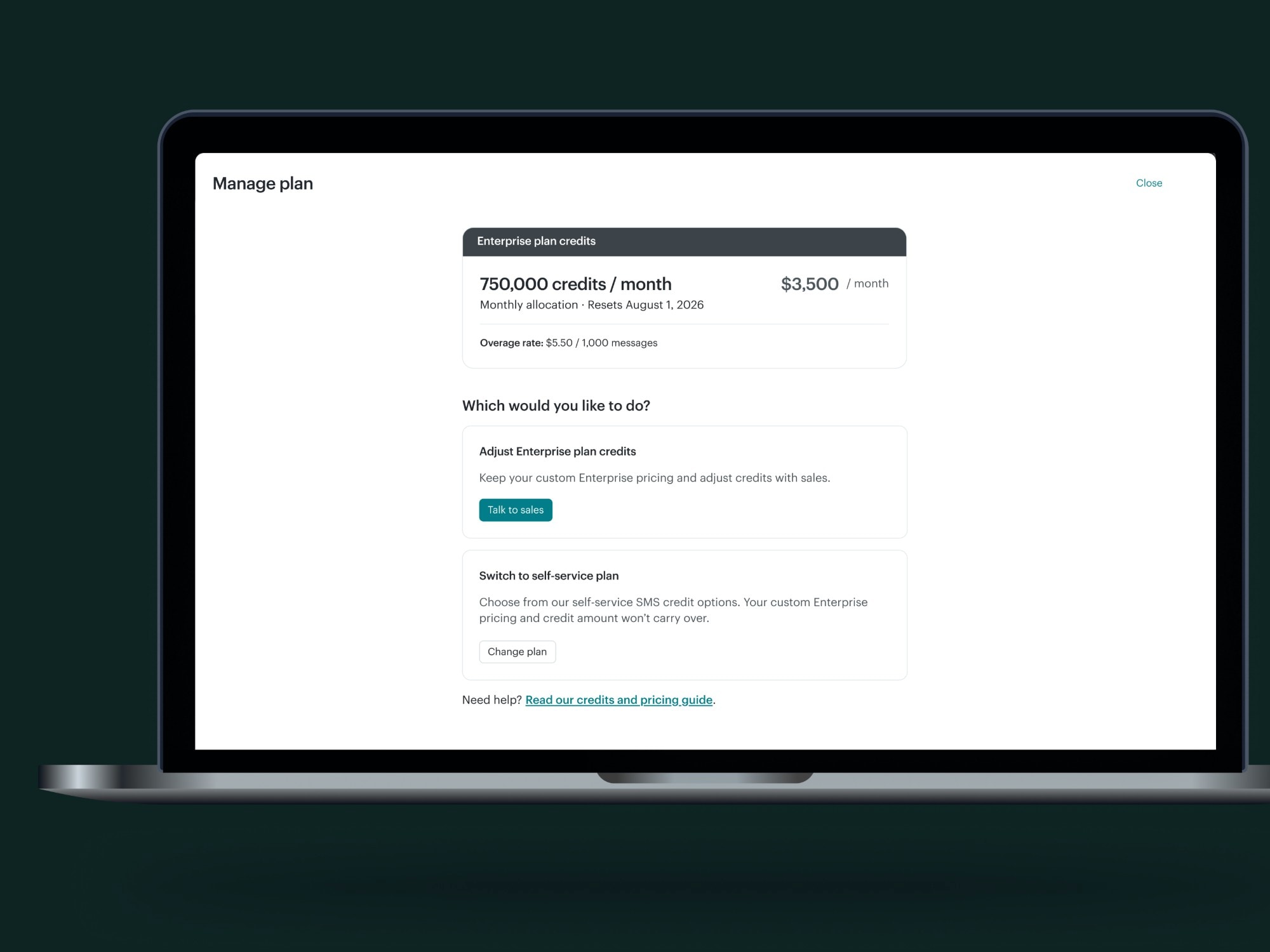
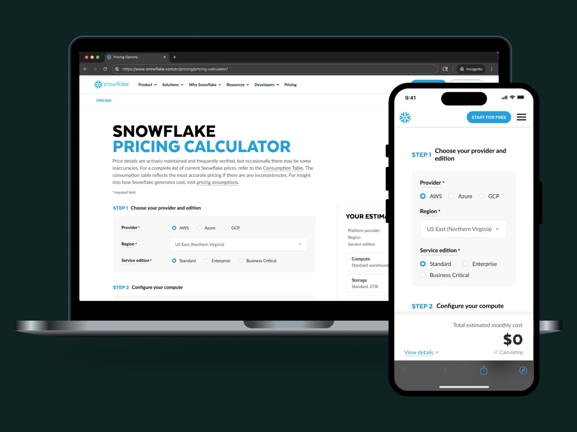
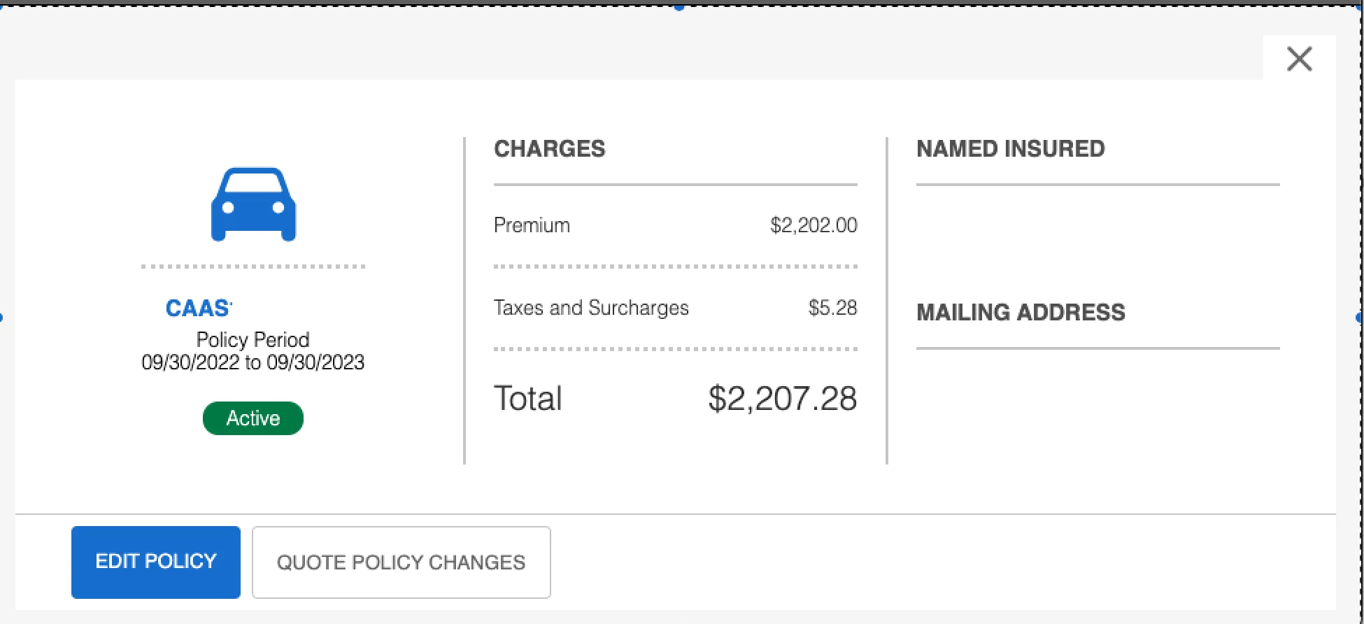
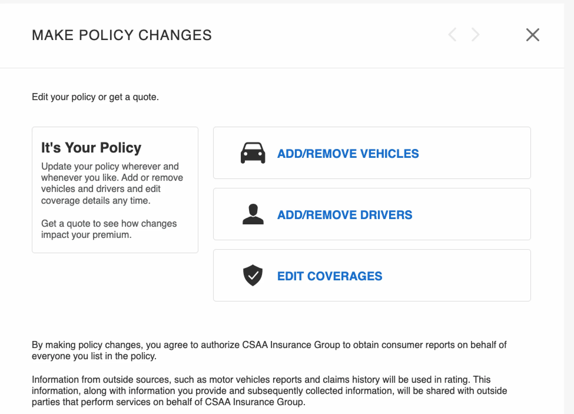
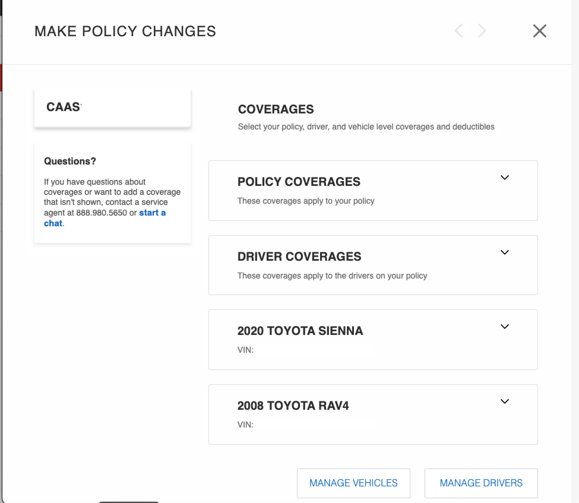
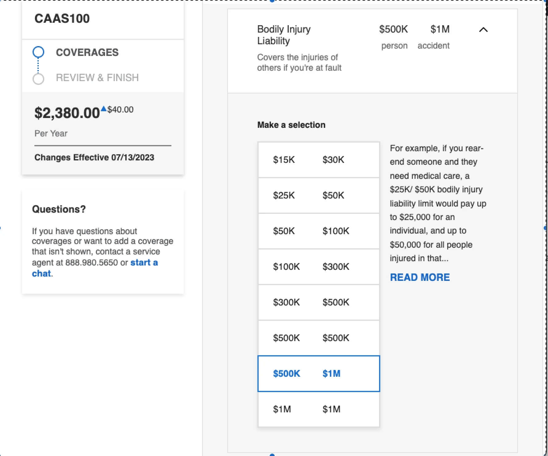
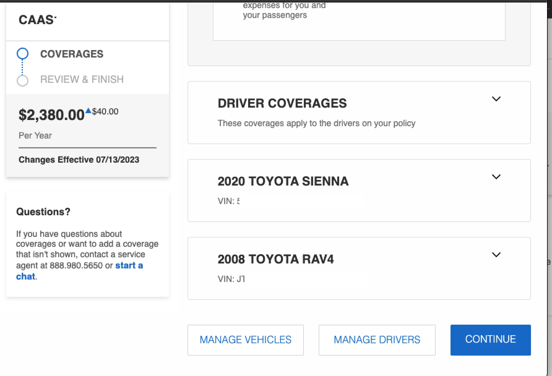
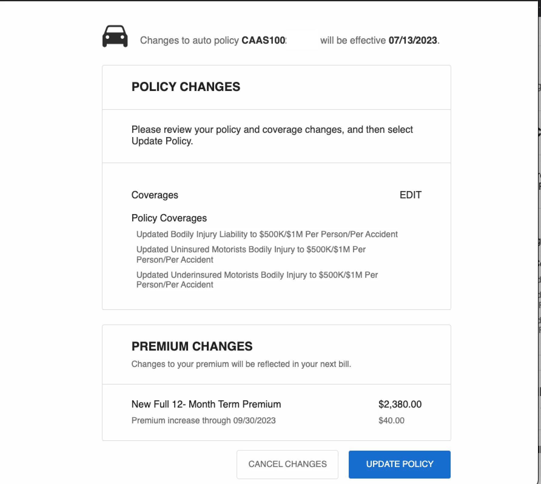
Why use a car insurance plan as inspiration?
Without a paid subscription, I hit a paywall when trying to walk through the true paid-plan renewal experience of similar SaaS products. A team member’s car insurance renewal flow helped me envision the type of experience I aimed to design.
03 — Ideation
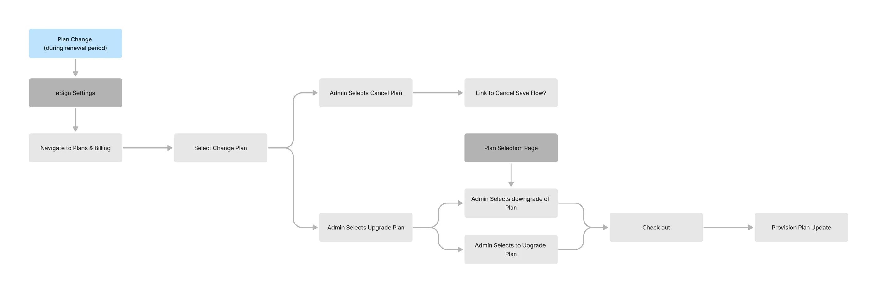
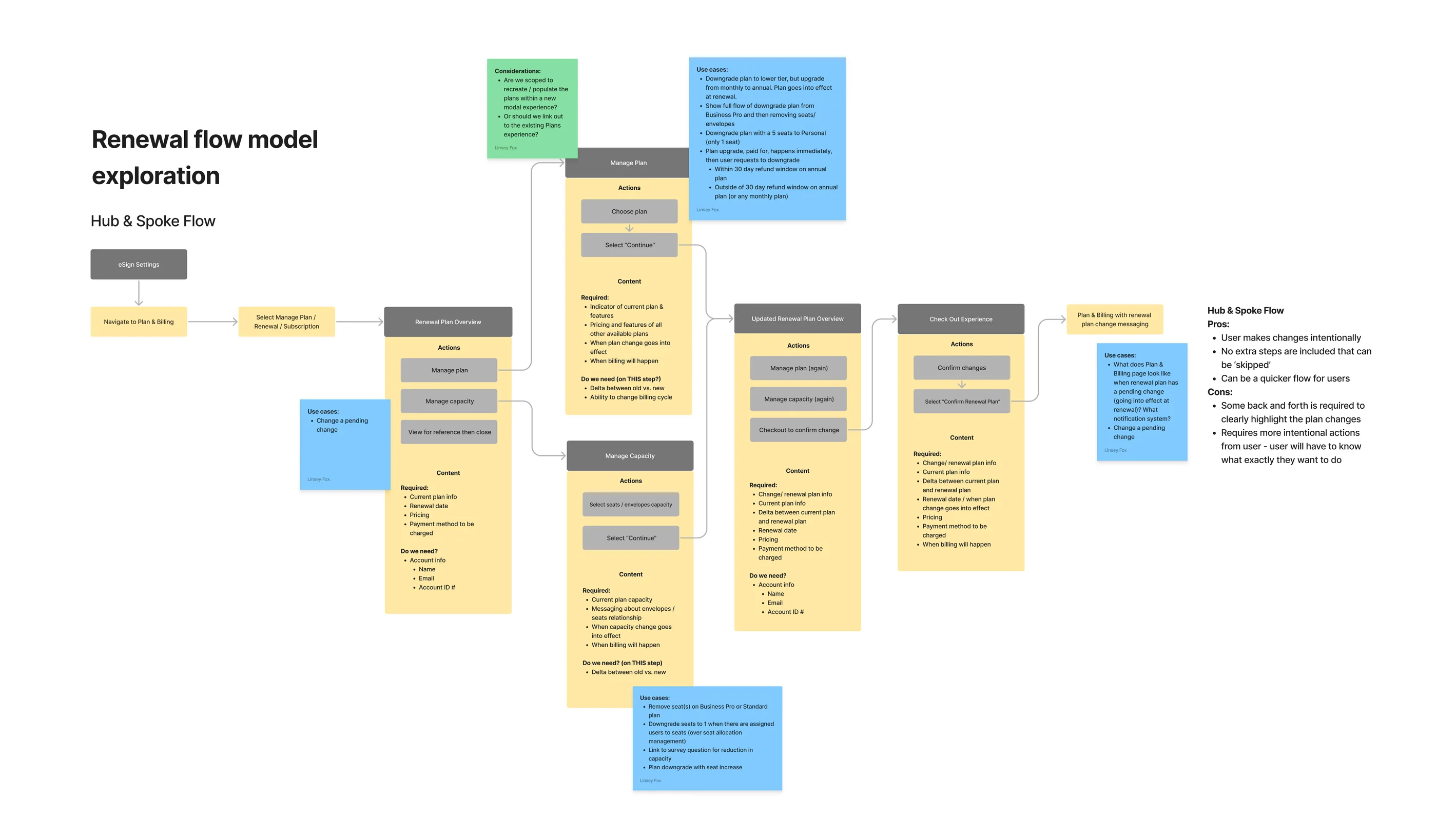
Mapping every scenario
Many user flows were created to solve the problem at hand, while also accounting for features launching shortly after this rollout. This version isn’t the final user journey — it’s shown to demonstrate the complex scenarios I had to account for. All flows are available to view in FigJam.
This design goal was my main priority for an optimal user experience:
Create a one-stop shop for all plan information and changes, including self-service license reductions.
After sharing extensive user flow ideations with Product Management and Engineering, it became clear it wouldn’t be possible in phase one. The compromise was to create the easiest way for a user to cancel a pending change, then introduce the desired functionality in phase two.
Early concept wireframes
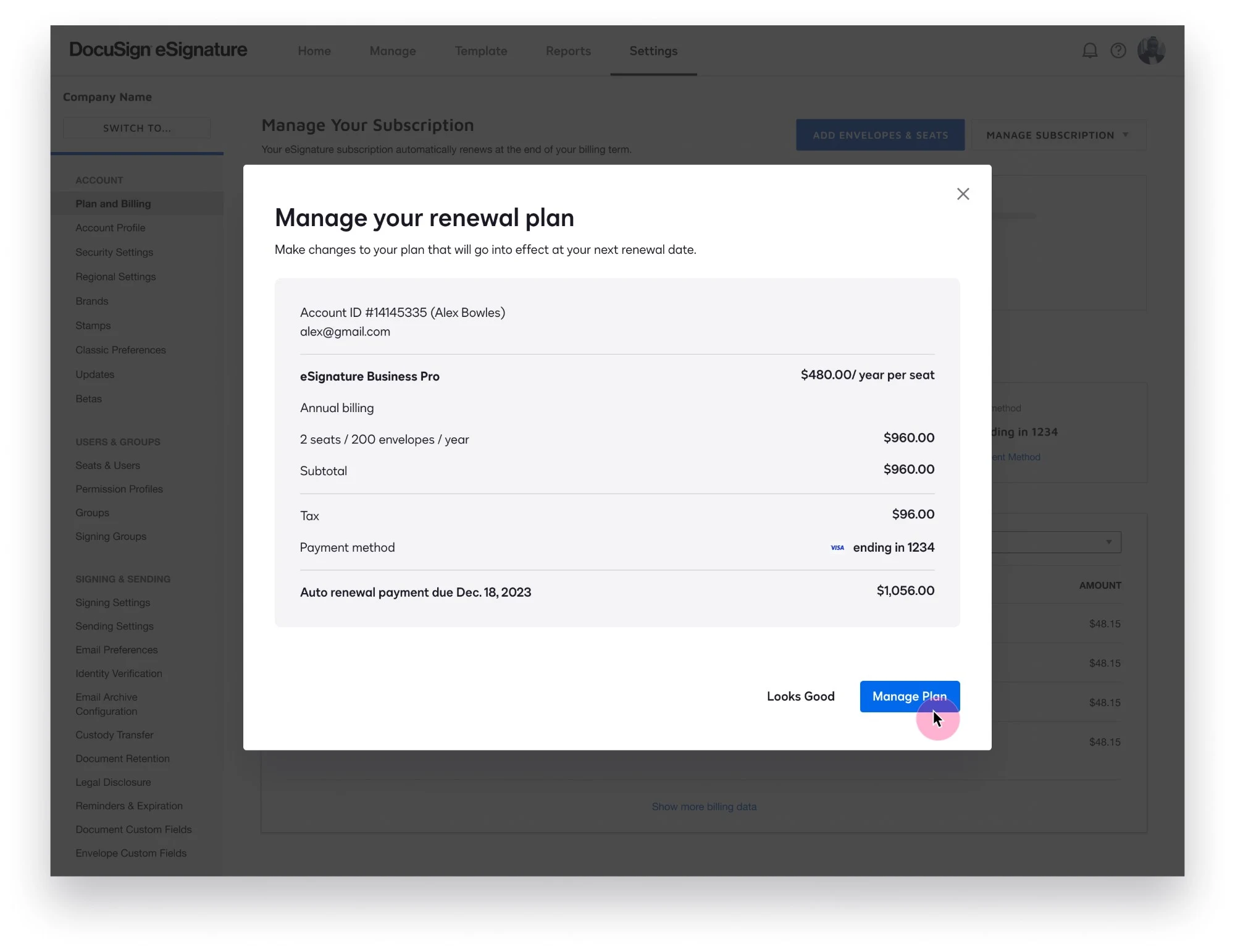
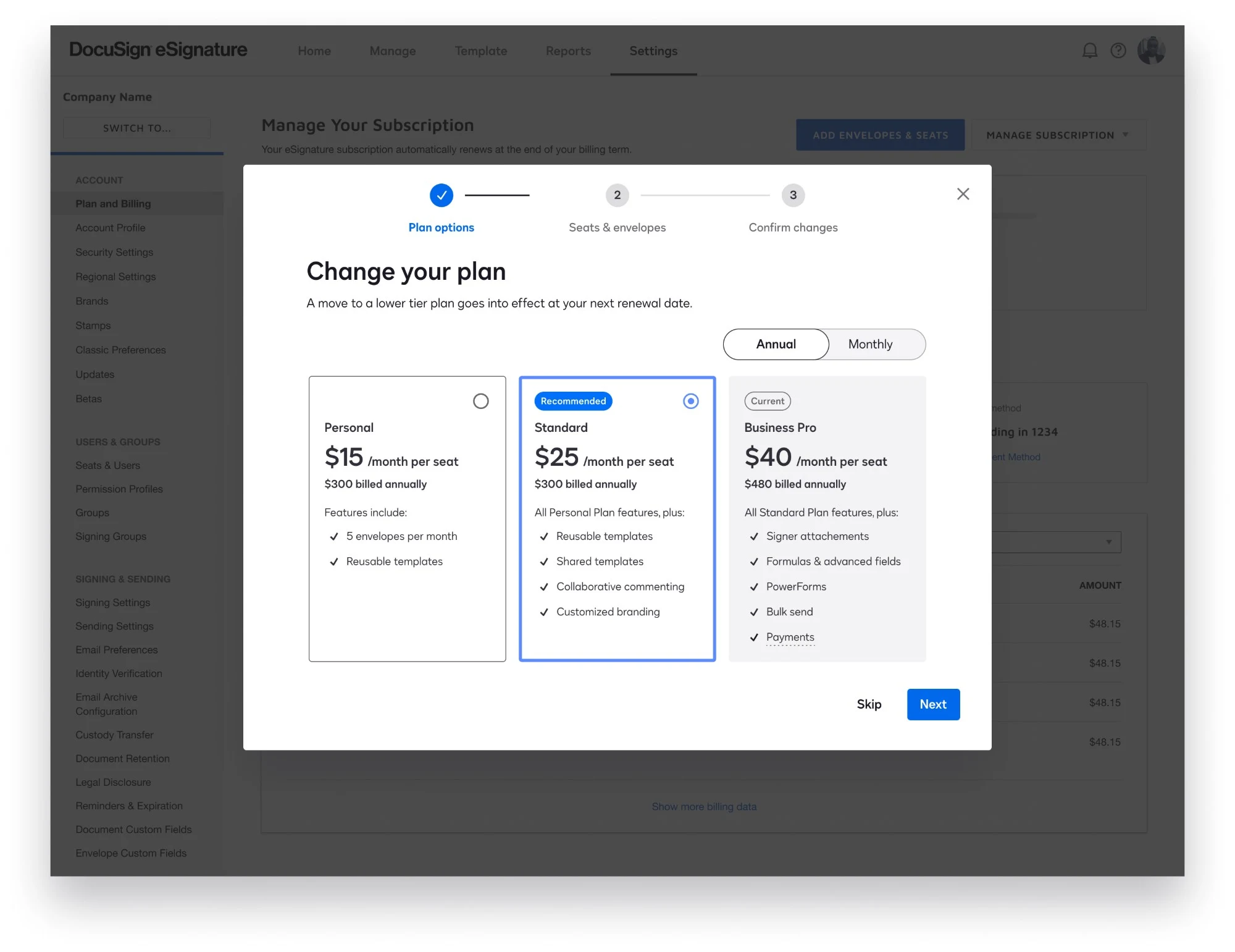
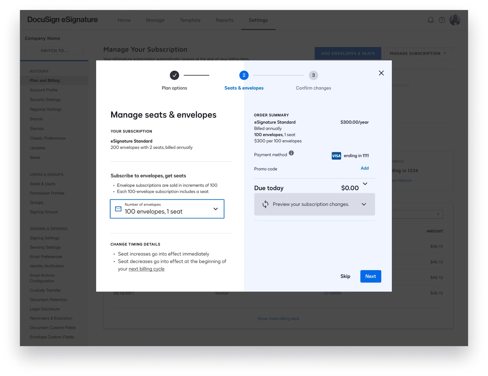
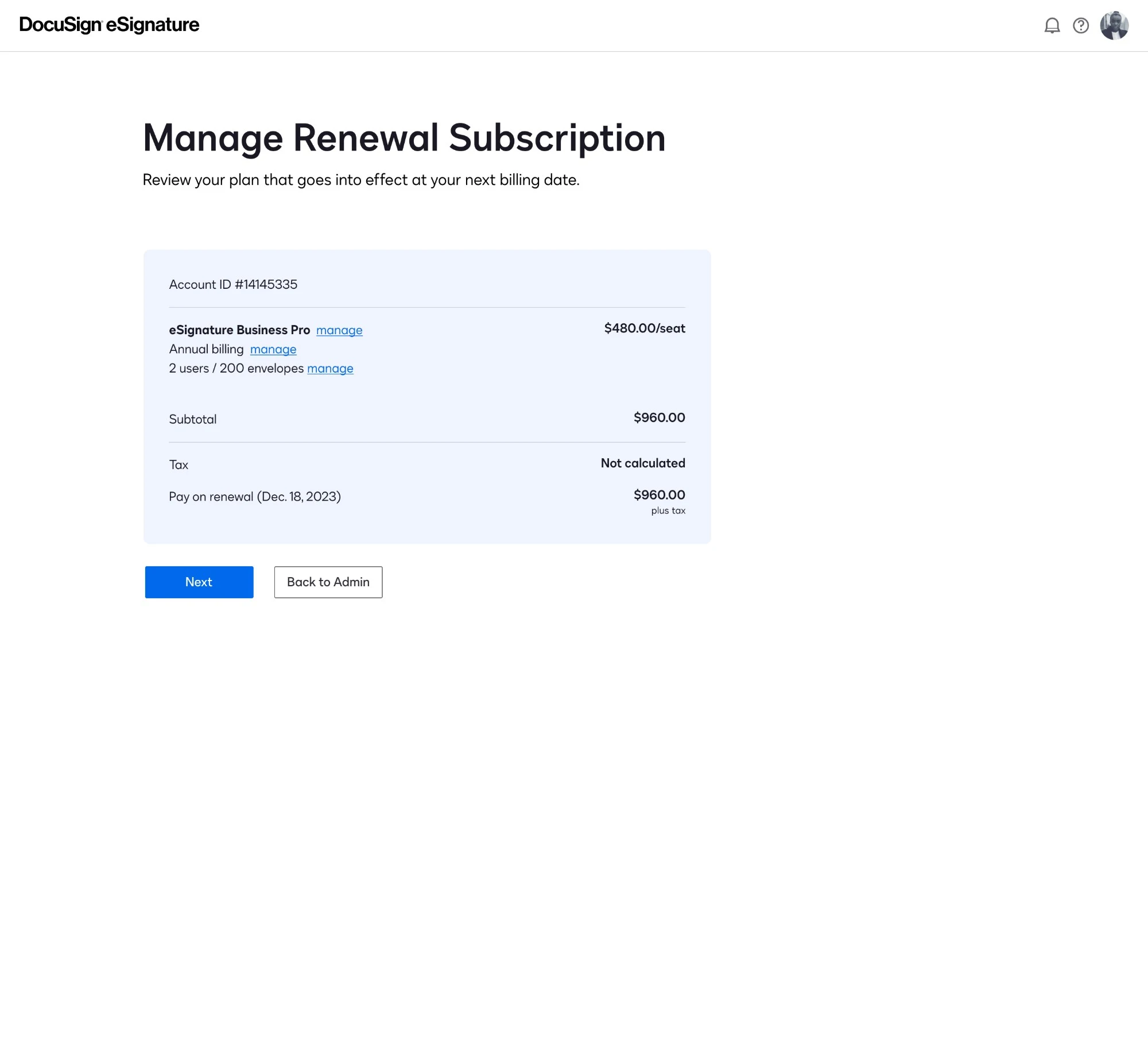
Explored full-page and modal renewal hubs
Once we determined the need for a dedicated space for the renewal experience, I explored full-page vs. modal design options. I pushed for a full-page experience because it would scale better for future functionality.
The project timeline was limited by the large engineering scope, so I had to compromise on a modal experience.
04 — Usability testing
Research findings & opportunities
User research confirmed two necessary updates:
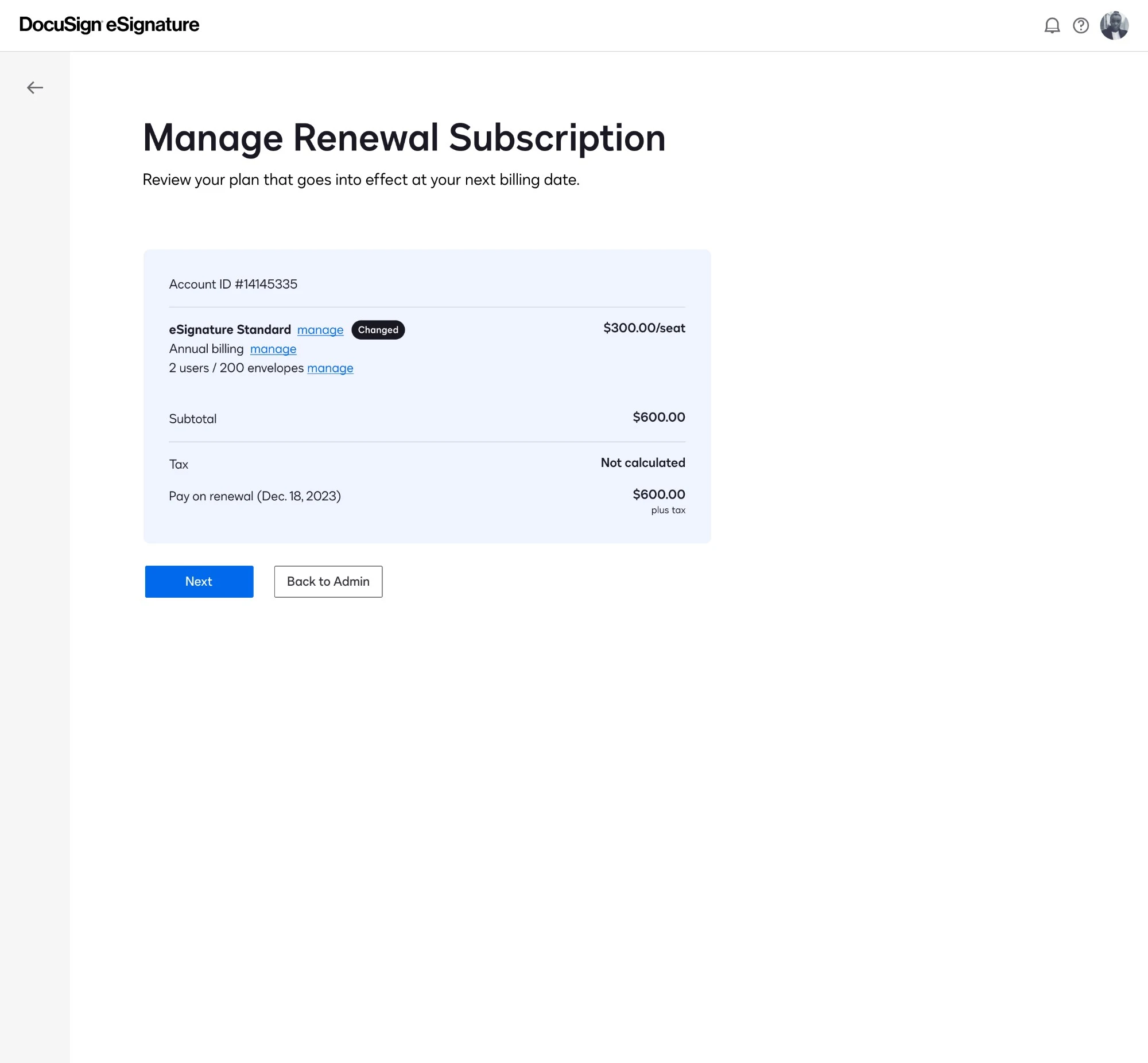
Improve “manage subscription” findability. While I pushed to update the “change plan” button to include the manage subscription experience at launch, the research proved that update was needed as soon as possible. Ultimately, it shipped as a fast follow in the phase immediately after launch.
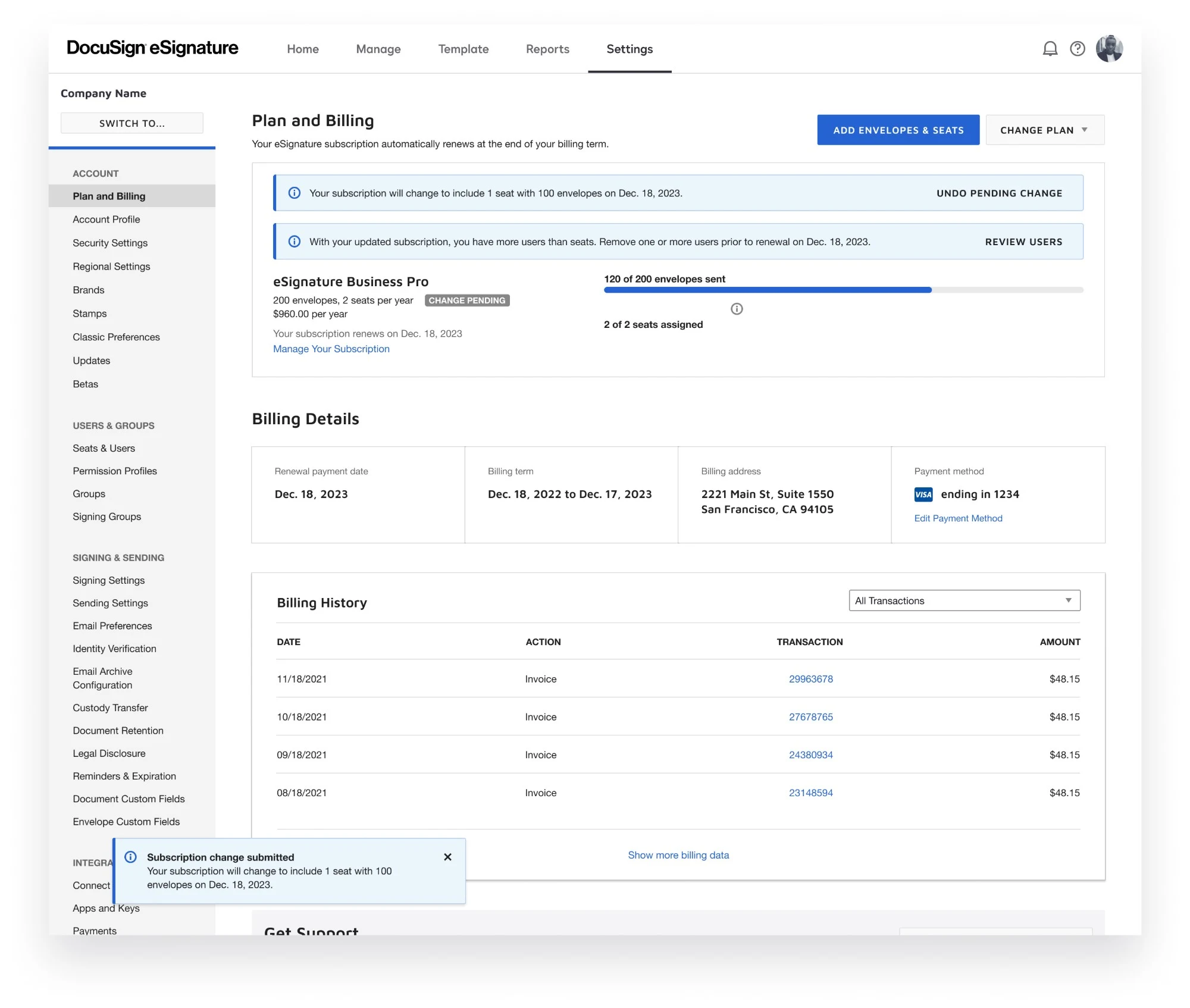
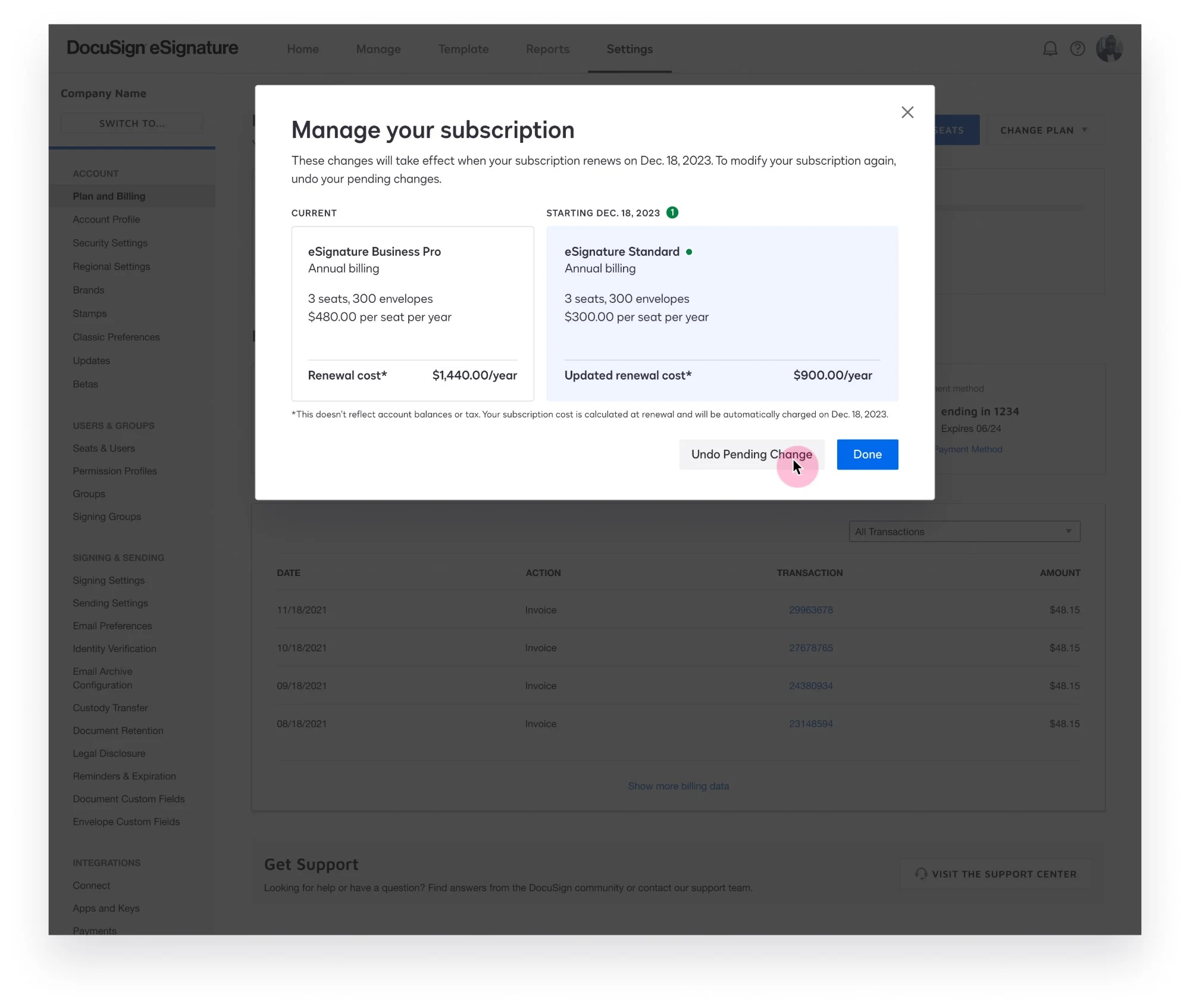
Revise the awkward “undo pending change” experience. While this was a compromise, it needed to be more elegant. I moved the interruptive yellow banner and button to replace the disabled button, bringing the intended action where the user expected it. Thankfully, this band-aid was removed once the back end was updated in phase two — and users could make changes as I originally intended.
05 — Final designs
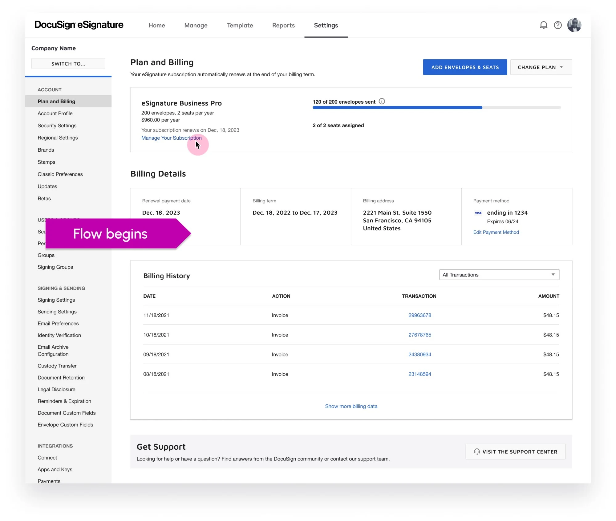
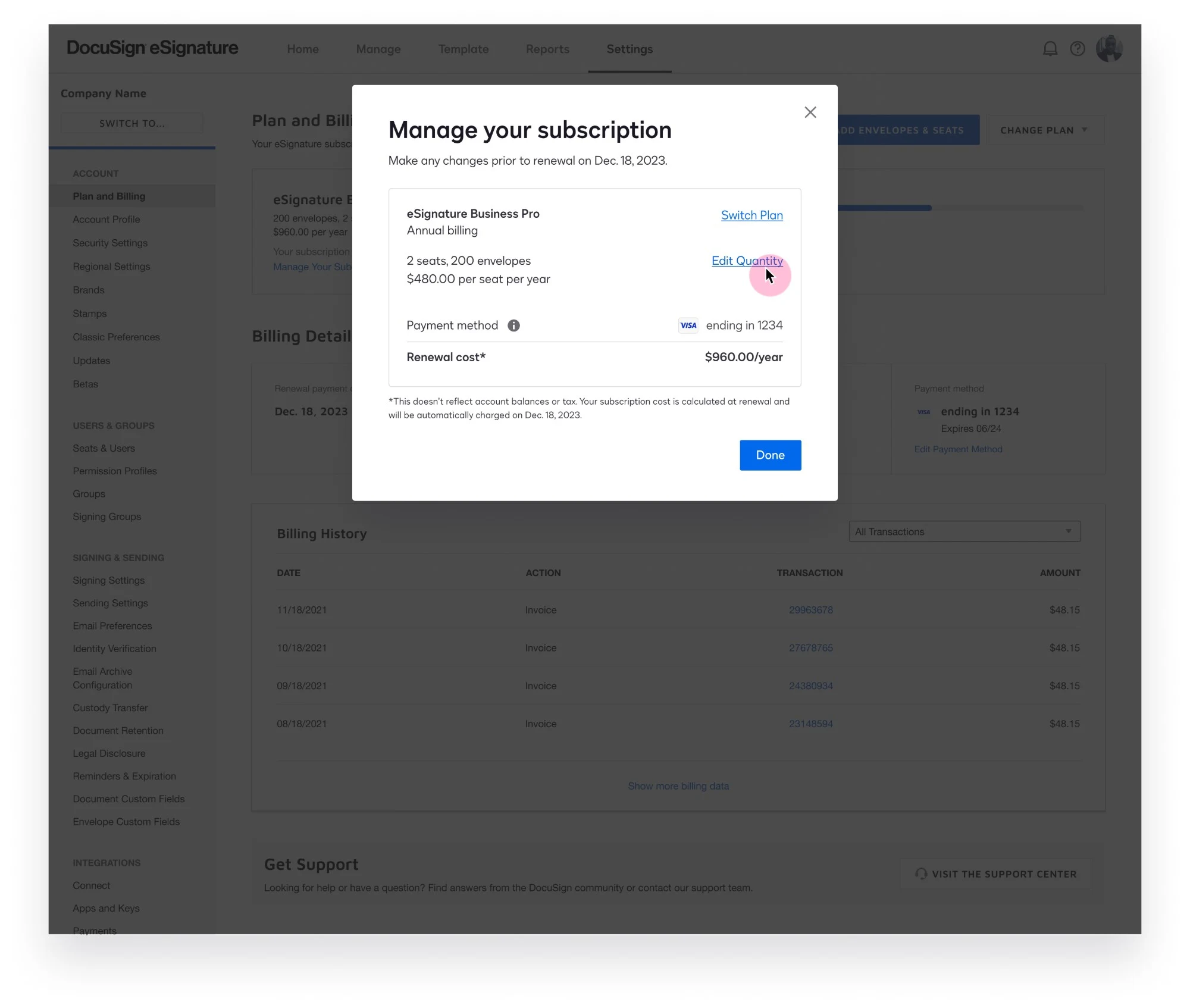
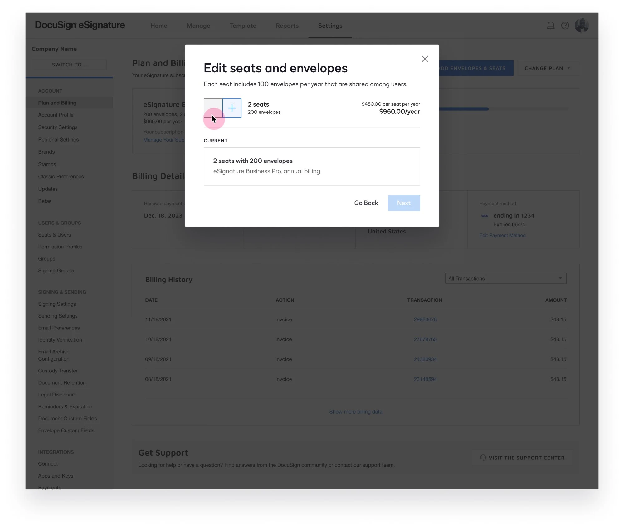
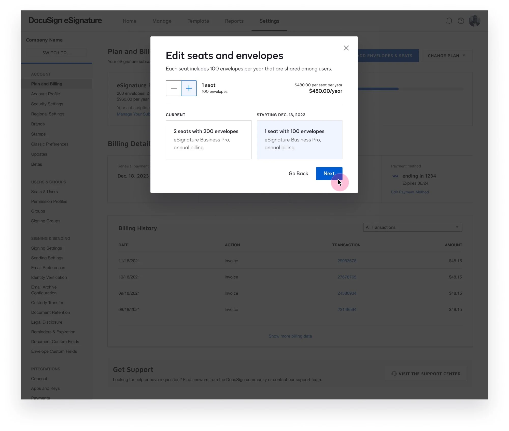
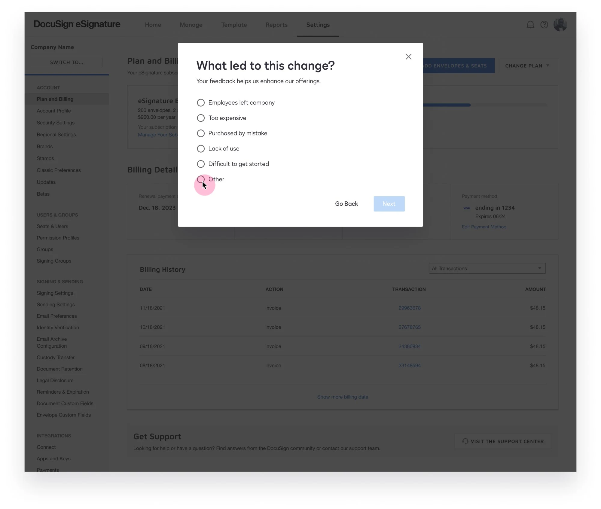
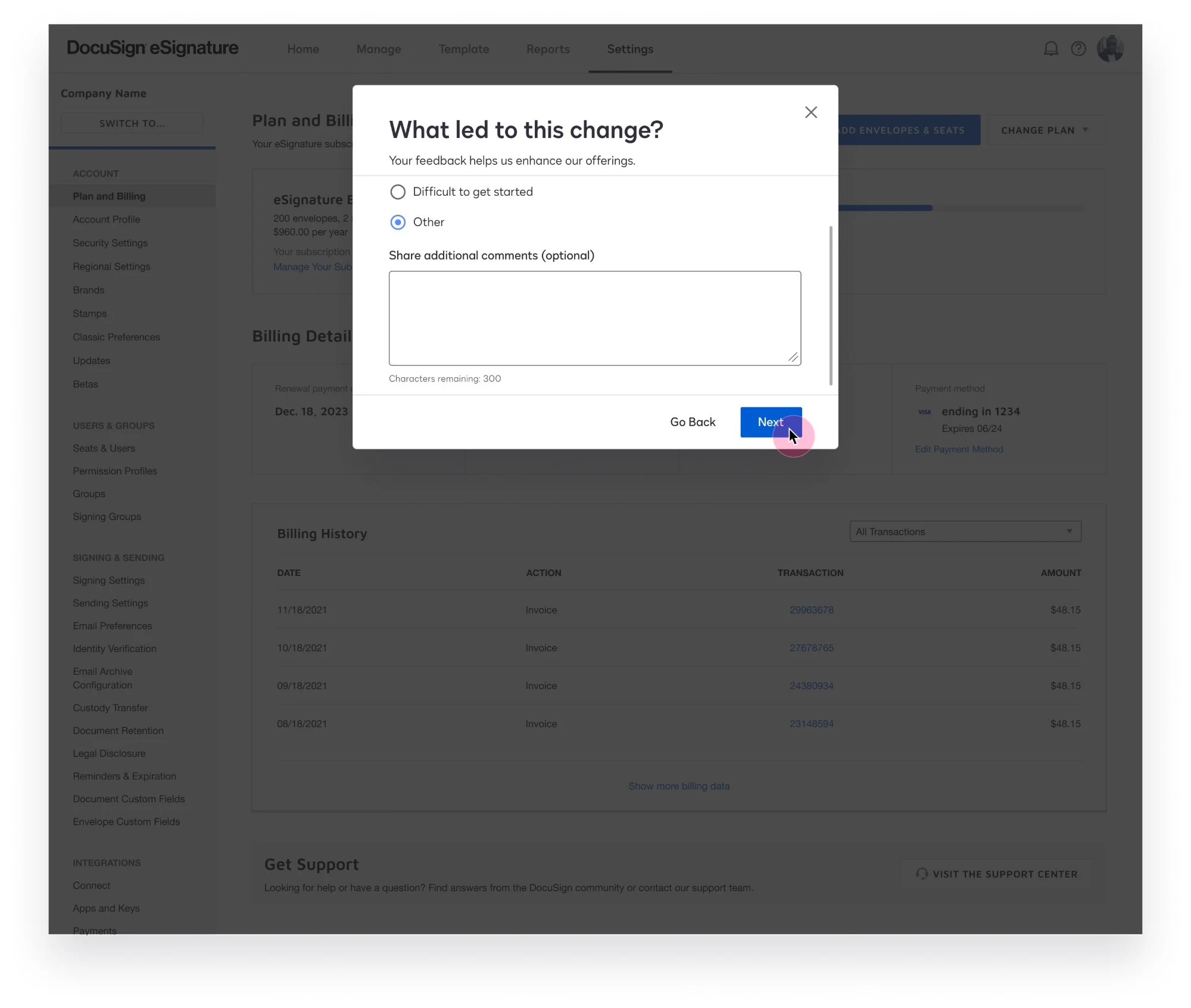
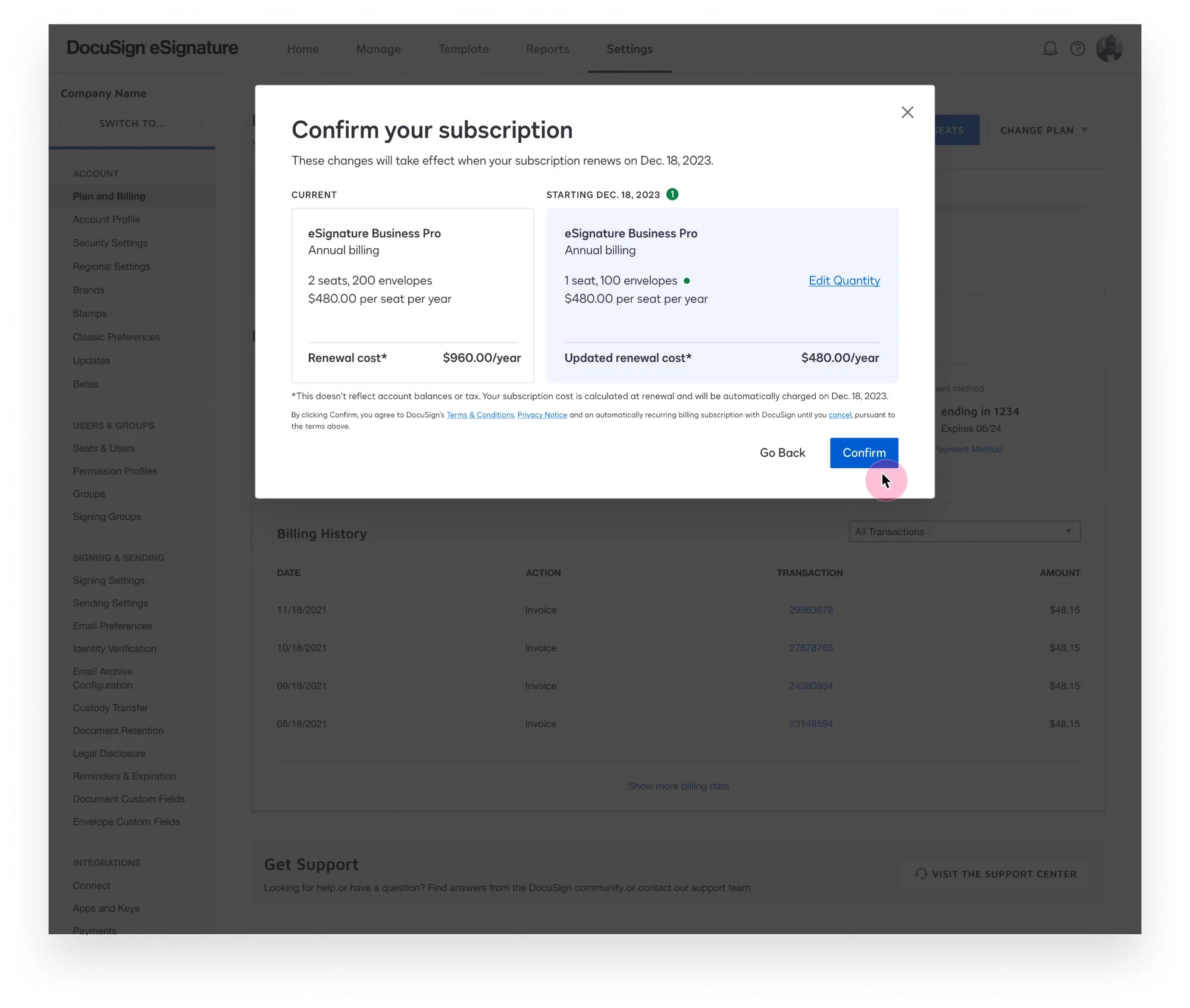
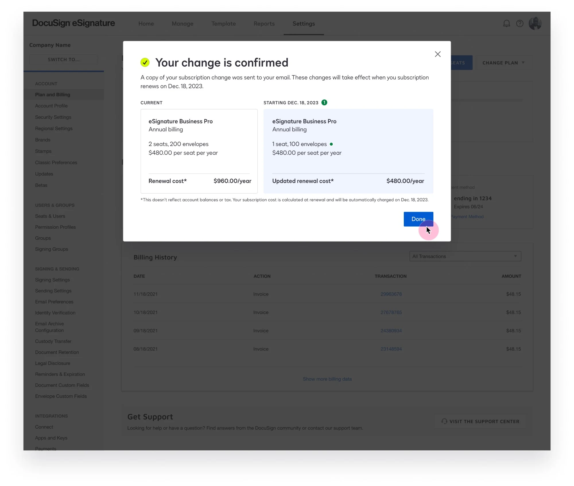
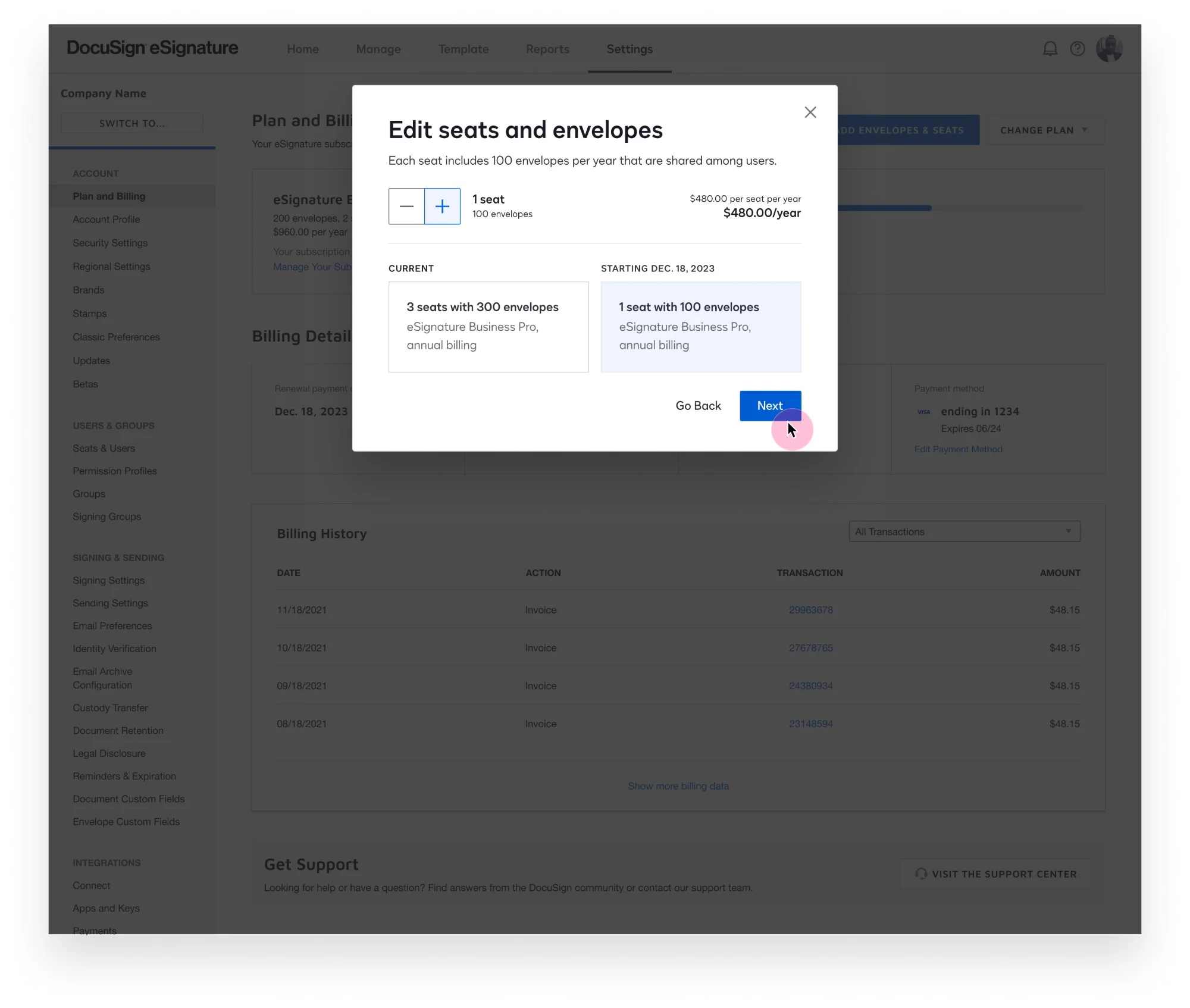
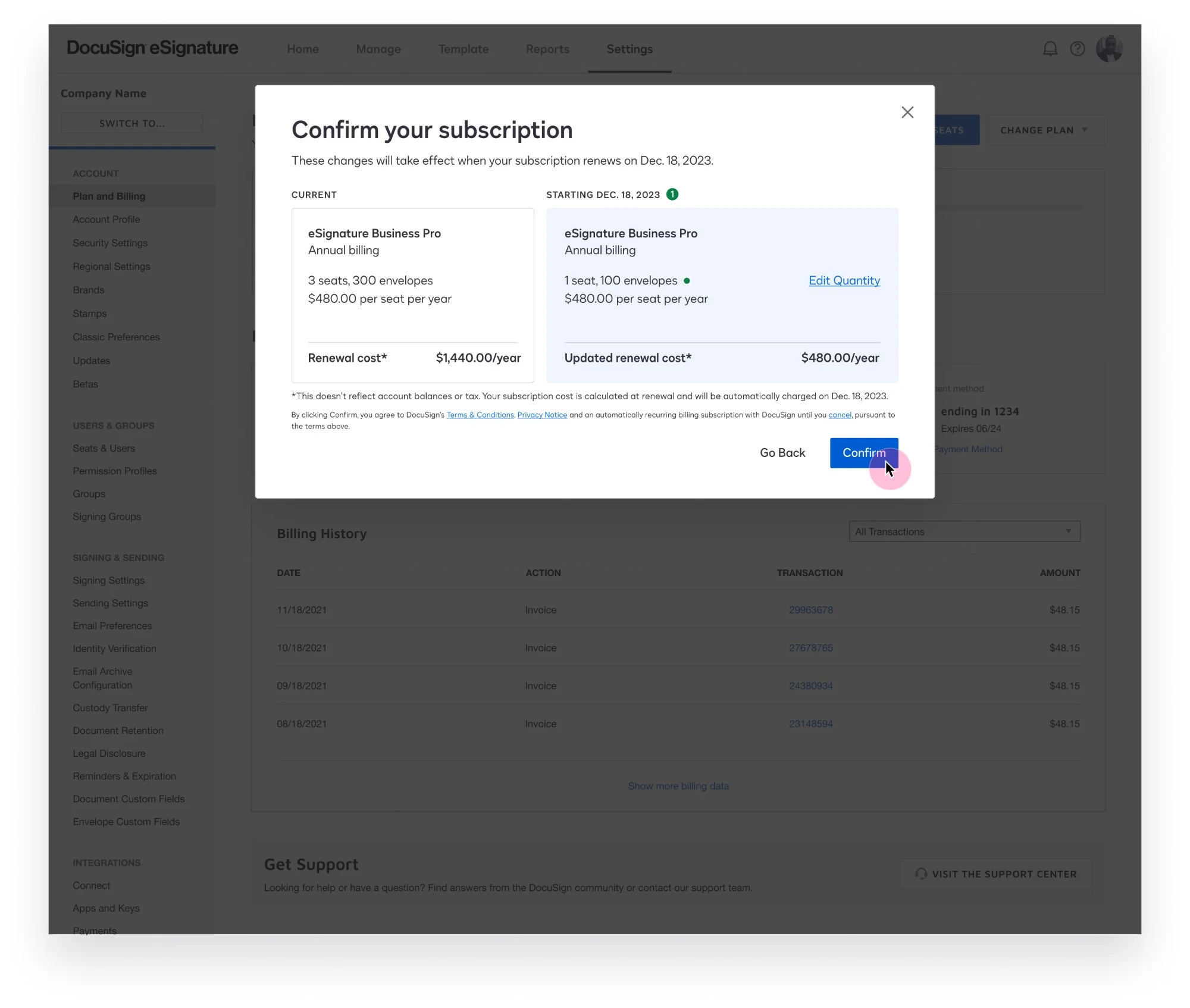
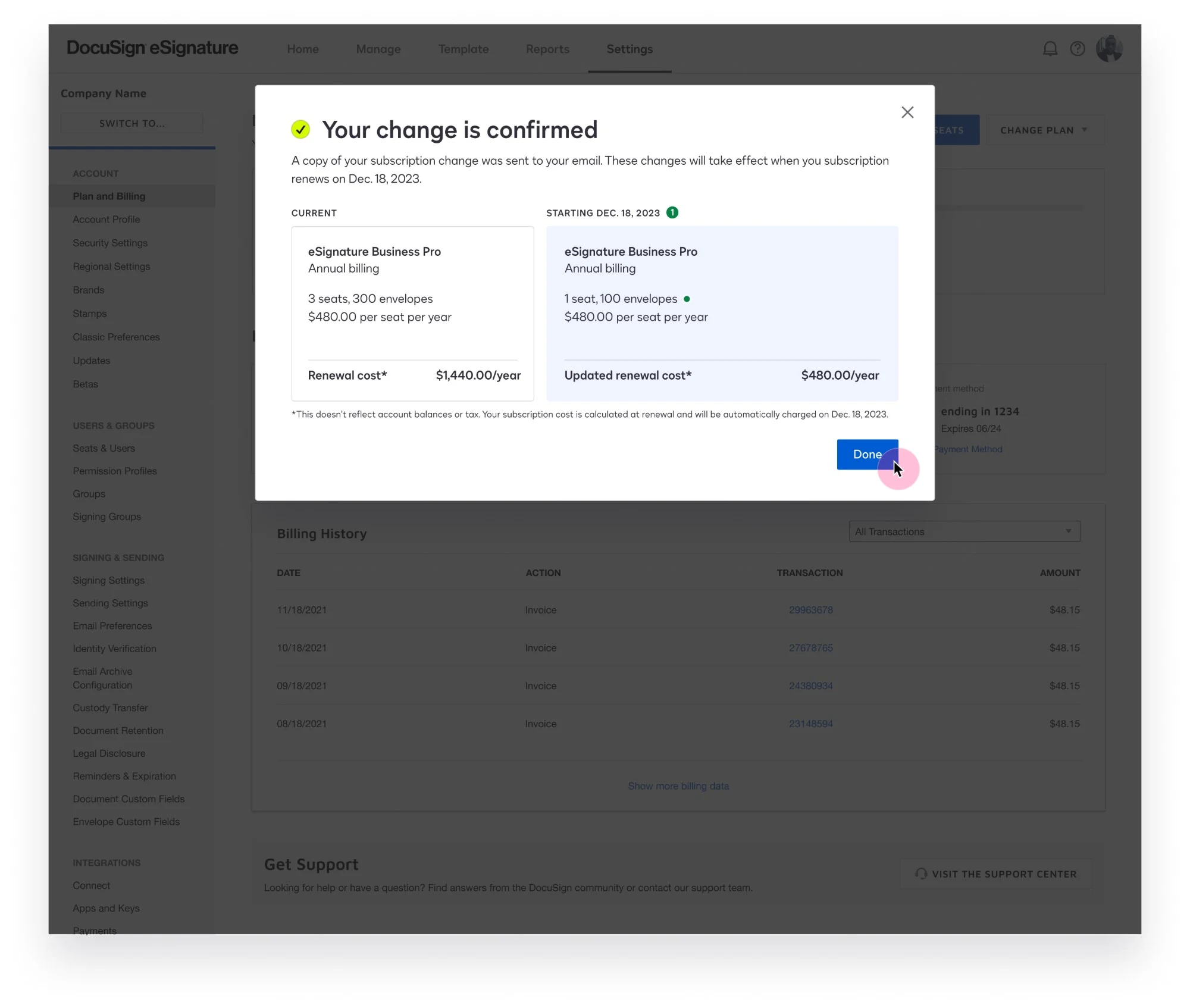
Final designs were delivered to engineering with accessibility annotations, responsive screen sizes and variants for edge cases.
Reducing seats
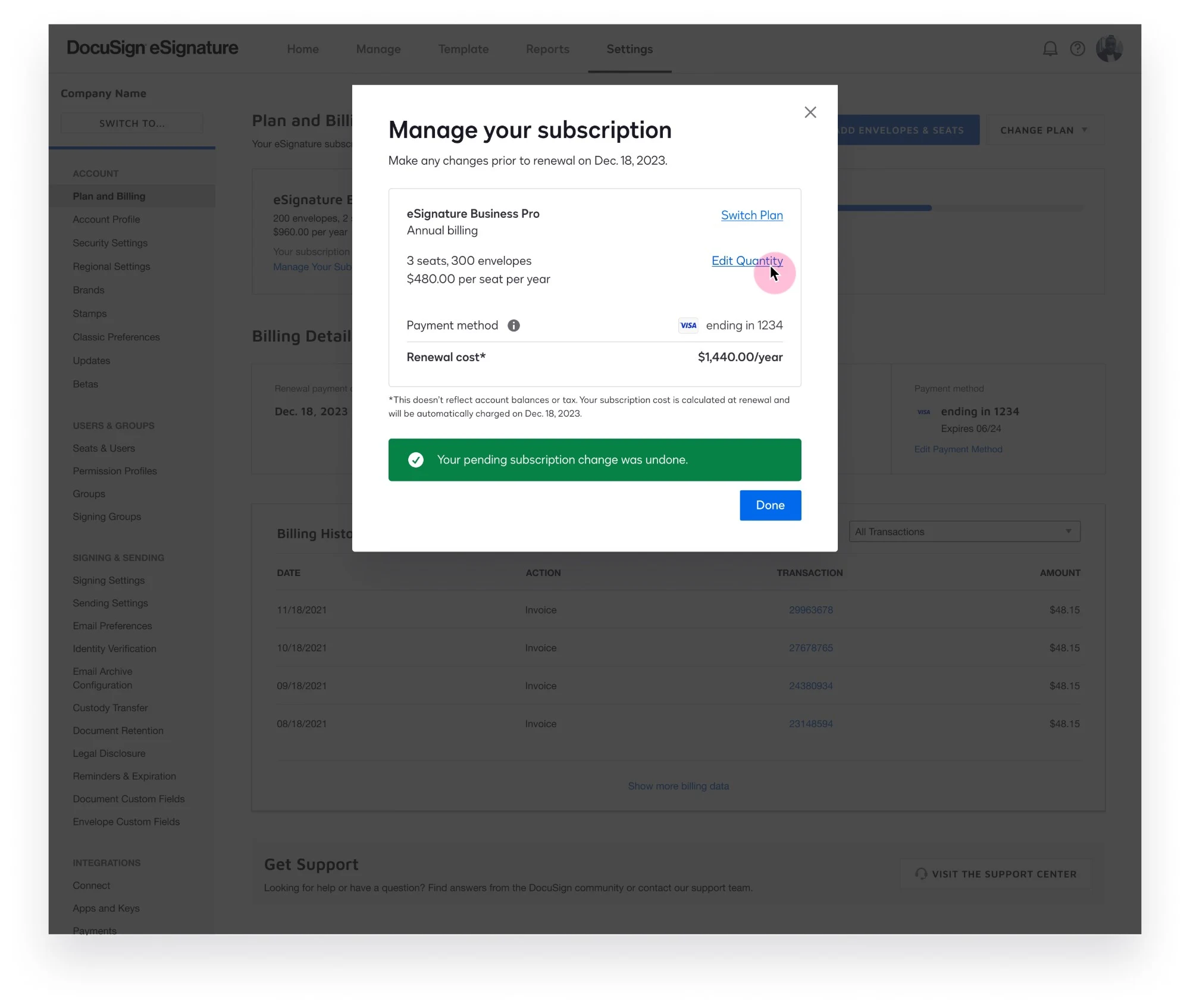
Undoing a pending change
06 — Results & learnings
Results
- 12
- Design iterations
- $50k+
- Estimated monthly recurring revenue for fiscal year 2024
- $137.5k+
- Estimated monthly recurring revenue for fiscal year 2025
What I learned
The design goals I had for this project weren’t realistic once I discovered back-end system constraints would limit functionality.
I had to trade off the goal of letting the user make multiple changes at once for allowing just one change per renewal period. This was a disappointment, but it further emphasized the need to fix the issue — which was addressed in the next phase. To solve for this lack of system flexibility, I created clear messaging and UI treatment so the admin understands the actions they’re able to take, and how to undo them.
Next time, I’ll ask more questions of the project sponsor at kickoff — in particular, whether the full range of stakeholders and teams are aware of the scope. If the back-end engineering team had been included earlier, I could have designed the flow knowing how system limitations impacted the user experience.