Pl. II · Snowflake · UX writing · Pricing
UX writing & design for a pricing calculator on Snowflake.com
How I created the first Snowflake pricing calculator for complex information.
01 — Problem & goals
Snowflake users need a way to accurately estimate their spending — and none of the existing calculators came from the company
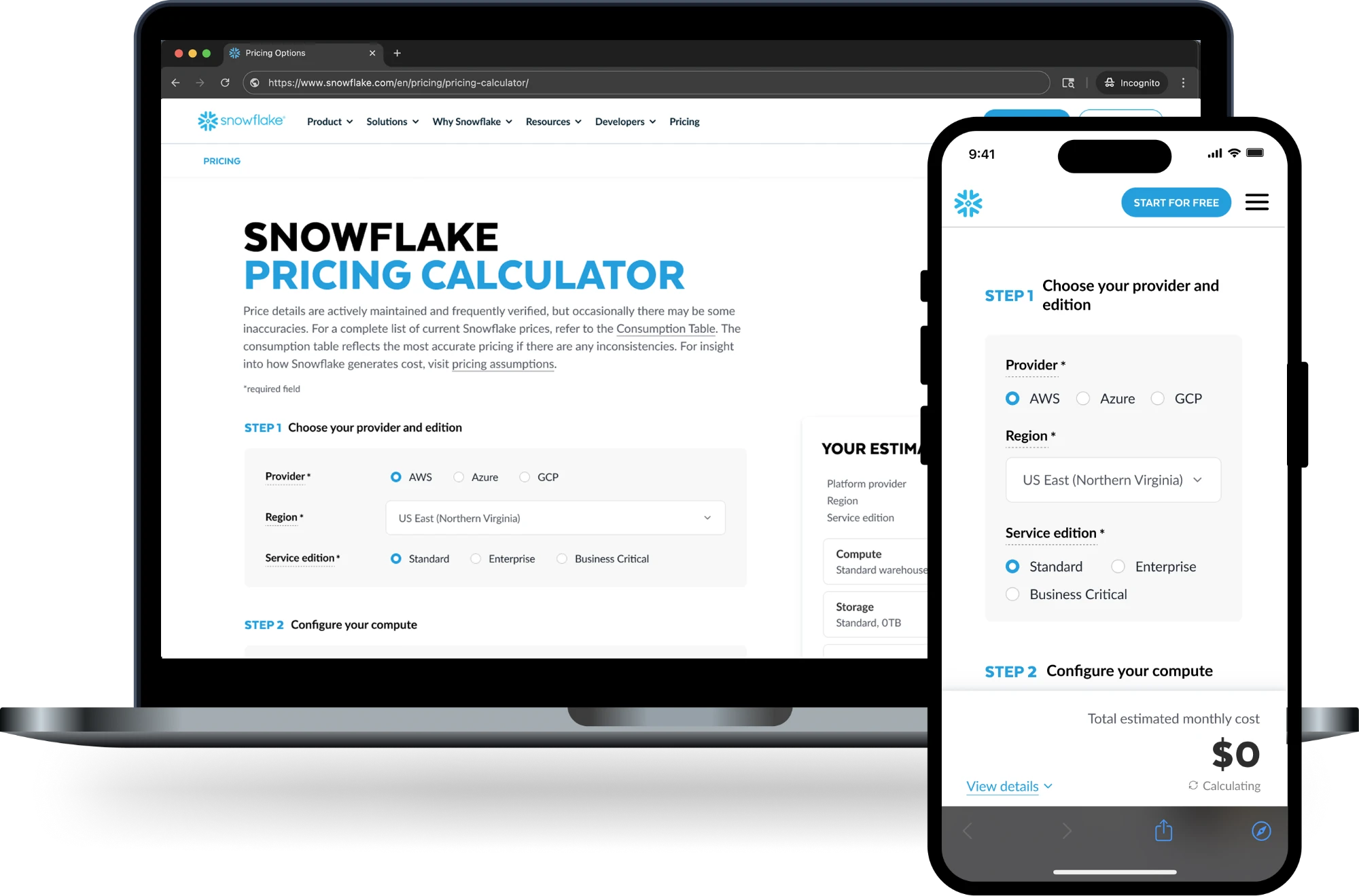
Snowflake has a perception problem of being an expensive tool. Part of the marketing strategy is to create visibility so customers understand what we charge. A few calculators already existed on the web, but this effort was the first of its kind: a pricing calculator on the Snowflake.com marketing website.
Problem
Estimating Snowflake platform cost can be daunting with the current resources available to customers, including a complex consumption table and an outdated pricing guide. We need a way for users to immediately calculate what they might spend given their needs.
Hypothesis
By launching a pricing calculator on the Snowflake.com marketing website, more sales meetings will be booked. We also anticipate positive community sentiment around Snowflake providing pricing transparency.
Design goals
In addition to designing the pricing calculator, I led these pricing updates in tandem:
- Conduct a UX audit of the current pricing page
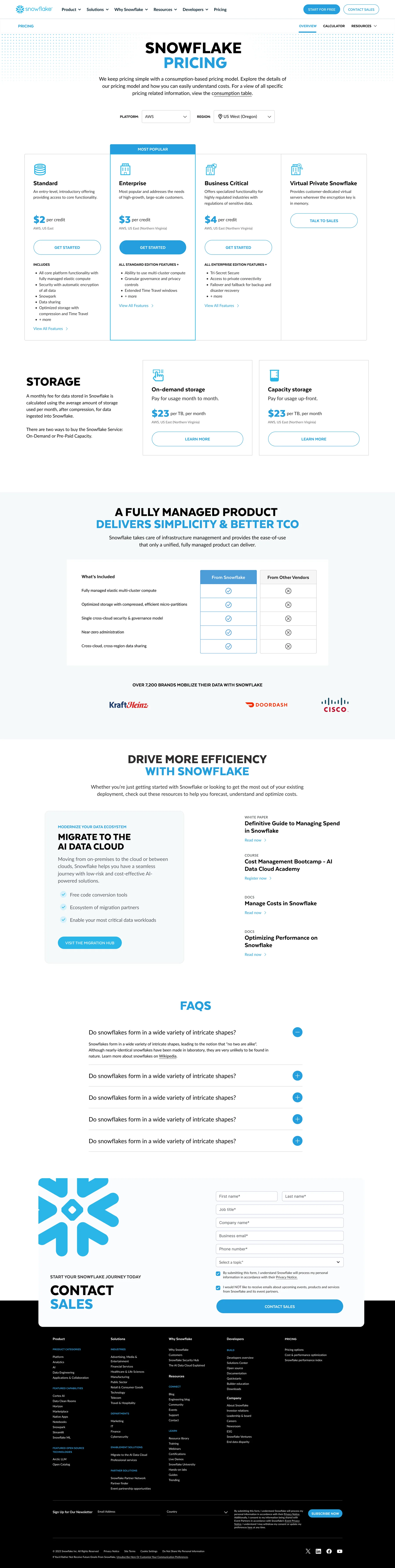
- Revise the pricing page content and hierarchy for improved readability, meeting users where they are in their journey
- Update the pricing sub-navigation to create a clear path to related pages
- Refine the content design for a more modern, clean and clear user experience
Key performance indicators
- Increase in sales contact form completion
- Increase time on site and page views per session
- Reduce website bounce rate
My role
I served as the sole UX & content designer, overseeing the project from discovery, to low-fidelity concepts, to UX writing. The team included a UI / visual designer, a lead engineer plus an offshore team of 4 engineers, a project manager, and the pricing stakeholder team.
02 — Discovery
Current experience audit
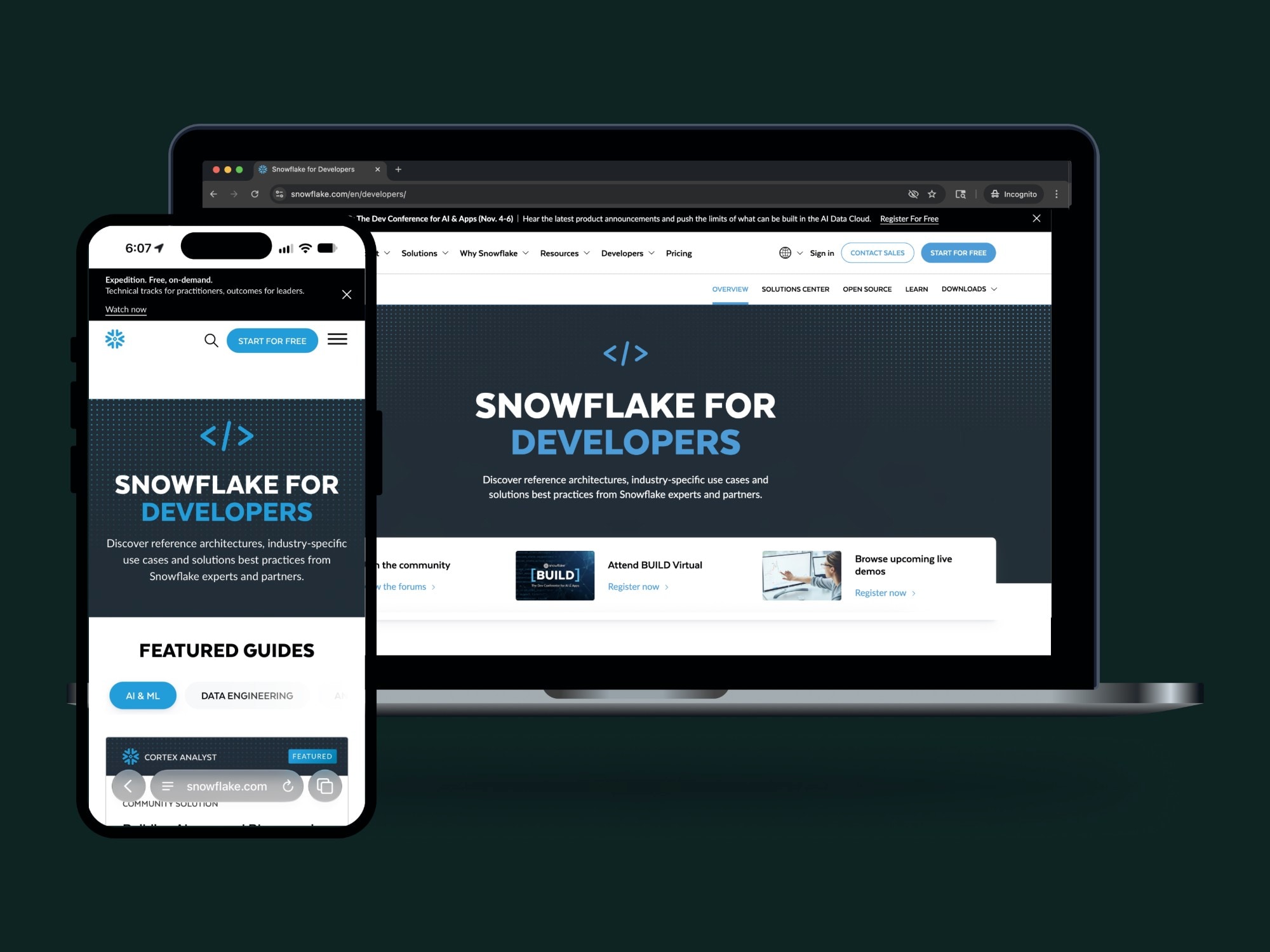
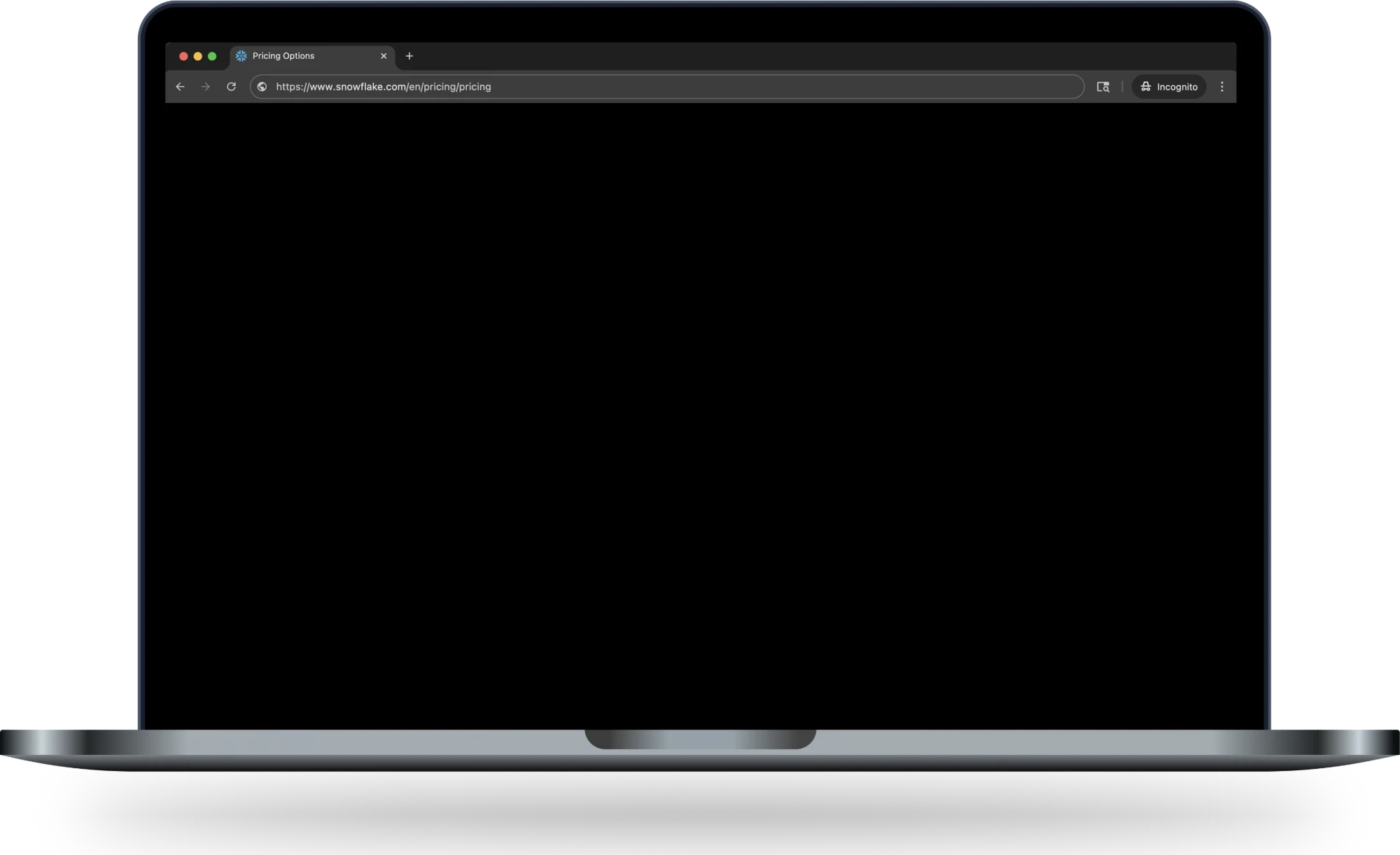
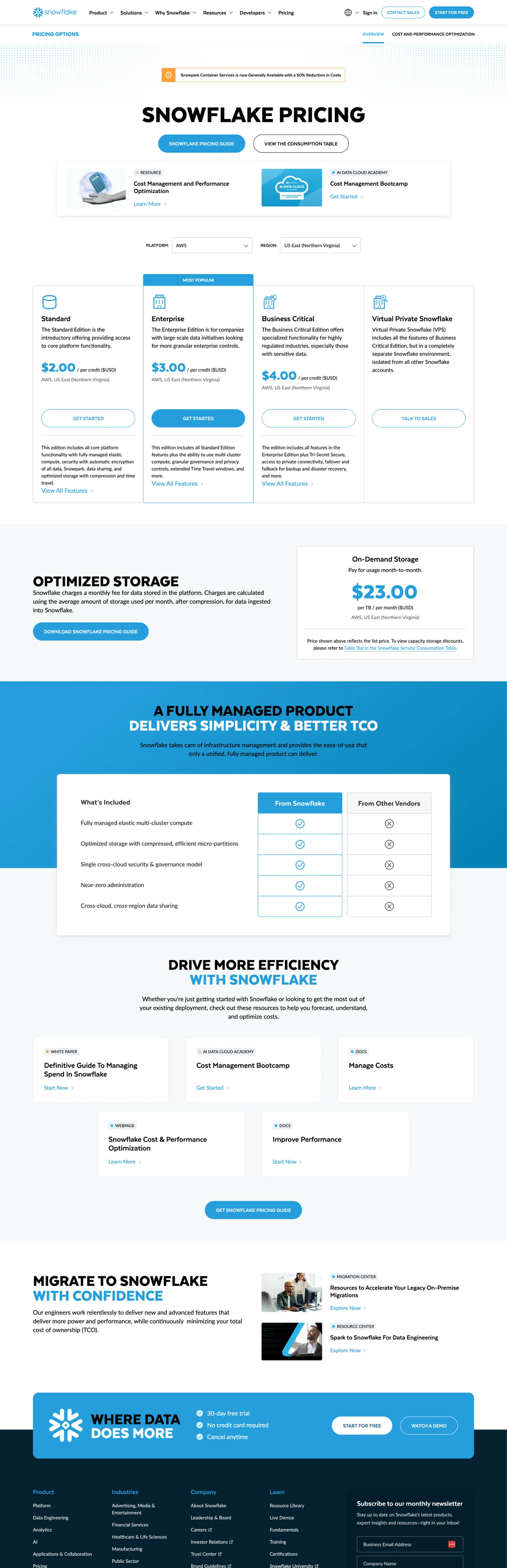
There wasn’t a calculator on the Snowflake website, but there was an existing pricing section.
Opportunities identified in discovery
- Re-order the page hierarchy so more complex information is surfaced further in the journey
- Revise copywriting for improved readability and easier scanning
- Create a more robust sub-navigation that includes the calculator
- De-emphasize linking users off the page; instead, give them the content they’re seeking with limited marketing fluff
Competitive analysis
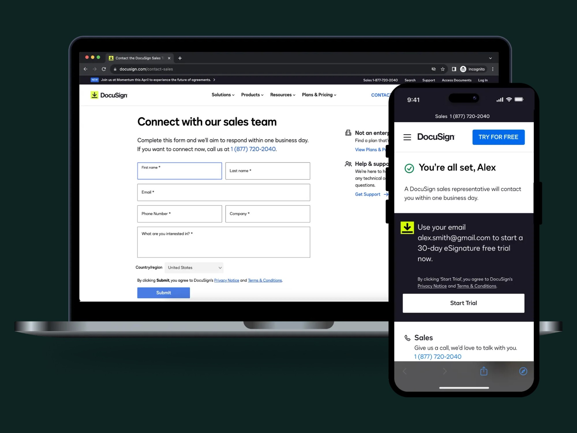
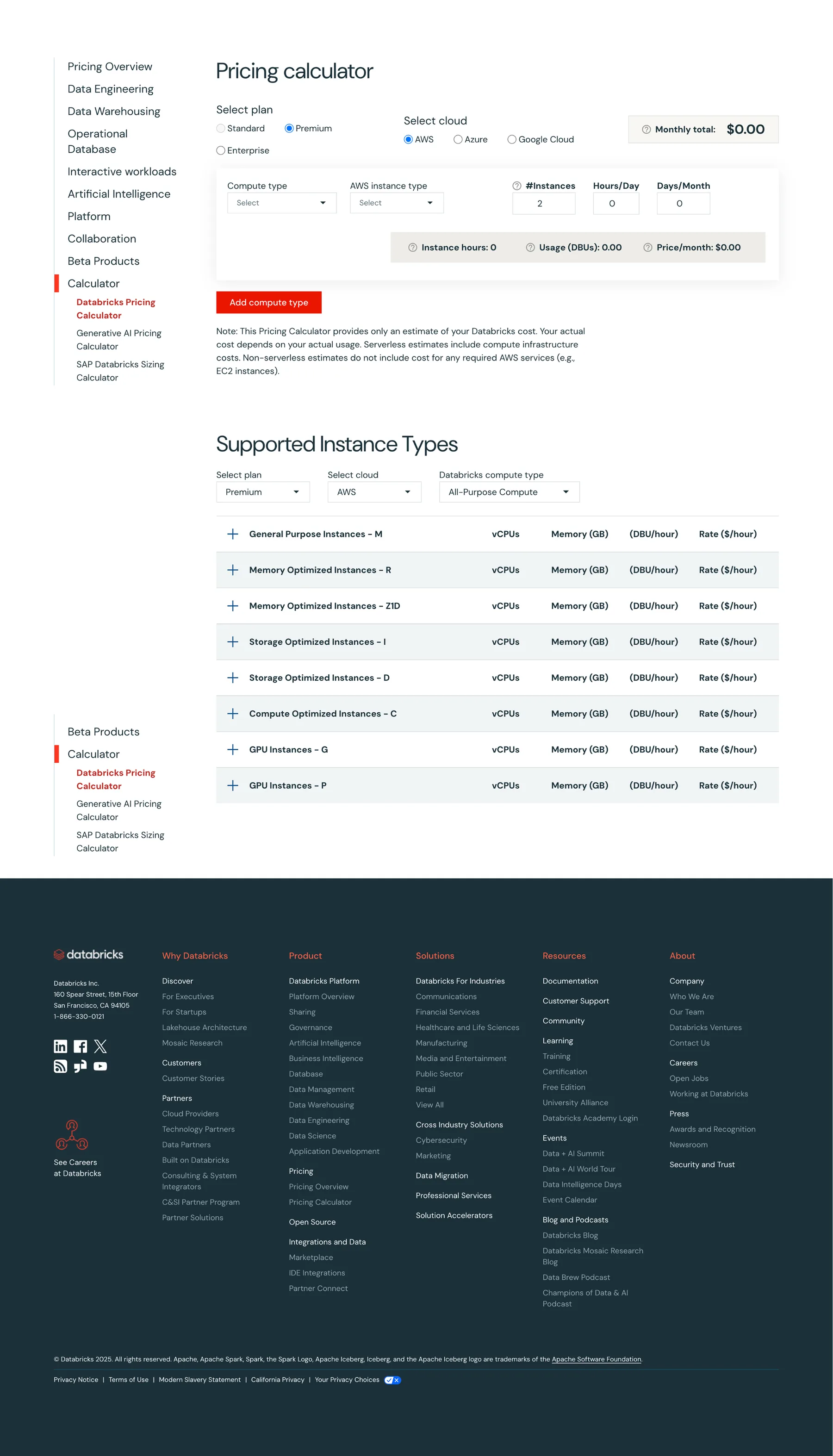
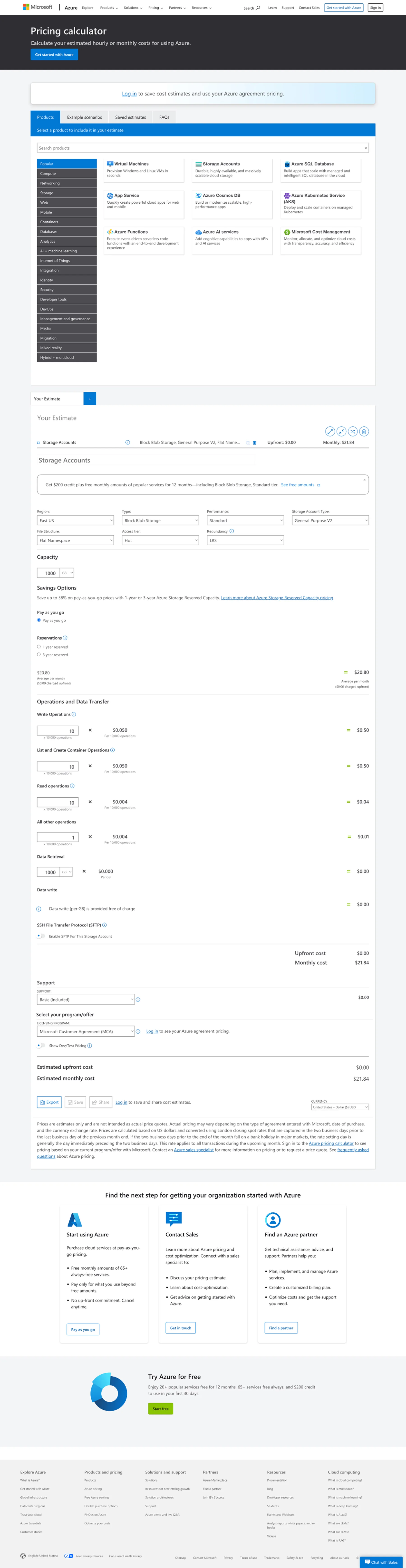
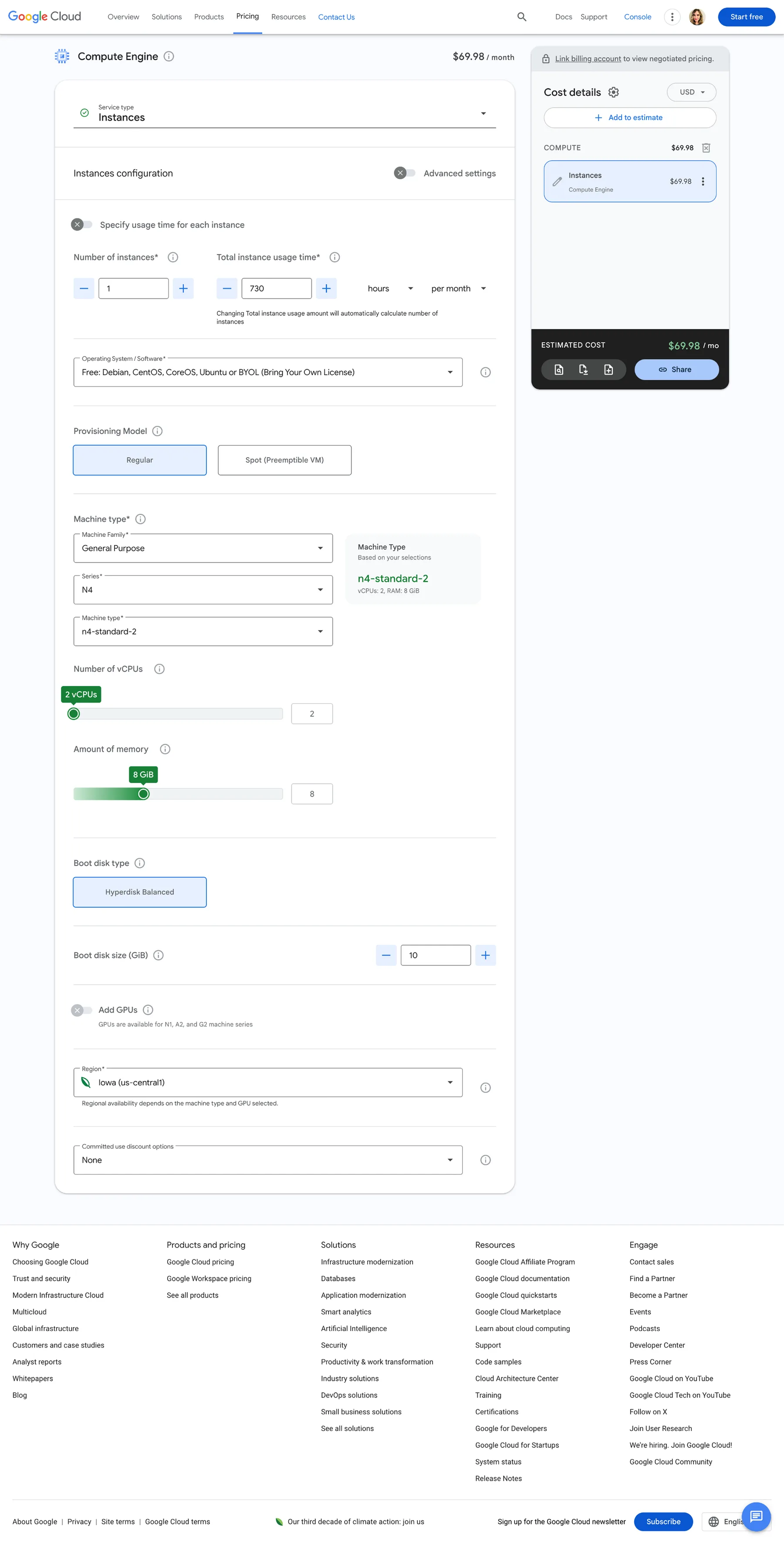
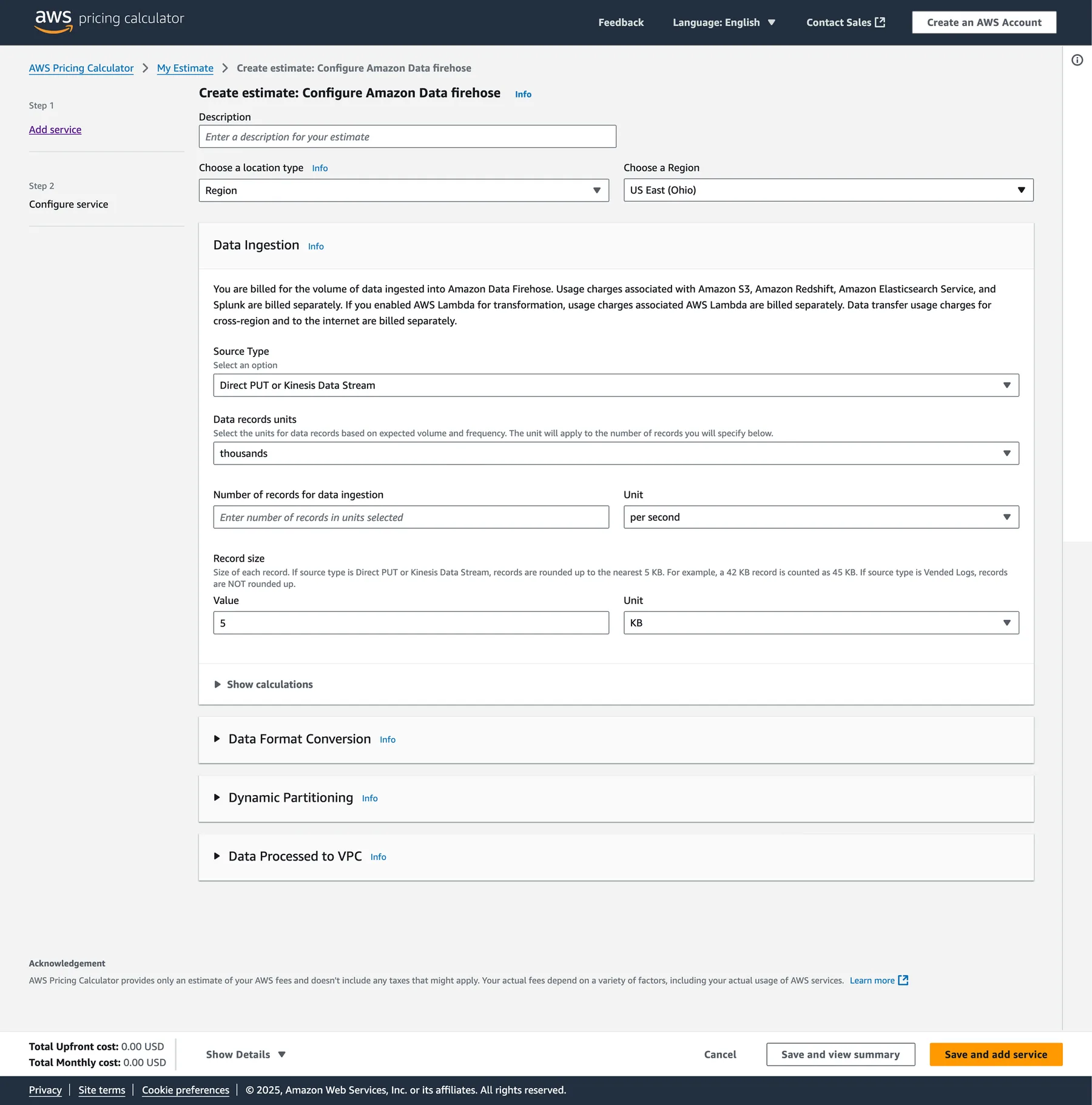
Pricing calculators on competitor sites are robust and complex
The other calculators I tested has pros and cons. It quickly became clear that ours would need to be complex — but the goal was always to keep it as simple as possible.
03 — Ideation
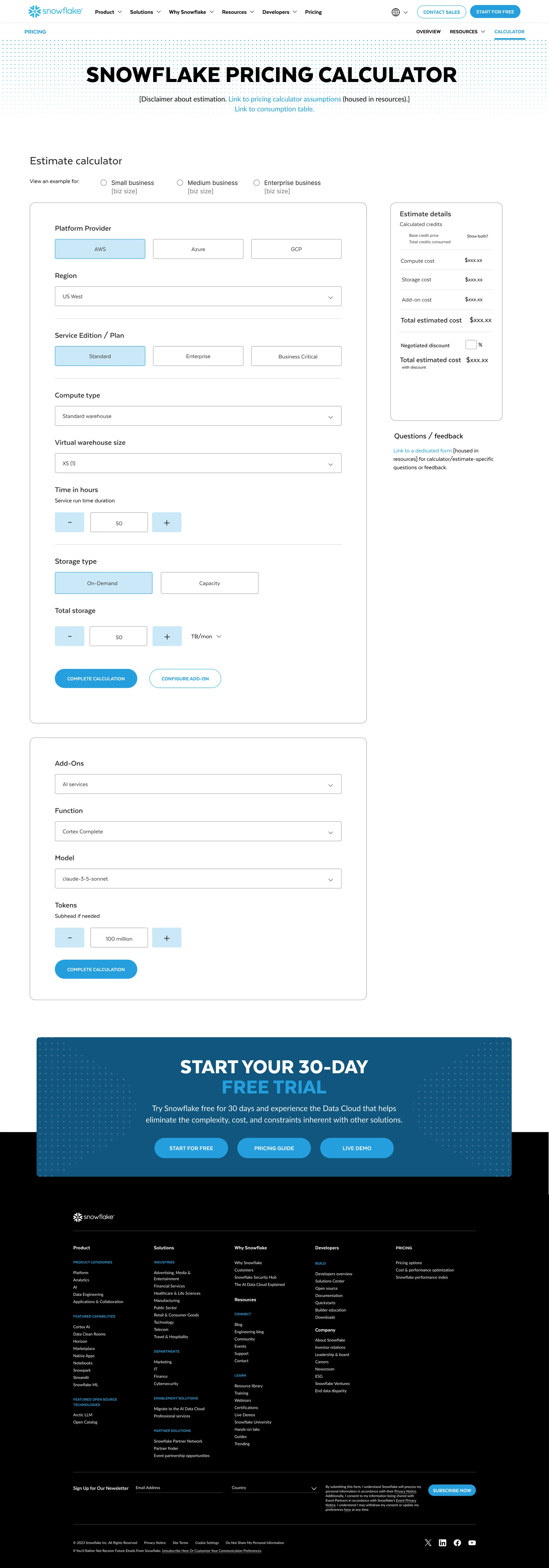
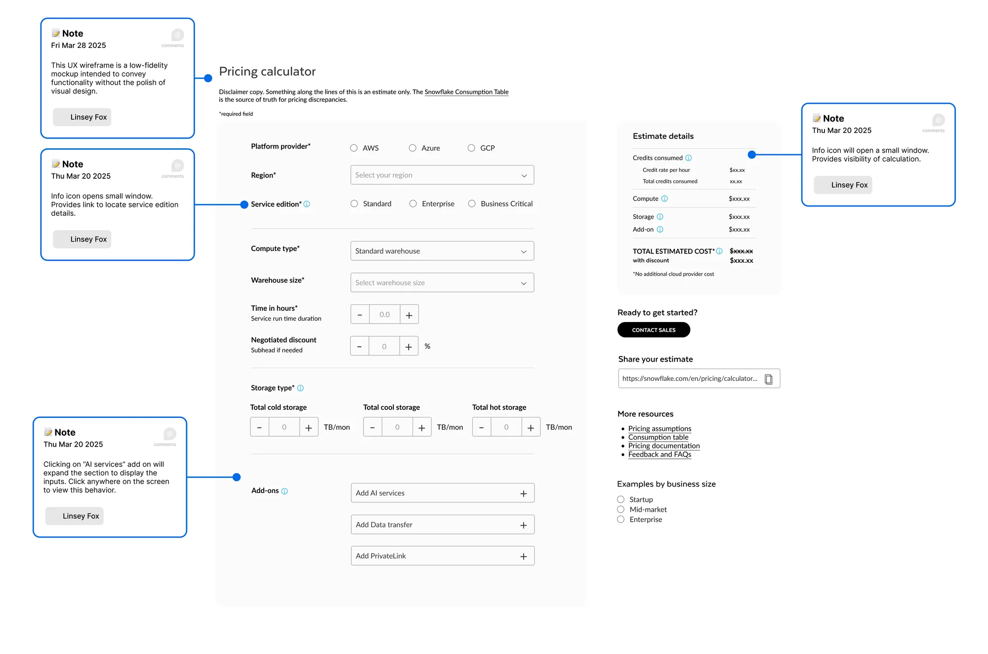
Complex inputs, a simple path
04 — UX writing
One way to make a complex workflow simple is with clear, concise information — in the moment it’s needed
Since a goal for the calculator was to make it as simple as could be, we adopted the idea of adding tooltips for each input. They were designed to be unobtrusive and to meet the user where they are. I wrote the tooltips for each input, along with the content design for the full experience.
05 — Final design prototype
Final design prototype
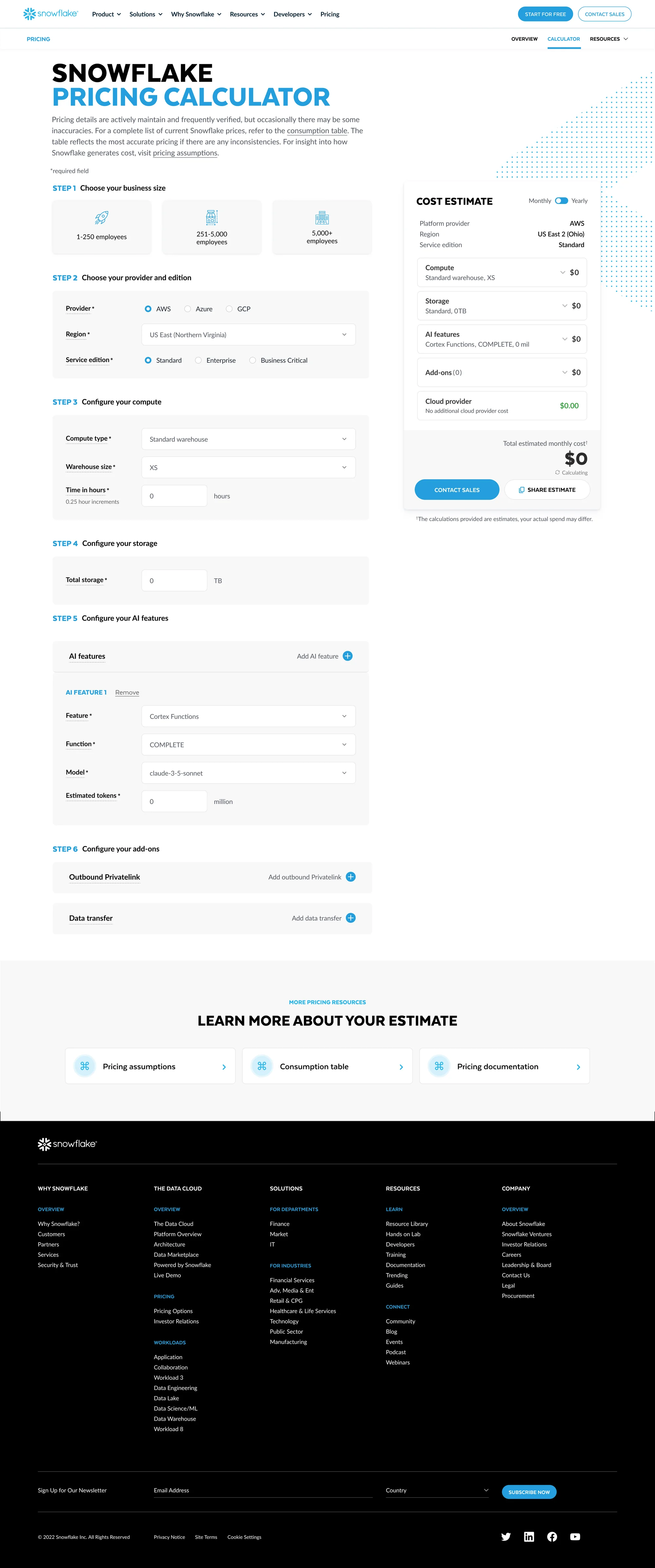
A limited Figma prototype helped gain approvals and excitement internally. It also reduced engineering questions from the offshore development team building it from scratch.
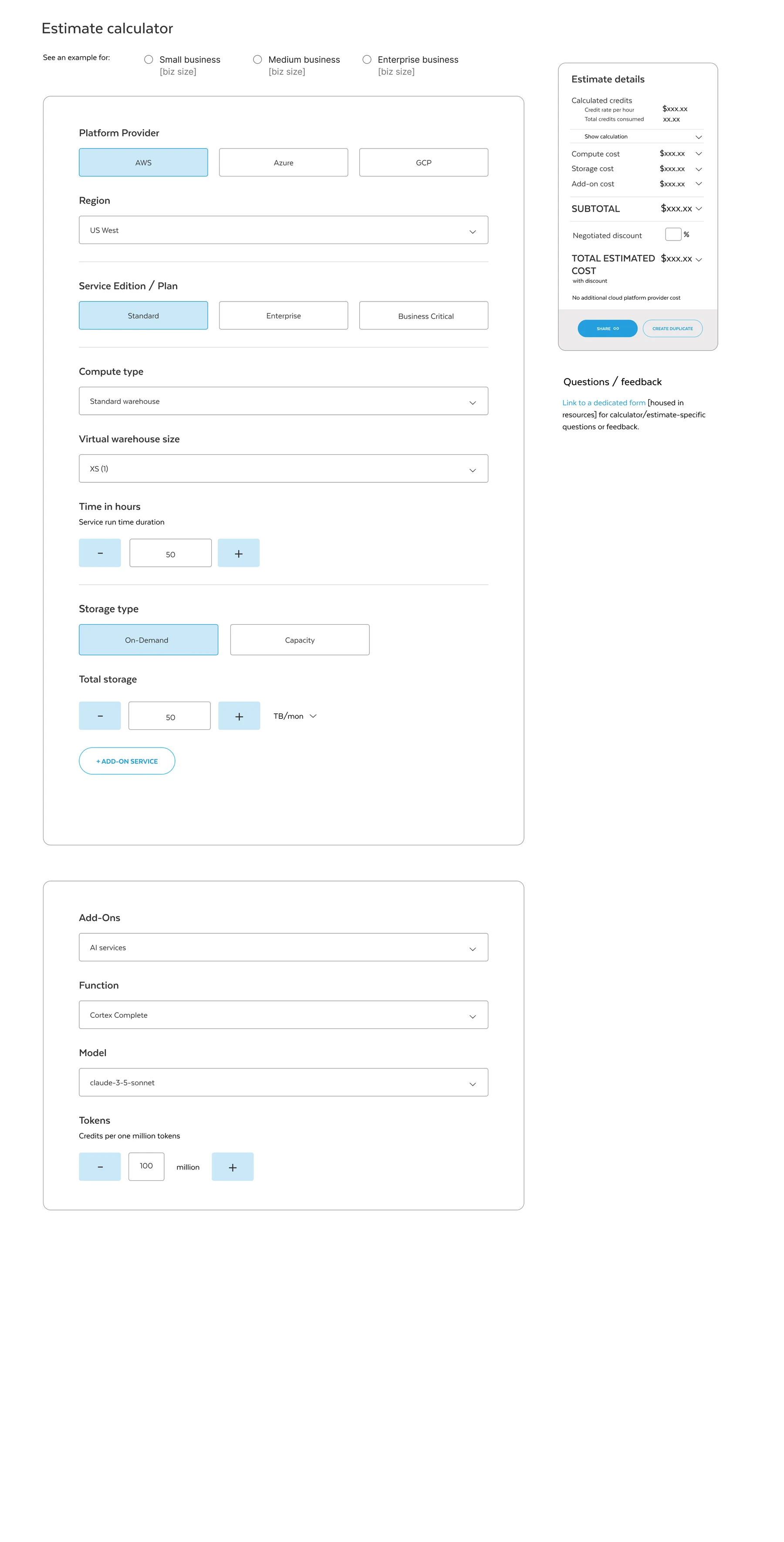
Phase two designs
During extensive internal interviews, the topic of pre-selected business sizes came up frequently. Due to timelines we couldn’t launch with this feature, but the designs are ready for a fast phase-two follow-up. I also added subhead copy below each step to give further context without having to open a tooltip.
06 — Revised pricing page
07 — Final results & thoughts
Still live, in its original form
The calculator launched after my departure, so unfortunately I don’t have results to share. I can say that it’s still live in its original form today — which speaks volumes.
This is the most rewarding UX design project I’ve done to date.
At the onset, the complexity of the requirements was daunting due to layers of dependencies. In partnership with a great team who each brought our expertise to the table, we designed a simple and sleek product. Designing it from an outsider’s perspective ultimately became an asset, as my goal was always to keep it as simple as possible.