Pl. V · Docusign · Content & lead generation
Content & UI refresh on Docusign’s contact sales form
How small content changes make a big impact on a primary lead generation form.
01 — Problem & goals
An outdated form that left users at a dead end
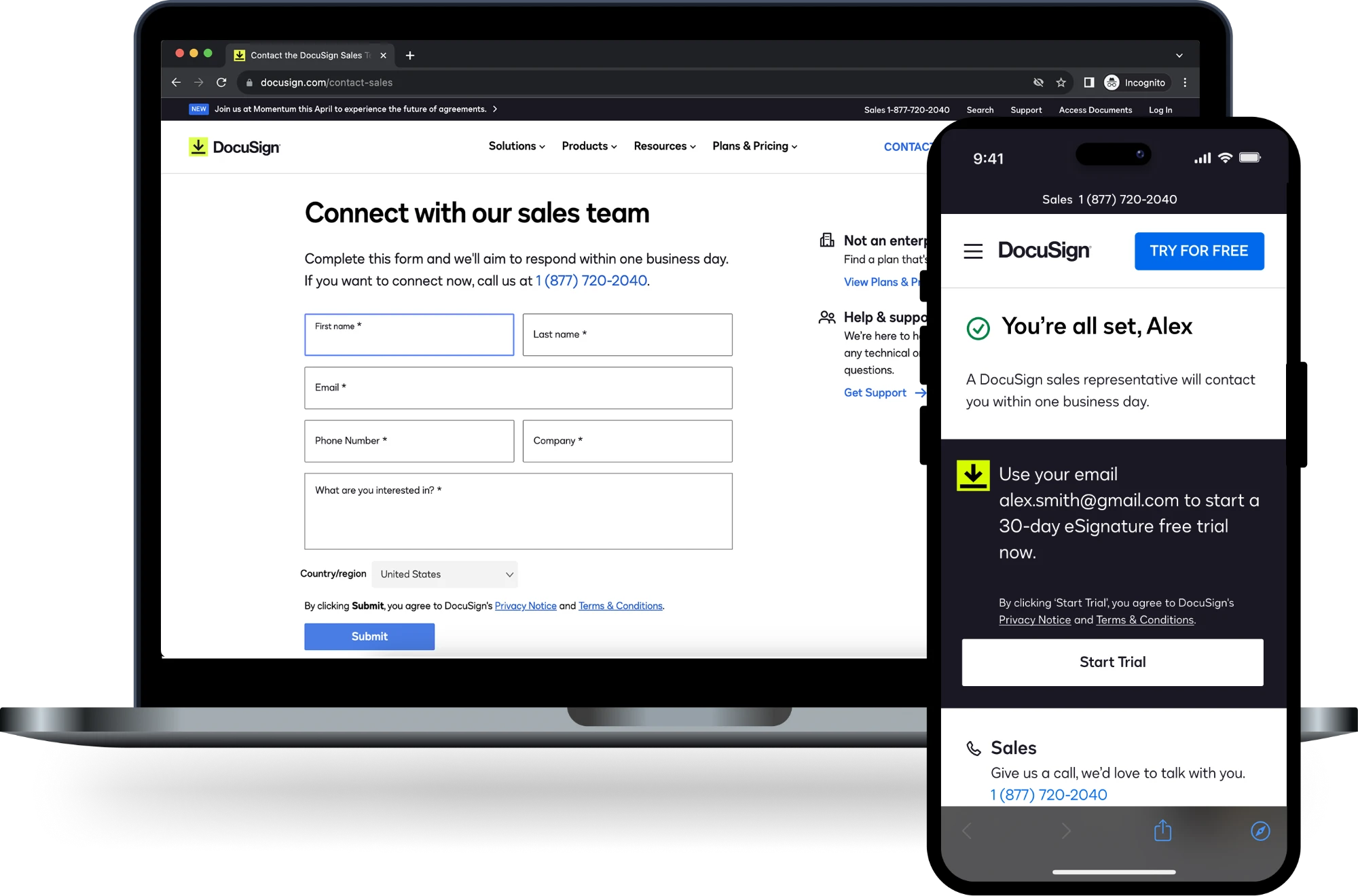
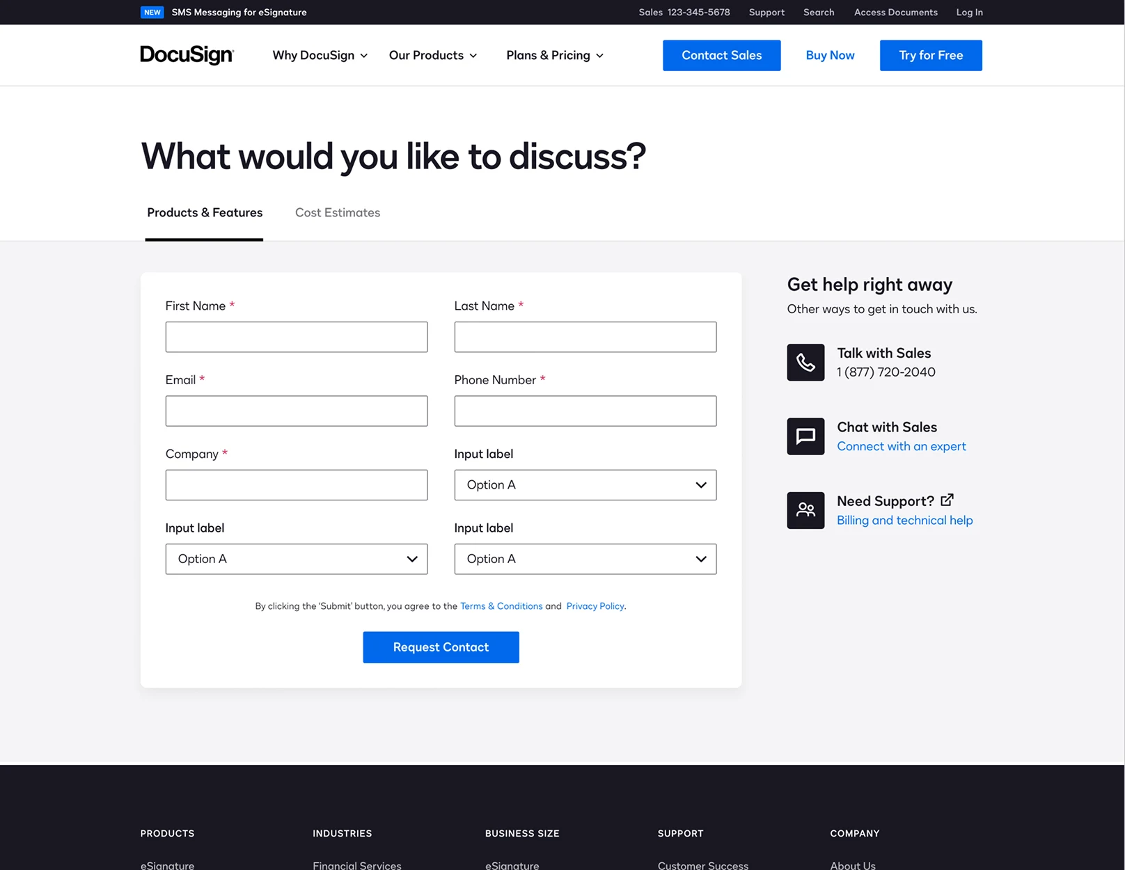
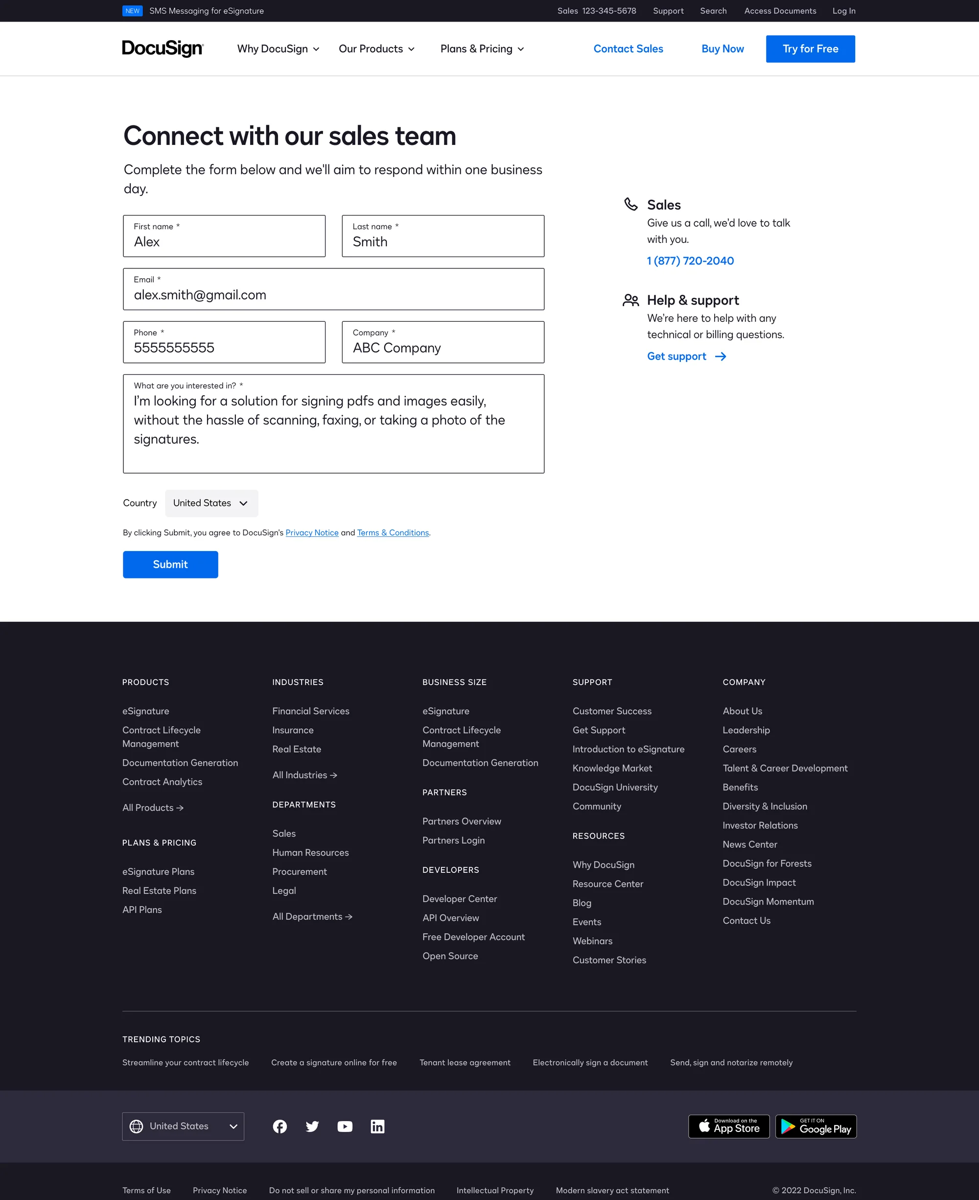
The form to contact Docusign’s sales team was outdated, stale and not communicating all it could to create a better overall user experience.
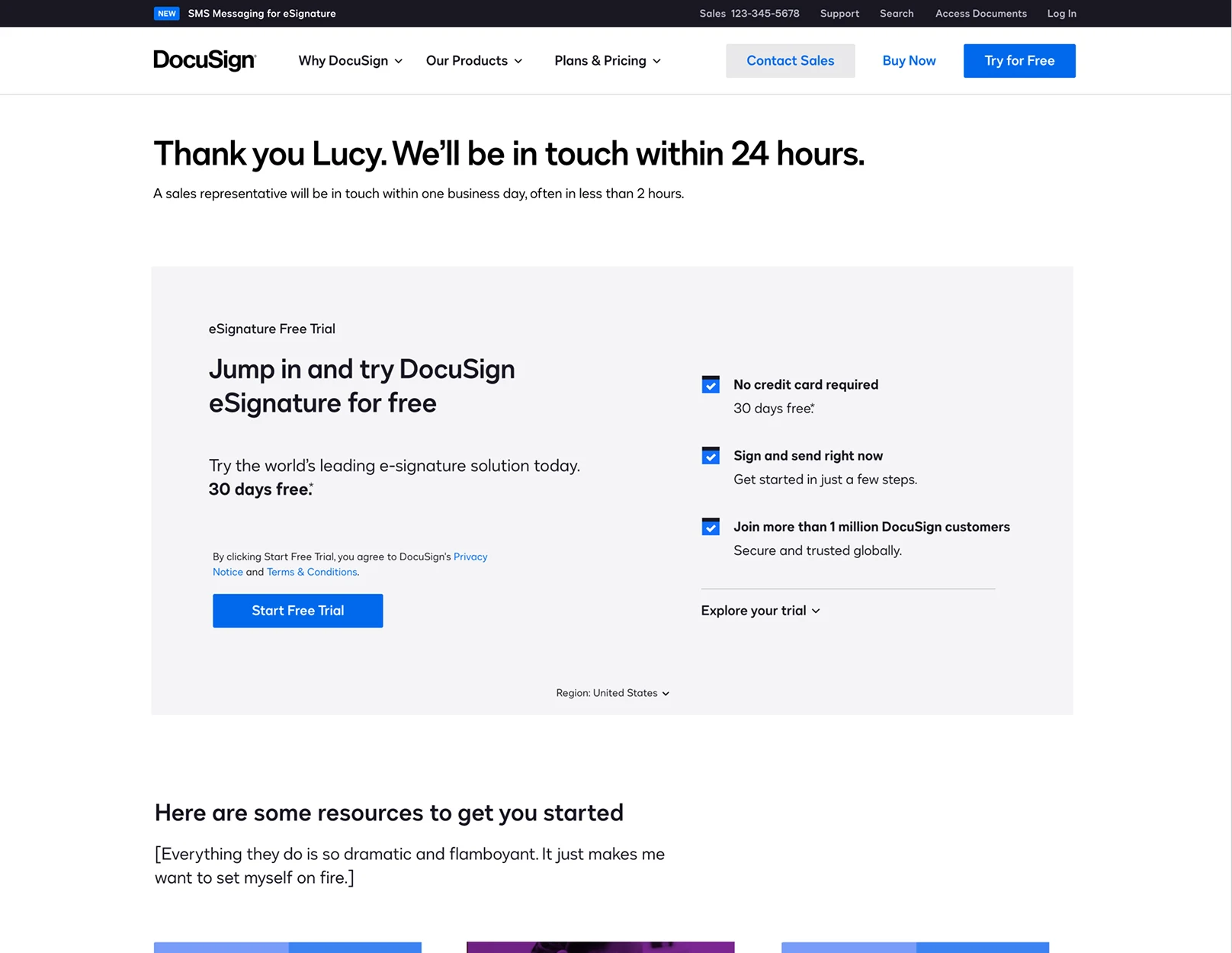
Additionally, the form left users at a dead end where there was a clear opportunity to promote a free trial.
Hypotheses / design goals
Rethink the overall experience of contacting sales, placing emphasis on:
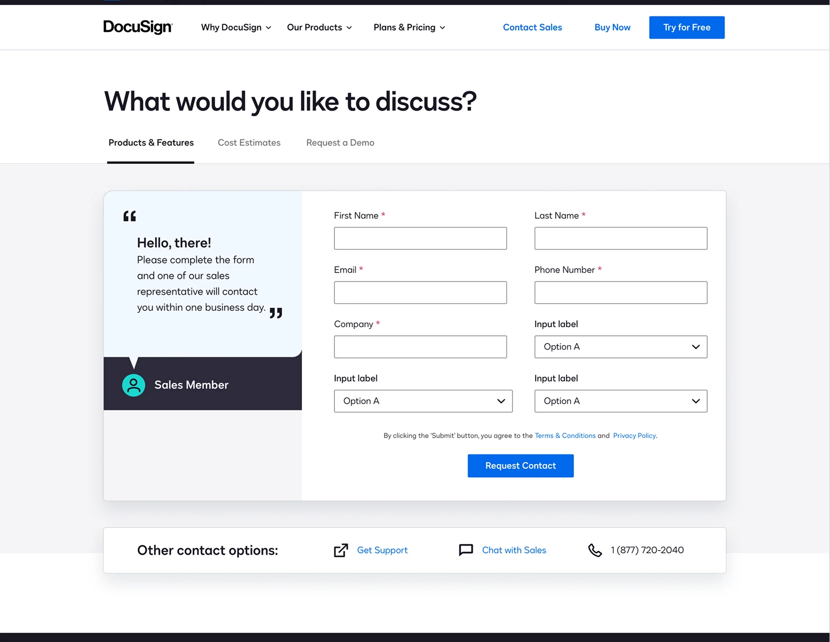
- Content strategy: providing helpful context and setting expectations on sales response times.
- Omit unnecessary form fields: reducing friction without sacrificing lead scoring.
- Direct to support: accurately guiding customers seeking support.
- Engagement: creating opportunities for customers to engage with Docusign products after successfully entering the sales funnel.
Key performance indicators
- Increase contact sales form submissions
- Decrease customer support submissions
- Increase free trial sign-up rate
My role
I was lead product designer, working with a product manager (sponsor), content designer, user researcher, program manager, project manager, engineering team and analytics manager. My role was to design the visual look and feel, create test prototypes, conduct usability testing on the final outcome and perform quality assurance testing prior to launch.
02 — Discovery
Current experience audit
Opportunities identified through customer research & discovery
- i.
Set expectations about turnaround time
Customer experience is negatively impacted without guidance on when they’ll be contacted — both before and after form submission.
- ii.
Provide contact option flexibility
Provide clear options for contacting sales outside of completing the form.
- iii.
Reroute to support where appropriate
Minimize incorrect routing of requests to sales and accurately guide customers seeking support. The support link sat below the fold on a typical laptop, and many users missed it.
- iv.
Don’t dead end
Create opportunities for engagement with Docusign products after successfully entering the sales funnel — e.g. one-click trial initiation.
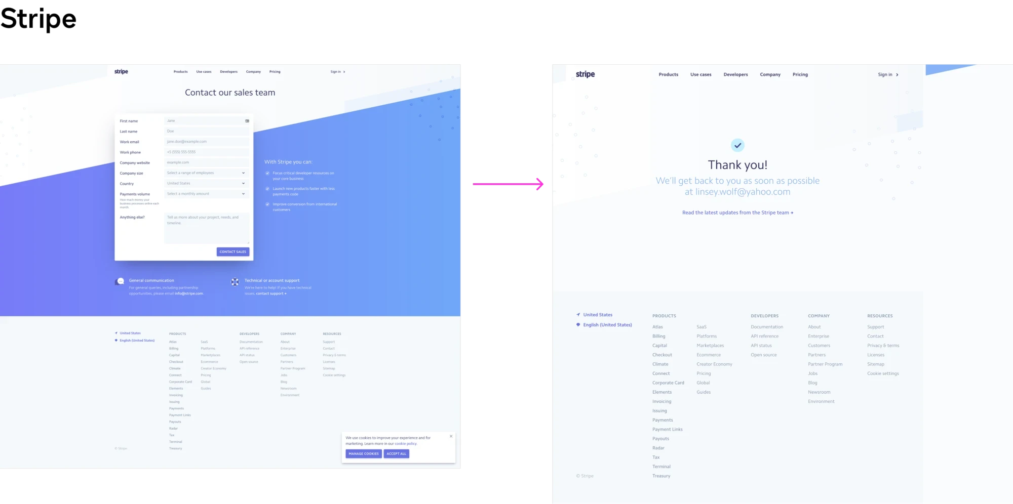
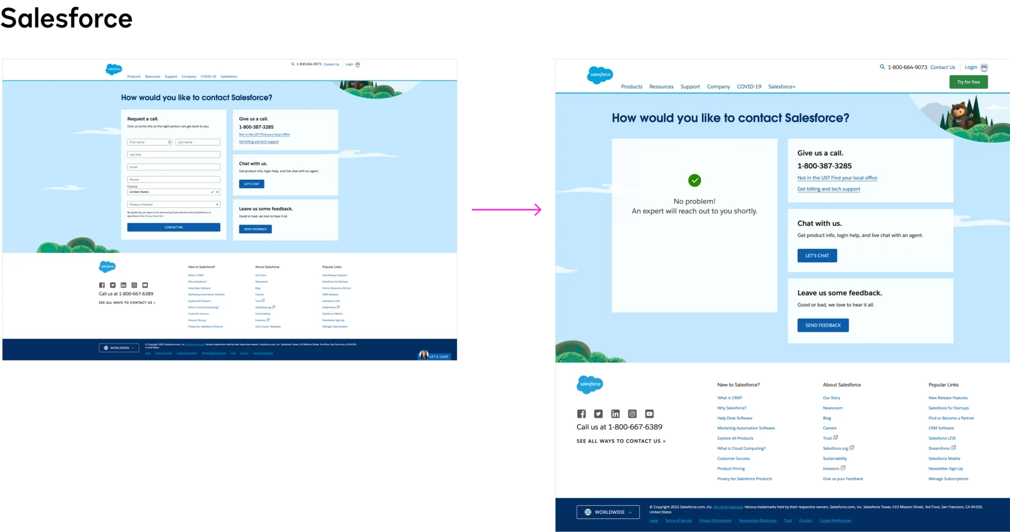
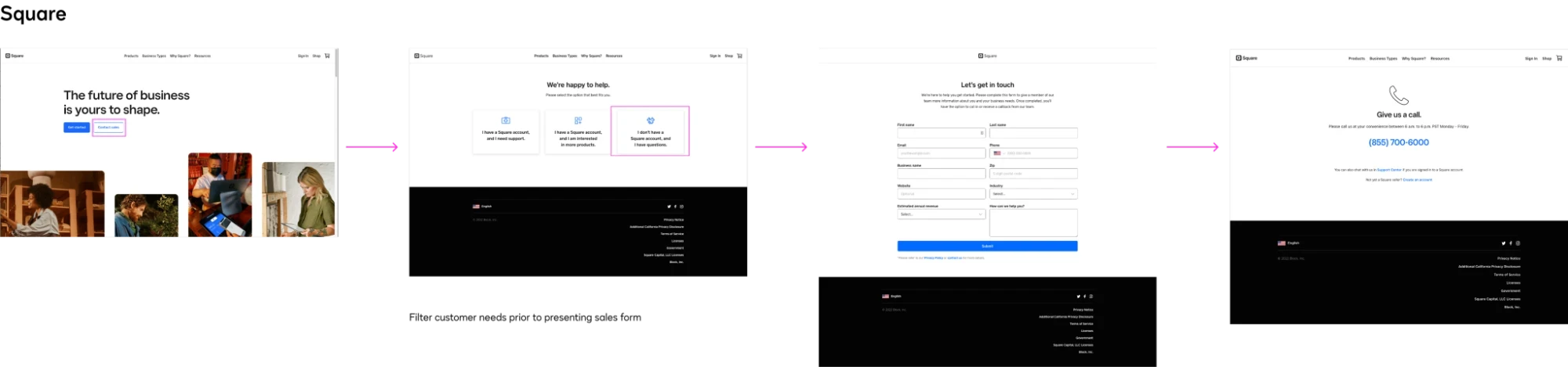
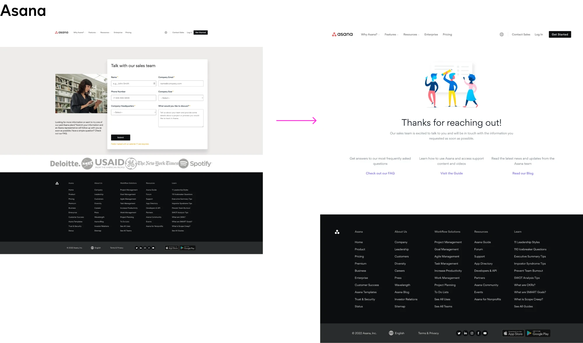
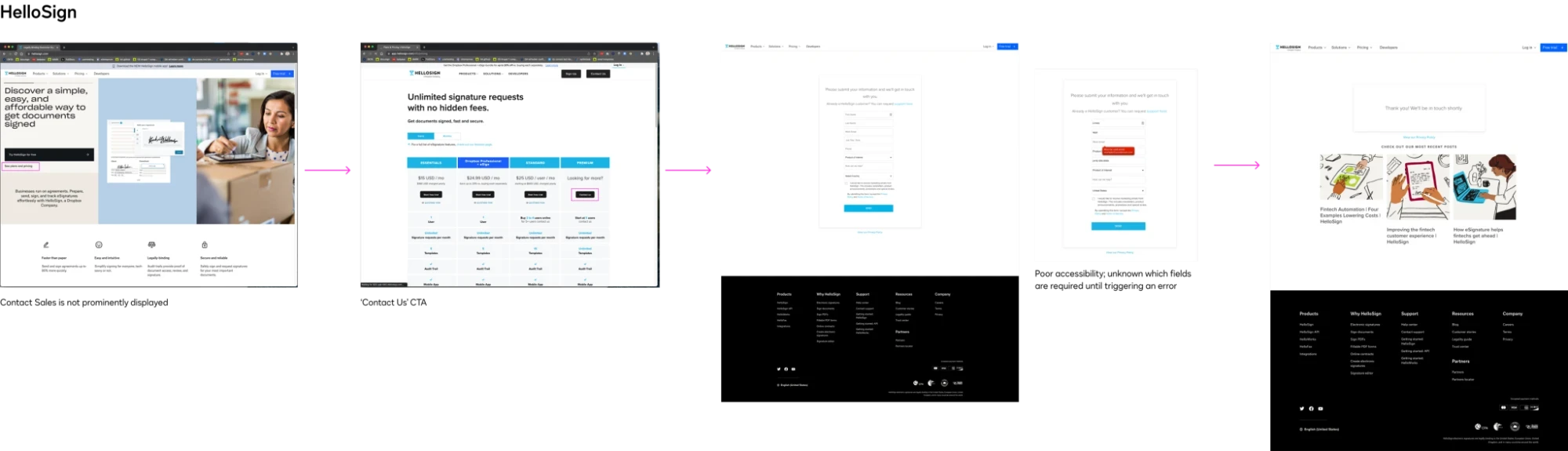
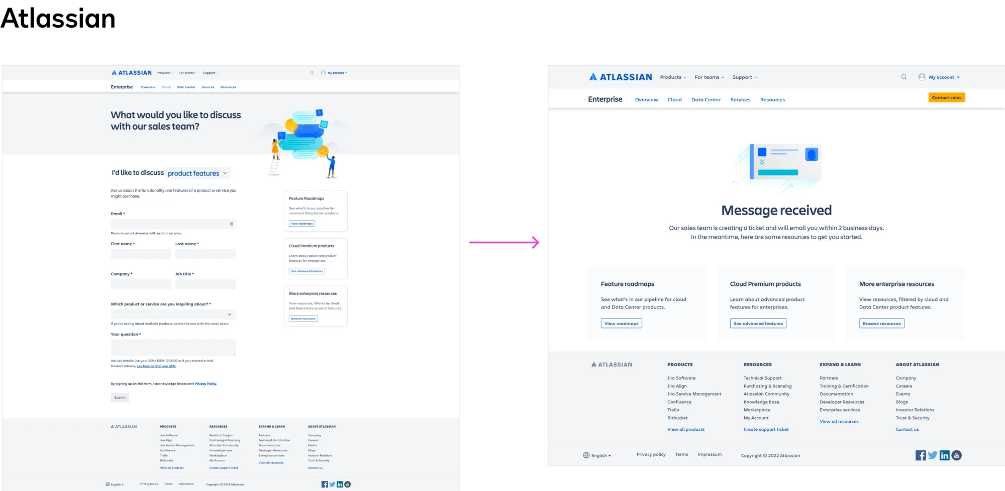
Competitive analysis
Discovery workshop
Objective
A discovery workshop is conducted in the early phases of a new project and encourages cross-collaboration among stakeholders and teams to define the value proposition, establish the target audience and surface user problem areas and opportunities. The objective is gaining consensus on overall project goals and direction: what the problem is, who our audience is and where our areas of focus should be.
The workshop was designed and led by our senior user researcher. I partnered with her to create assets and goals.
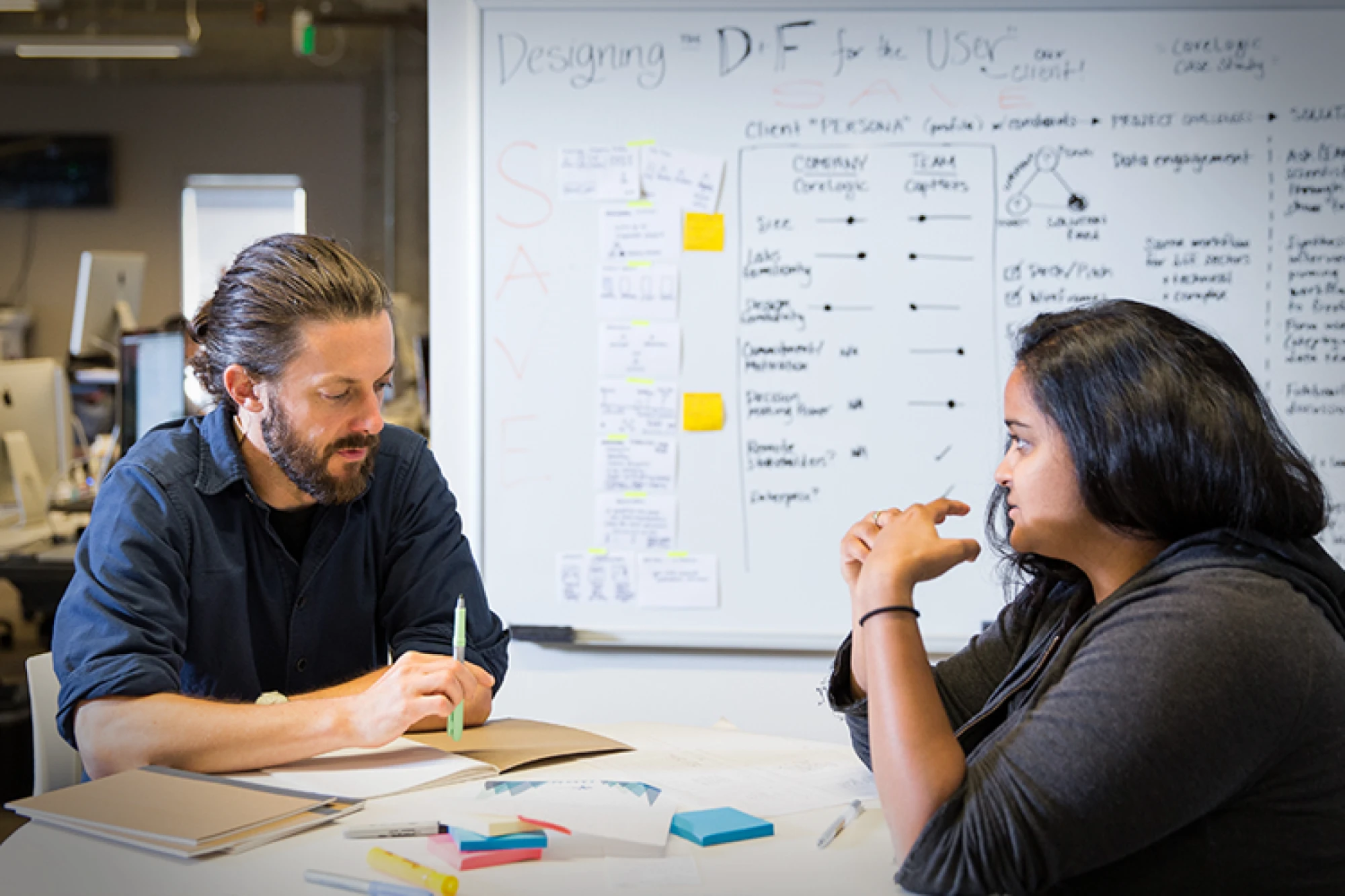
Pre-workshop in-depth interviews
Objectives
- Foundational and iterative design research to gain general understanding and feedback on the current and proposed design for contacting sales
- Capture core performers to understand the target audience and customer journey for contacting sales
- Benchmark the usability of both current and proposed flows to measure against future enhancements
Research goals — to understand…
- Our users’ mental models for why, when and how they contact sales
- Customers’ expectations when contacting sales
- Points of friction in current and proposed solutions
- Whether messaging is effective and helpful
- What information customers are willing to provide for sales lead scoring
- Why and when customers lose engagement, and how to potentially re-engage
Workshop & interviews outcome
We defined the target personas, a problem statement, a journey map, idea generation and prioritization of desired outcomes.
03 — Ideation
Journey map
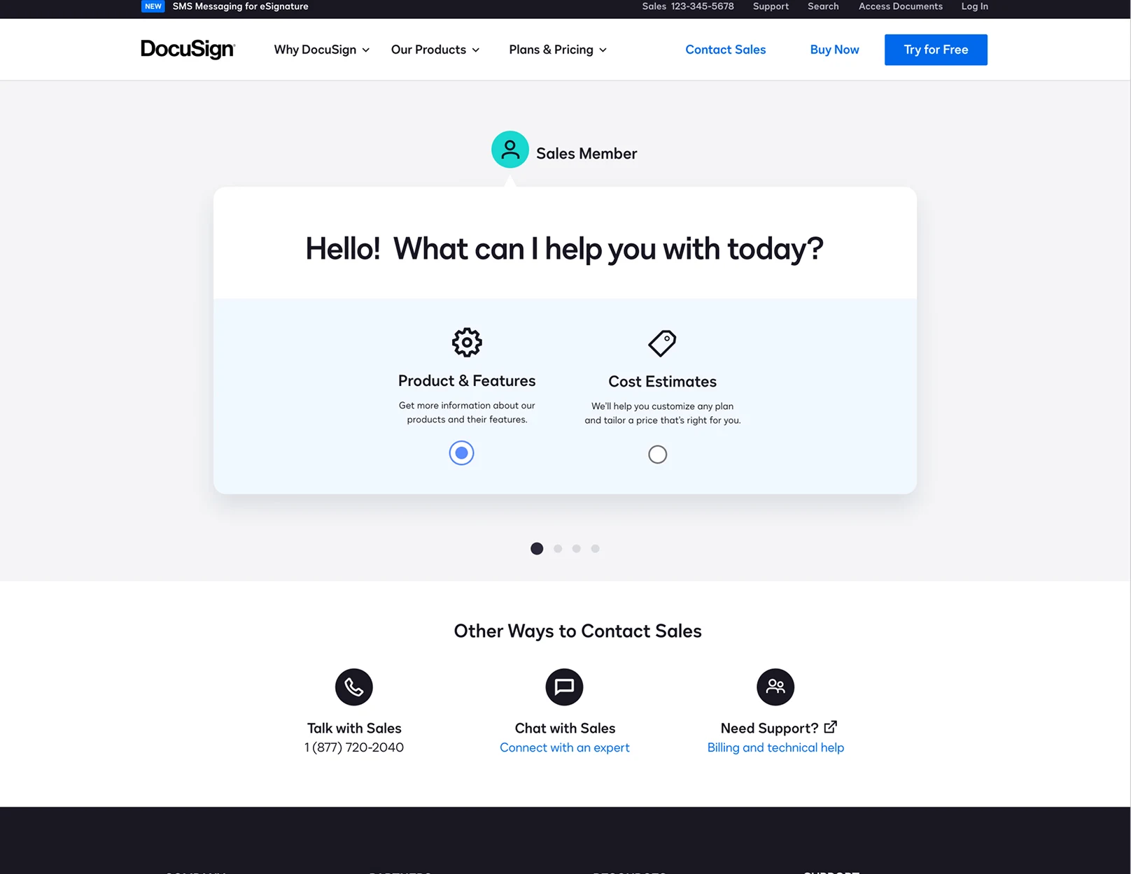
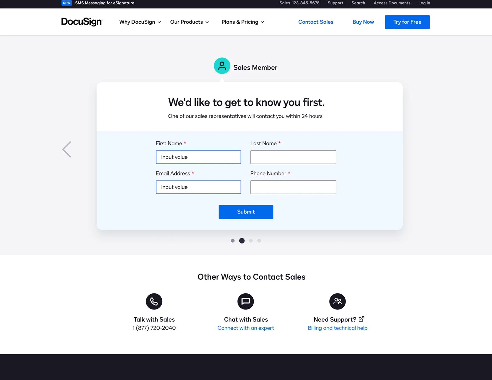
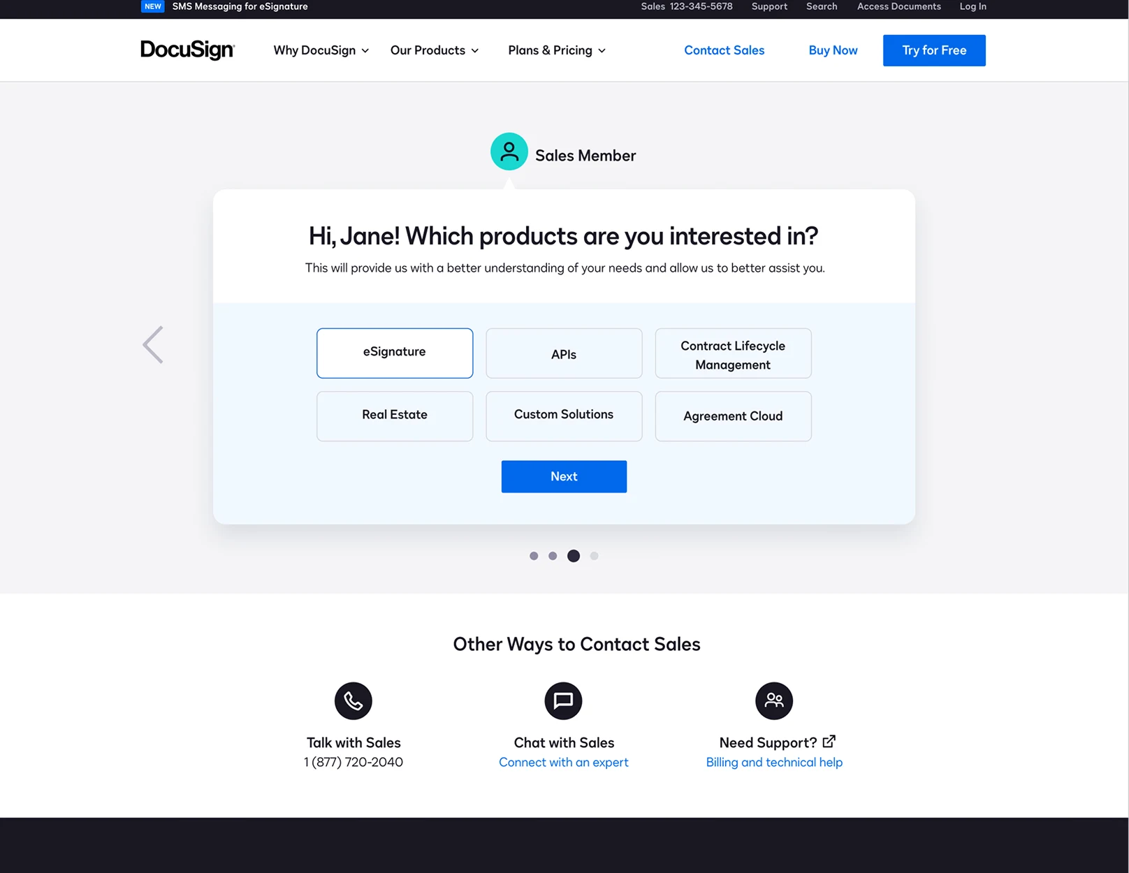
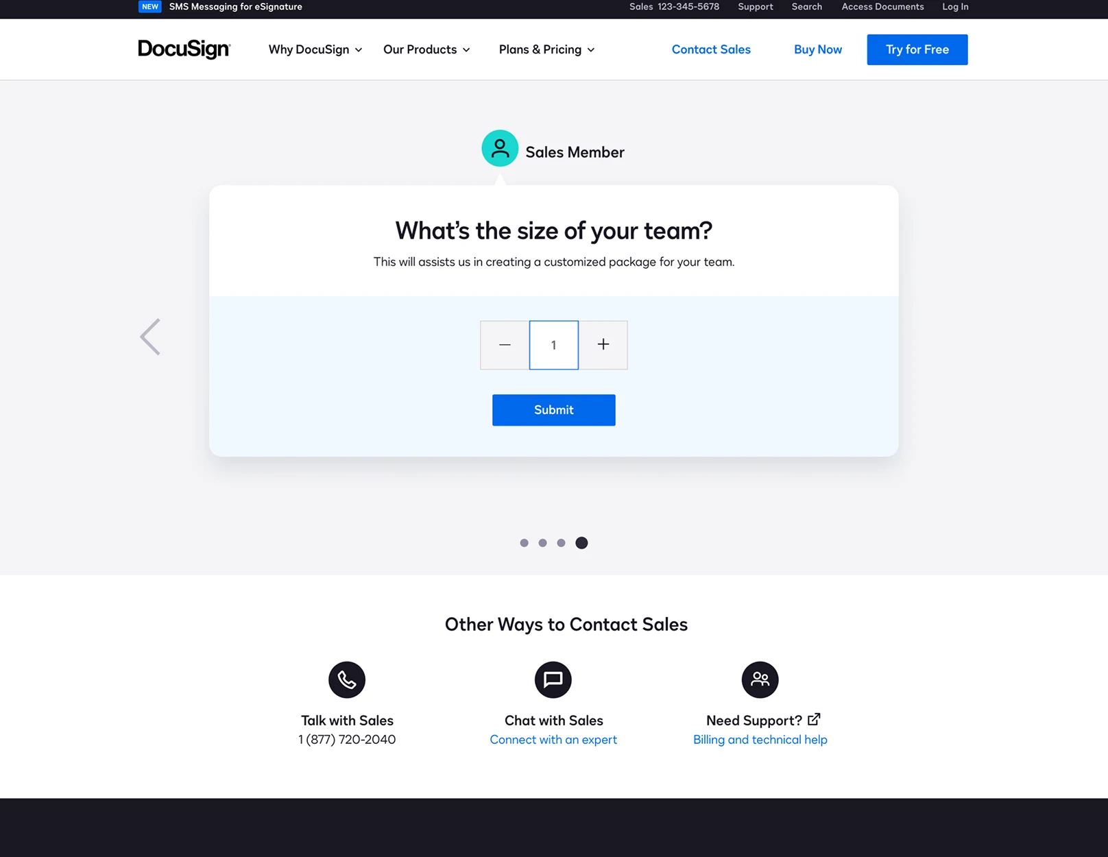
Initial design concepts had a filtered approach
I mapped out the journey based on what the user was looking to accomplish.
Early concept wireframes
Narrowing down the direction
In partnership with the product manager stakeholder, we settled on a design closer to the current experience — not requiring additional steps or filtering by desired action.
The concept ideation wasn’t forgotten; it was added as a future testing opportunity.
04 — Usability testing
I conducted usability testing with the high-fidelity designs to confirm we were meeting our design goals. Testing confirmed our direction, and we moved forward to engineering and production of the final experience.
05 — Final & experiment designs
Final designs
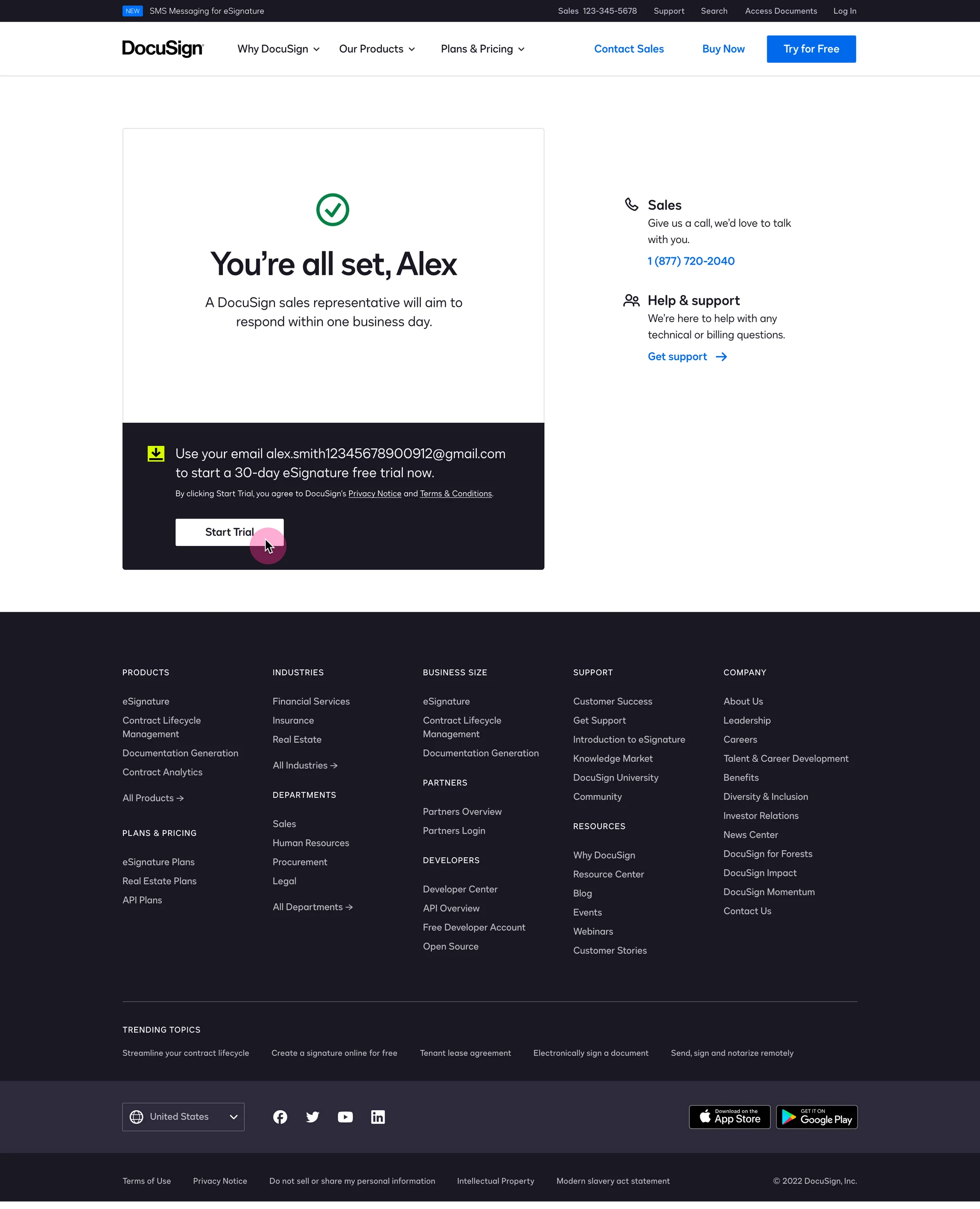
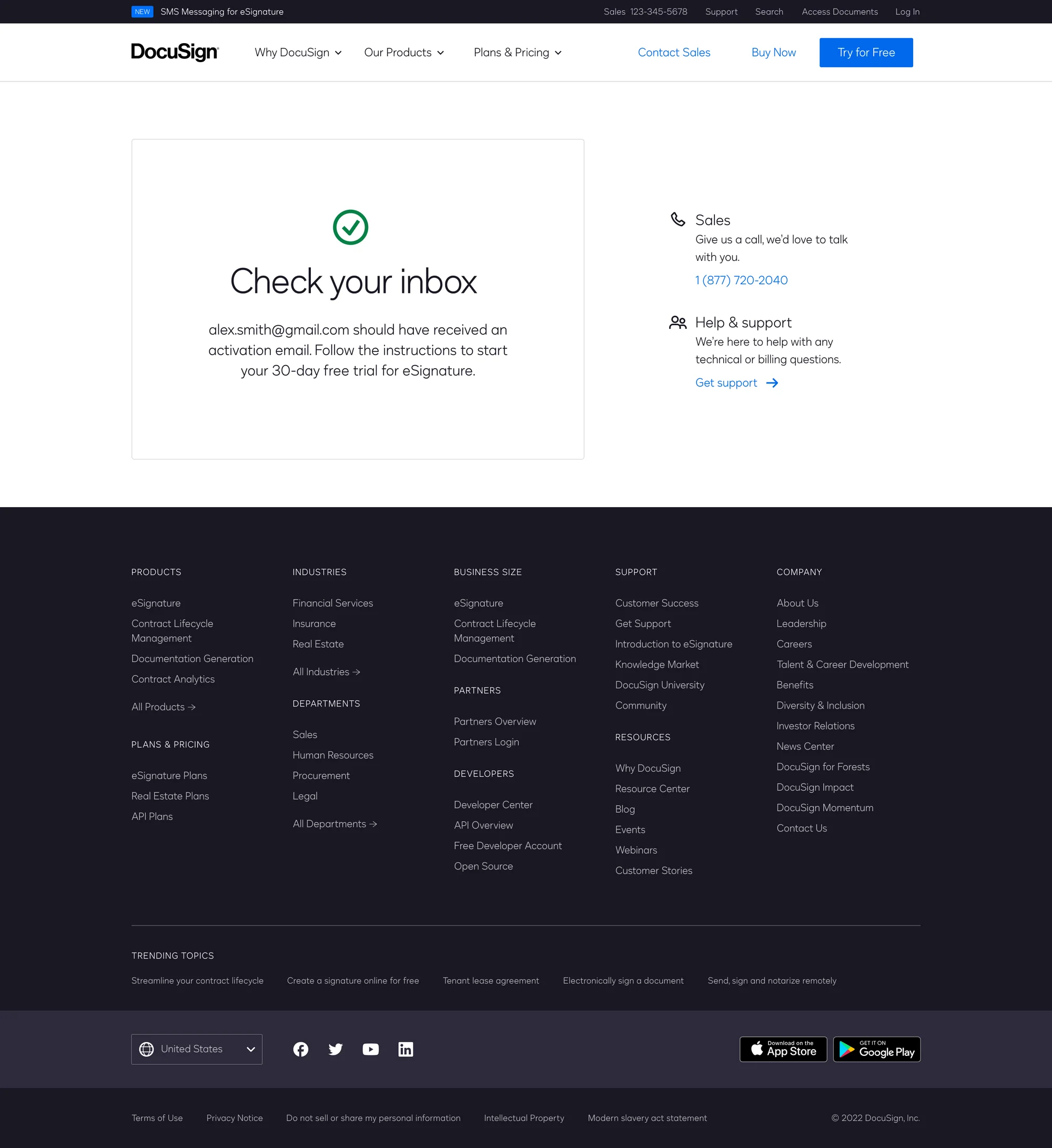
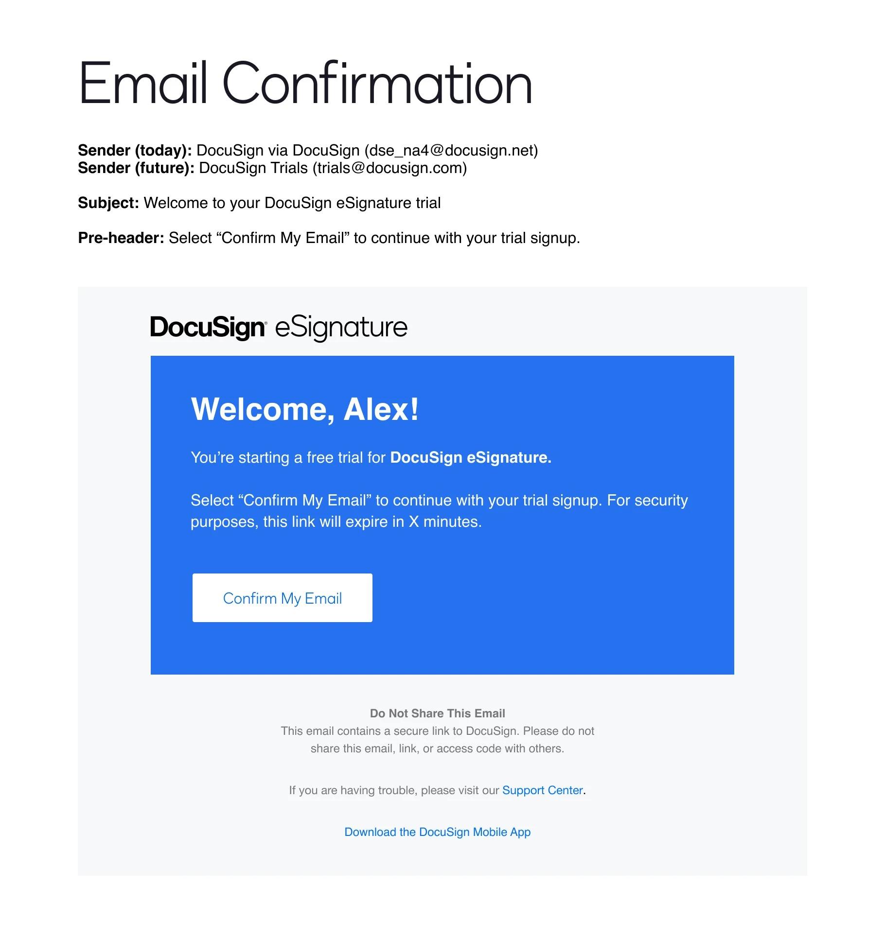
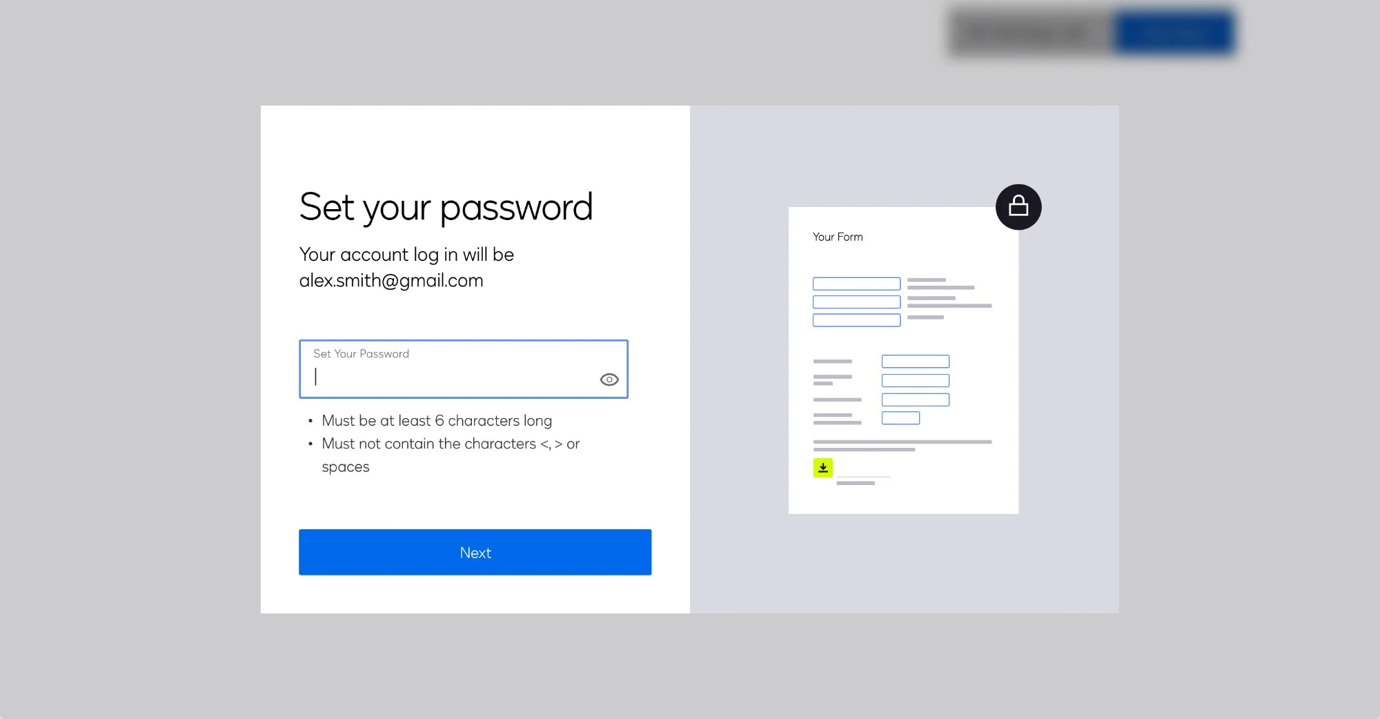
Experiment designs
A/B tests ready to go
The unshipped concepts explored during ideation were built out into designs that are ready to launch as A/B tests.
06 — Results & learnings
Results
- +5%
- Lift in trial sign-ups
- +300%
- Click-through rate on support link
- 53%
- Of customers engaged with new content
Summary of redesign results
The experience improved the way customers navigate to the help they need — support or sales.
- The updated experience successfully drew support requests away from the direct sales pipeline
- Higher-quality sales leads made their way into the downstream sales funnel
- No statistically significant metrics showed lower inquiry volume resulting in reduced sales
What I learned
The process was rewarding: go wide, then narrow the vision based on a “do no harm” philosophy.
The early design explorations were a departure from both the current experience and the final approved designs. They helped us think outside the box and created future experimentation concepts. While I was frustrated at times that I couldn’t make more sweeping changes, the process was rewarding.