Pl. III · Snowflake · Developer experience
Redesigning the developer experience on Snowflake.com
How I redesigned and elevated the developer experience on Snowflake’s marketing website.
01 — Problem & goals
Developer content lived on a different domain, with outdated and sparse information
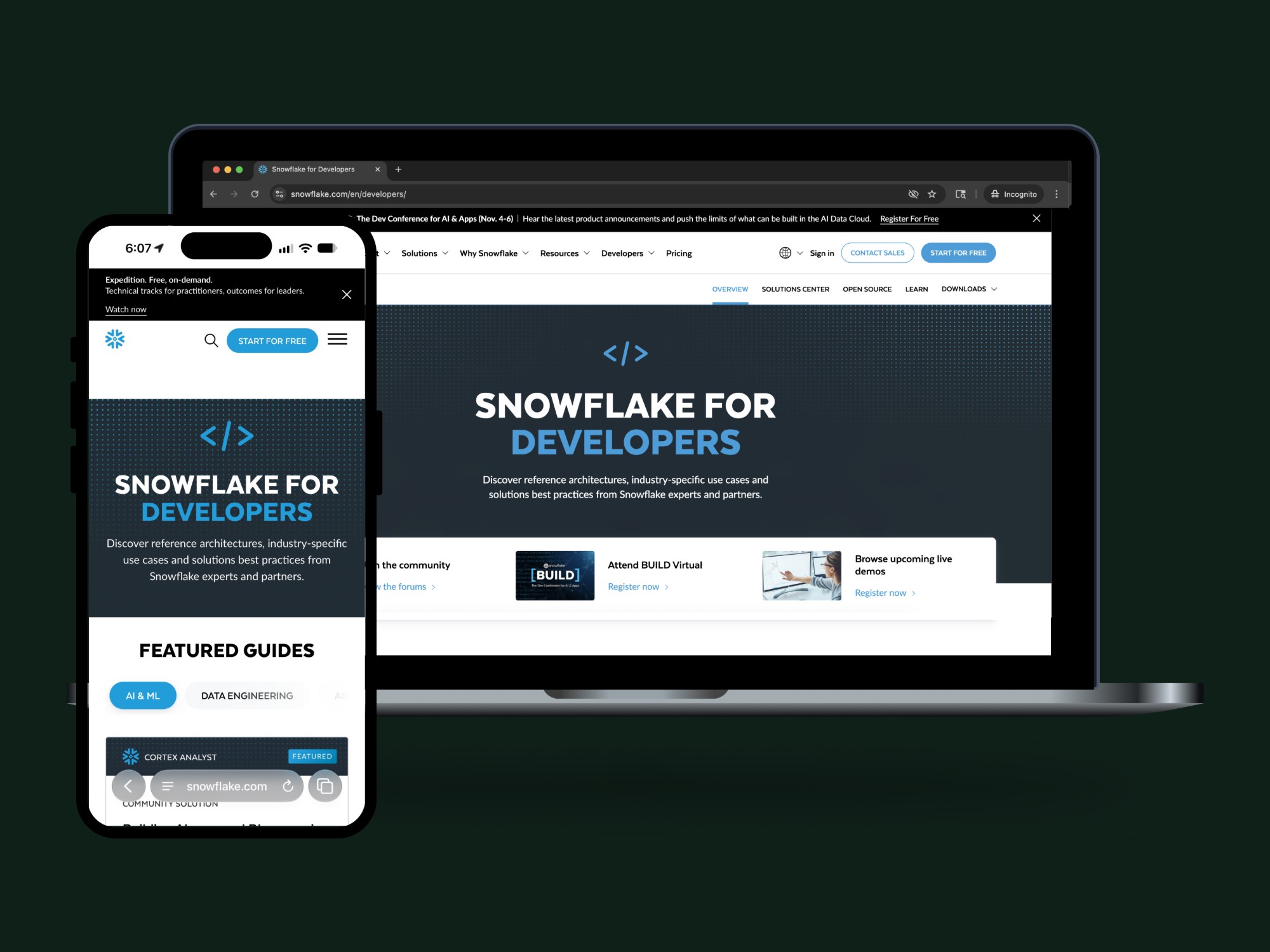
Snowflake wants its users to know that developers are very important to their success. The website experience for developers wasn’t showing that importance.
Developer content was housed on a different domain than Snowflake’s main website, the content was dated, and the design felt stale. To emphasize the importance of the developer community, Snowflake needed to make developers more prominent in the navigation and site domain, along with a fresh new experience to keep learning and discovering.
Problem
Developers are an important audience for Snowflake.com, but they weren’t being treated as such by the current web experience. Content was hard to find and disparate from the main Snowflake website, and making connections between content on different domains was a disconnect for the overall user experience.
Hypothesis
By migrating the developers website to the main Snowflake website, along with adding Developers to the global navigation, users will be more likely to discover, use and share content found within the updated developers site.
Design goals
In addition to the internal team goal of migrating the developers content to Snowflake.com, I had other improvements in mind:
- Through research, determine if adding “Developers” to the global navigation is a positive user experience for all site visitors
- Reduce the number of disparate links and one-off content types on the current developers home page
- Refine the design for a more modern, clean and clear experience for an audience with high expectations
Key performance indicators
- Increase traffic to developer solutions
- Increase time on site and page views per session
- Reduce website bounce rate
My role
I served as the sole UX designer and researcher, overseeing the project from discovery, to concepts, to usability testing. The team included a UI / visual designer for polishing the final designs, a project manager, and the stakeholder team of developer relations managers.
02 — Discovery
Current experience audit
Developer content lived on a different domain and had its own navigation, look and feel.
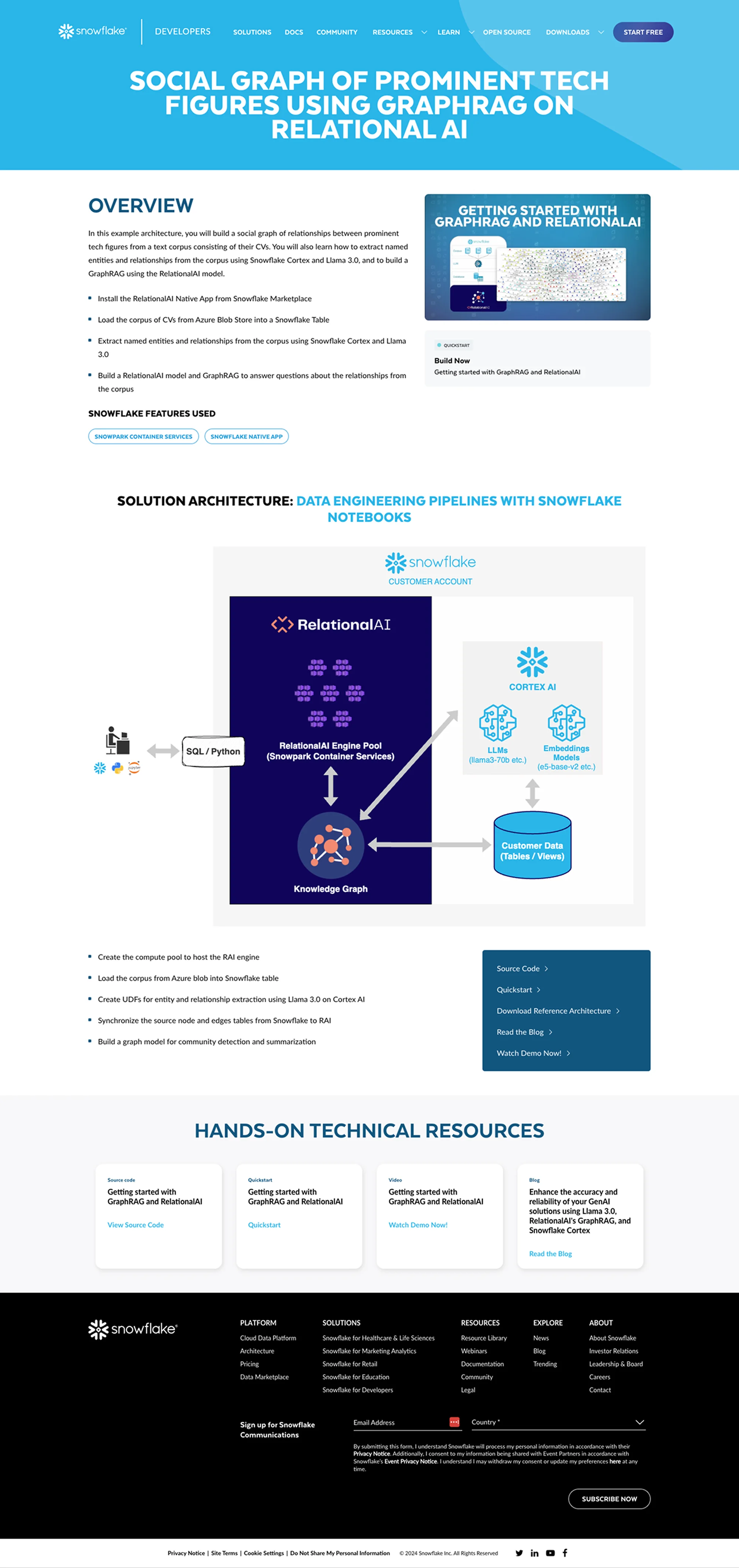
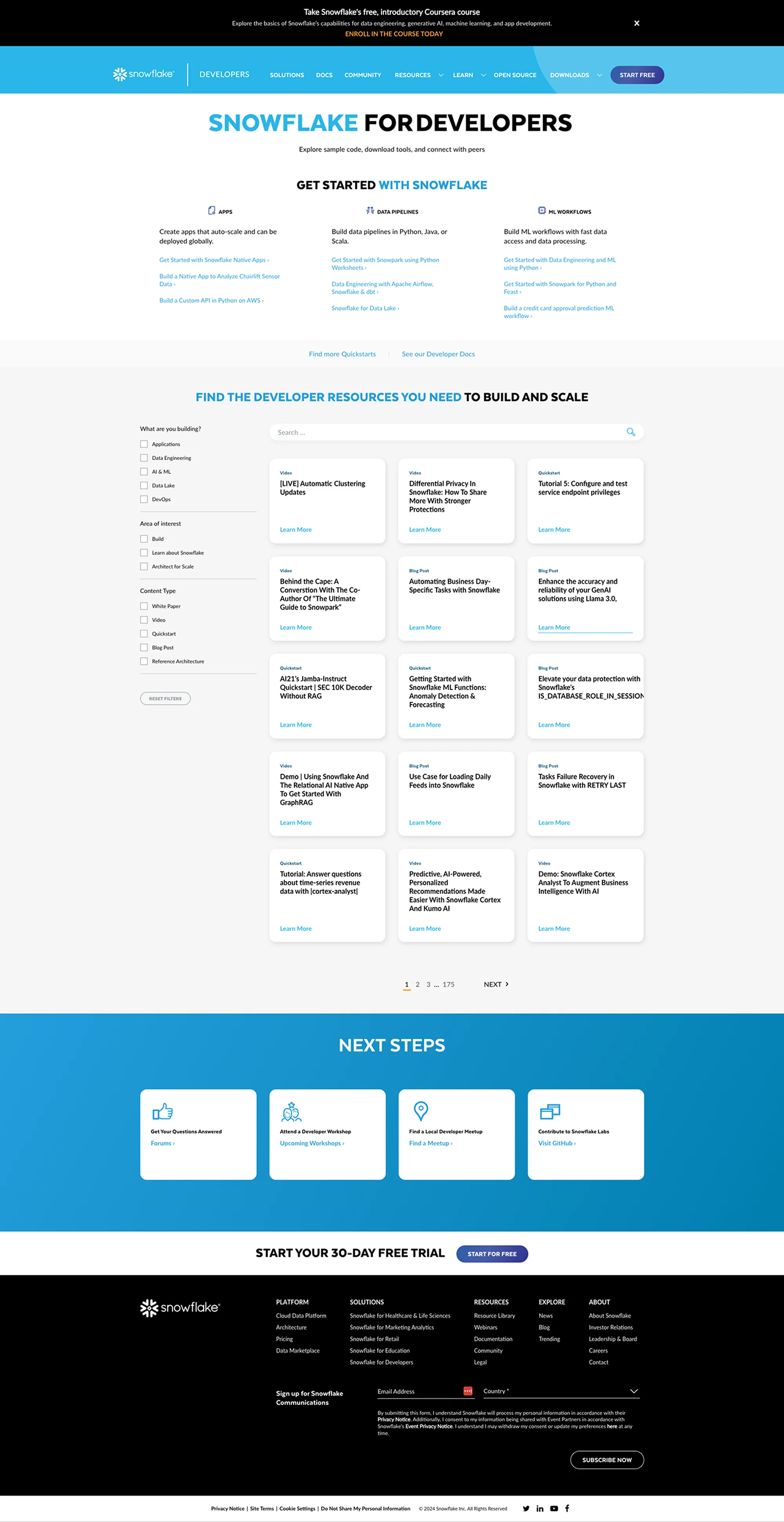
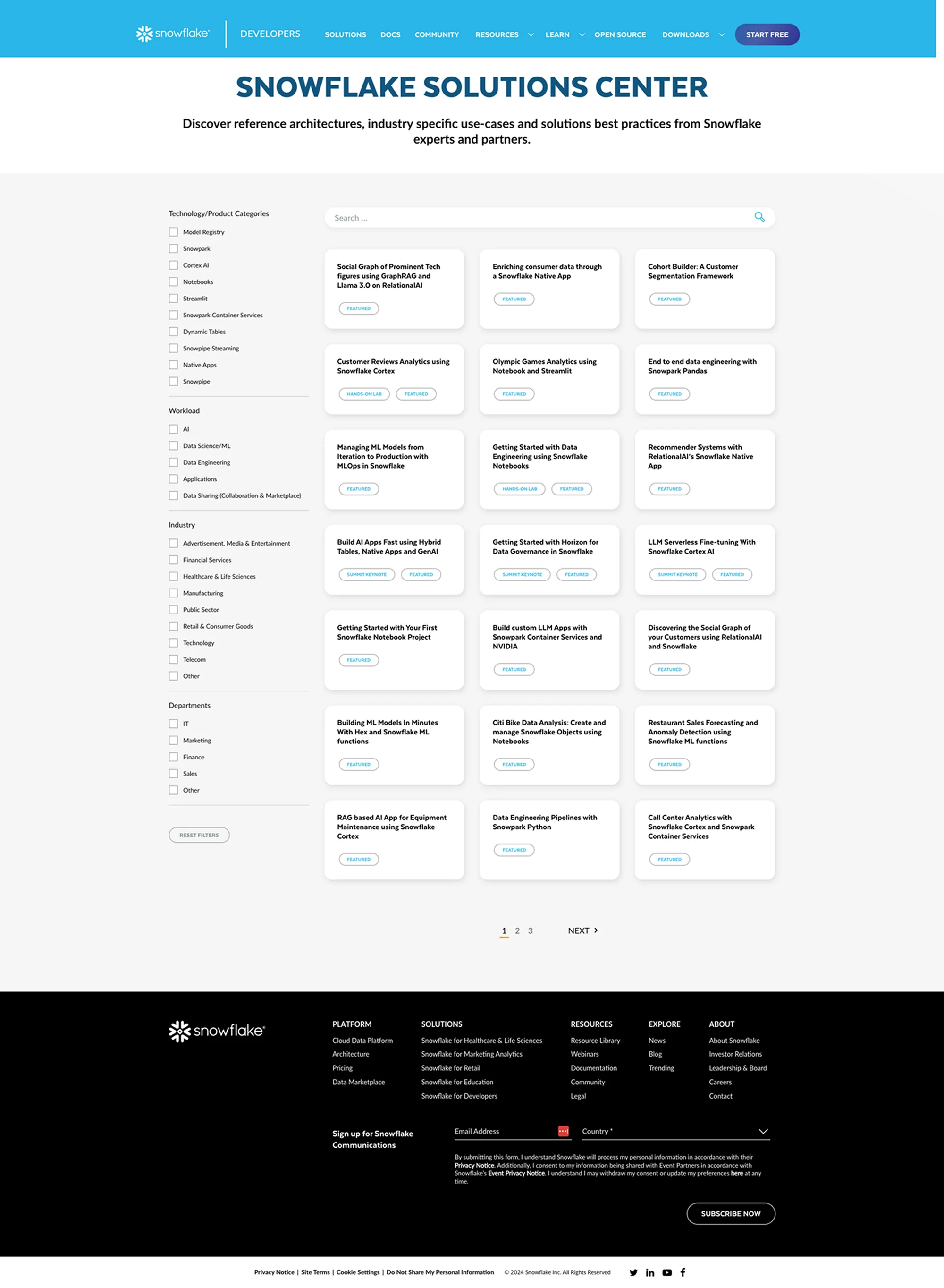
Opportunities identified in discovery
- Update the look and feel
- Make developer content easy to find
- Consolidate links and redesign how the information is displayed
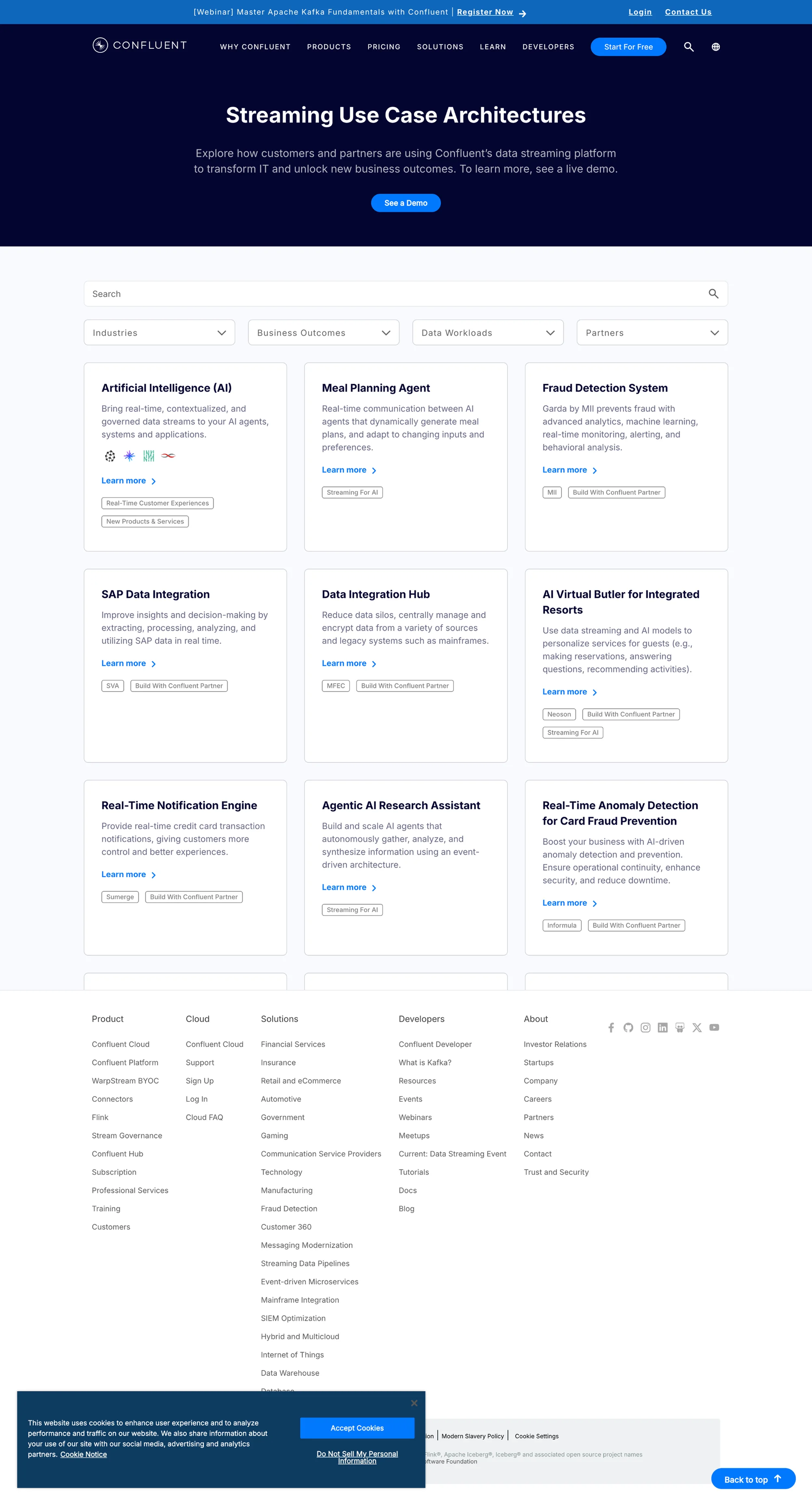
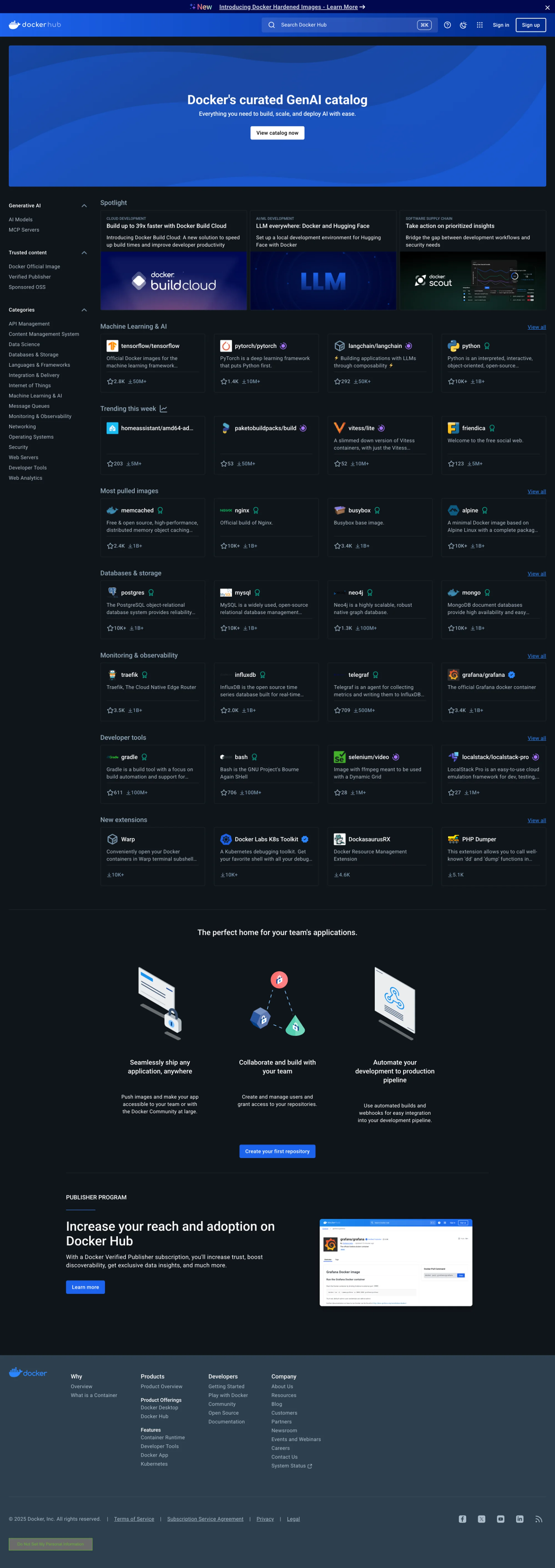
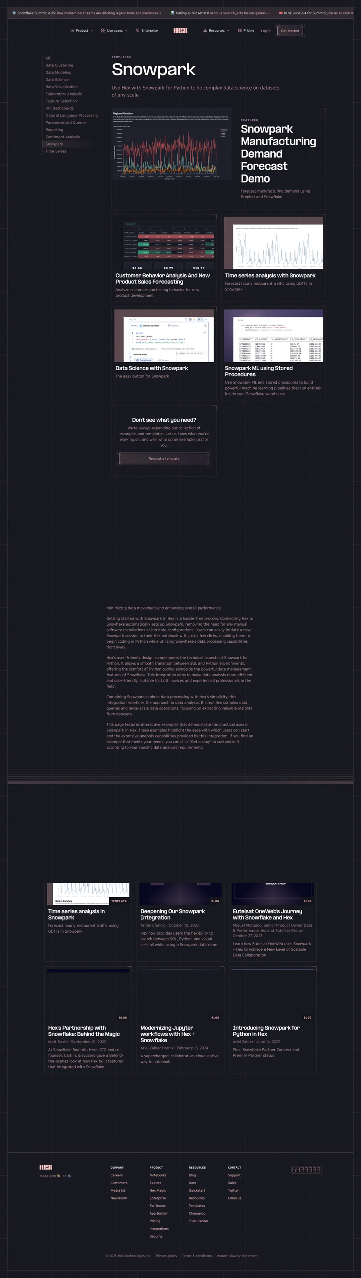
Competitive analysis
Developer sites have robust content for a technical audience
I looked at developer experiences for SaaS companies in a similar category to Snowflake. I found examples of what the technical developer audience needs and expects — for example, a left-hand side menu like GitHub. This discovery work helped determine the best way to display the content for this user type.
03 — Ideation
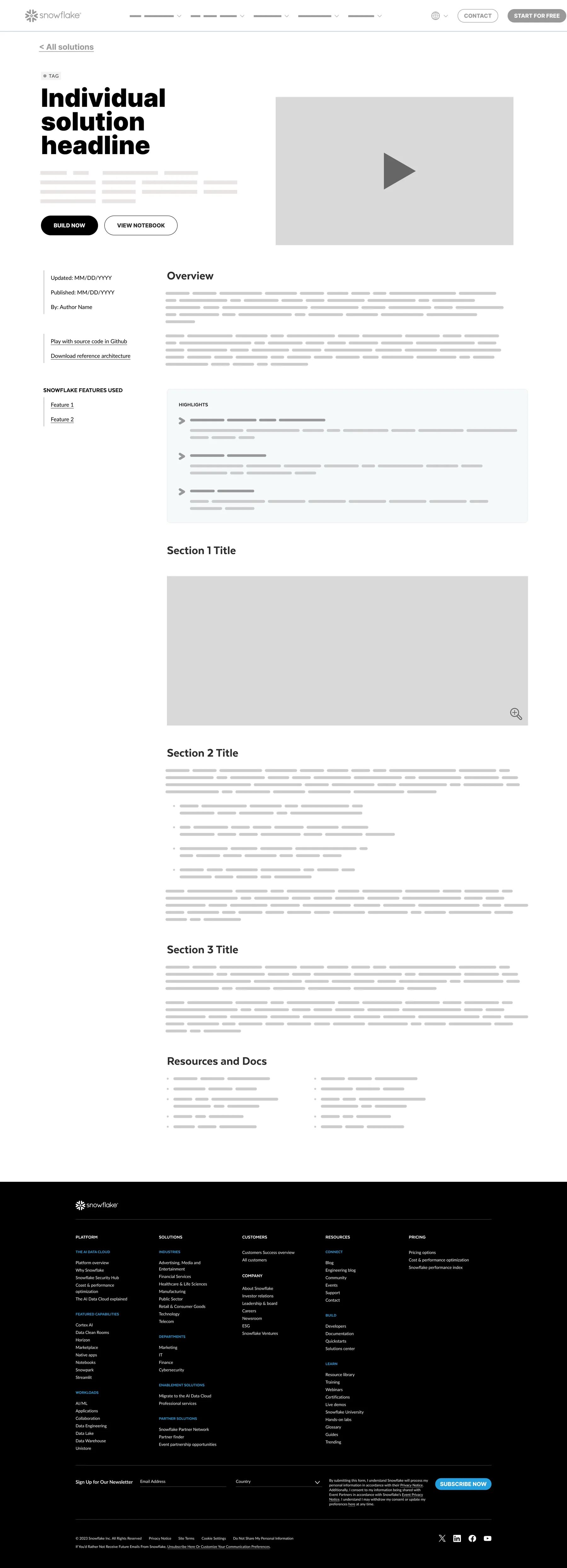
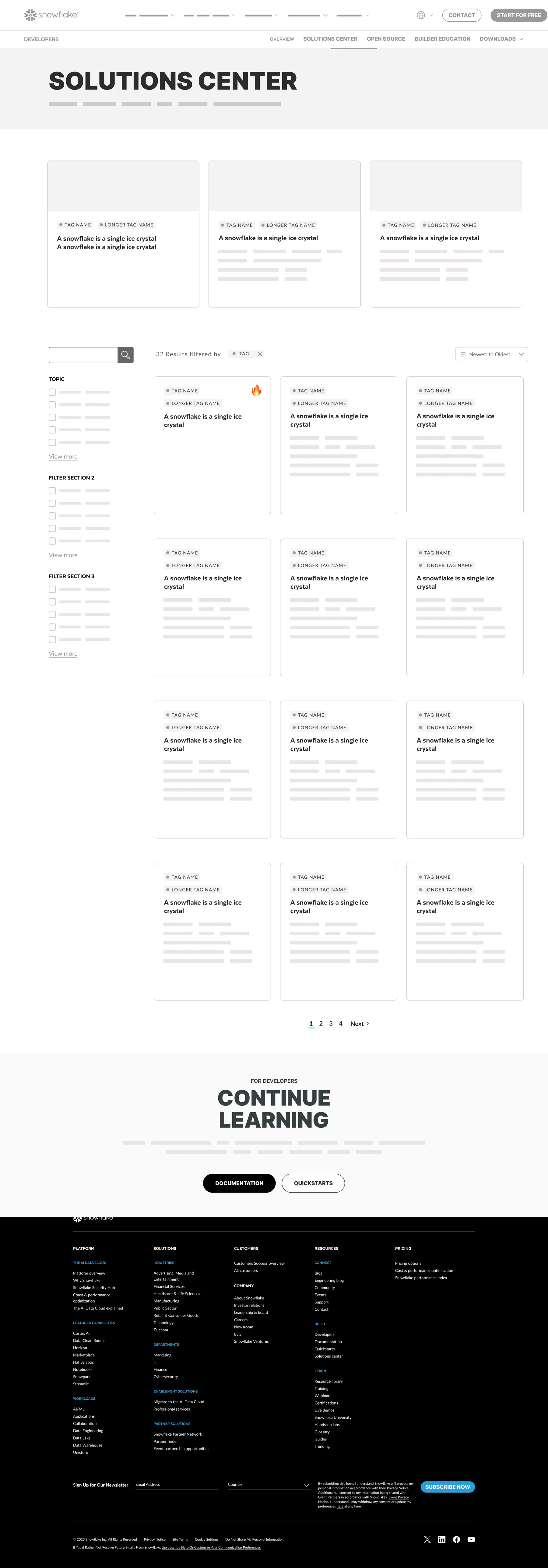
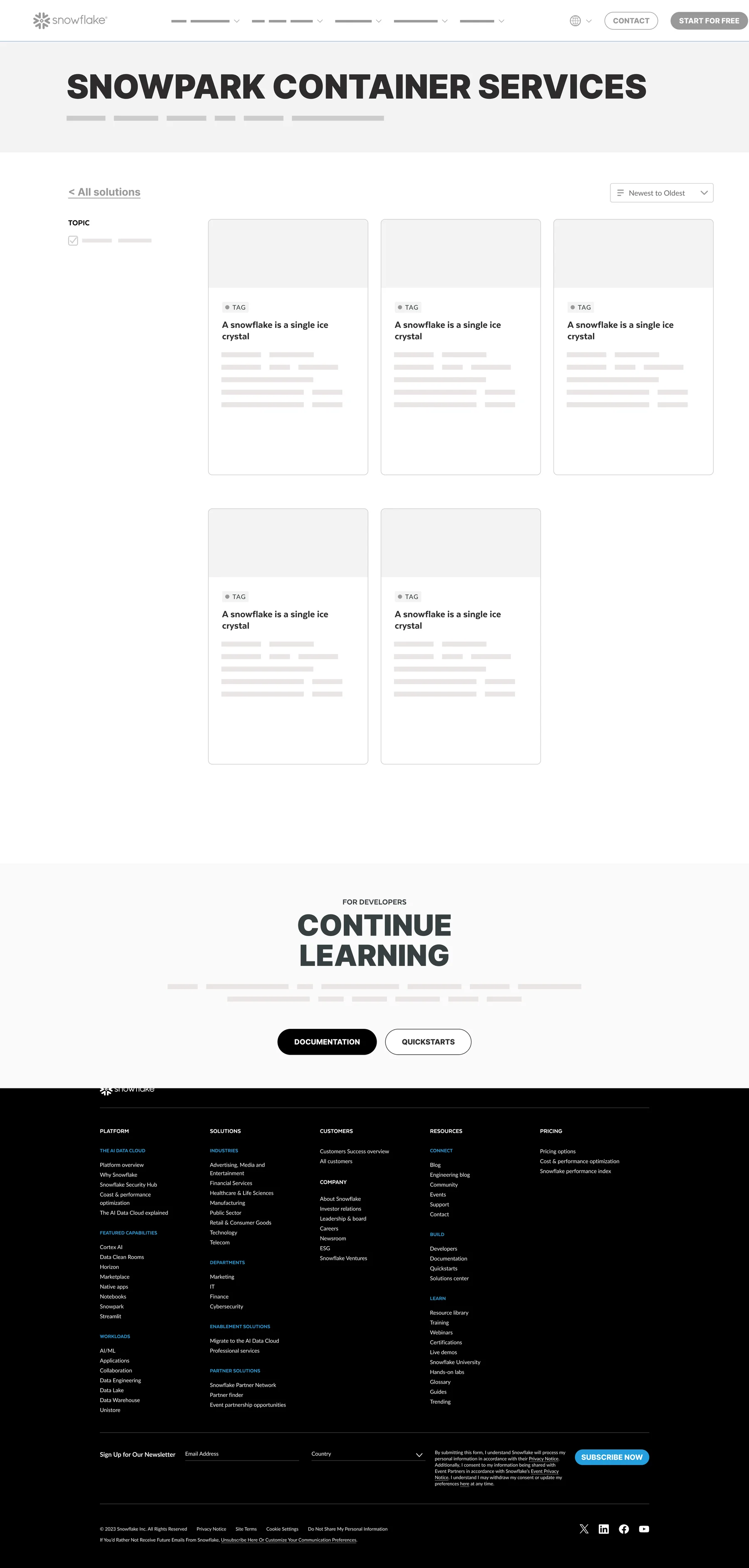
Reusable templates designed to scale
04 — Usability testing & user research
Adding Developers to the navigation
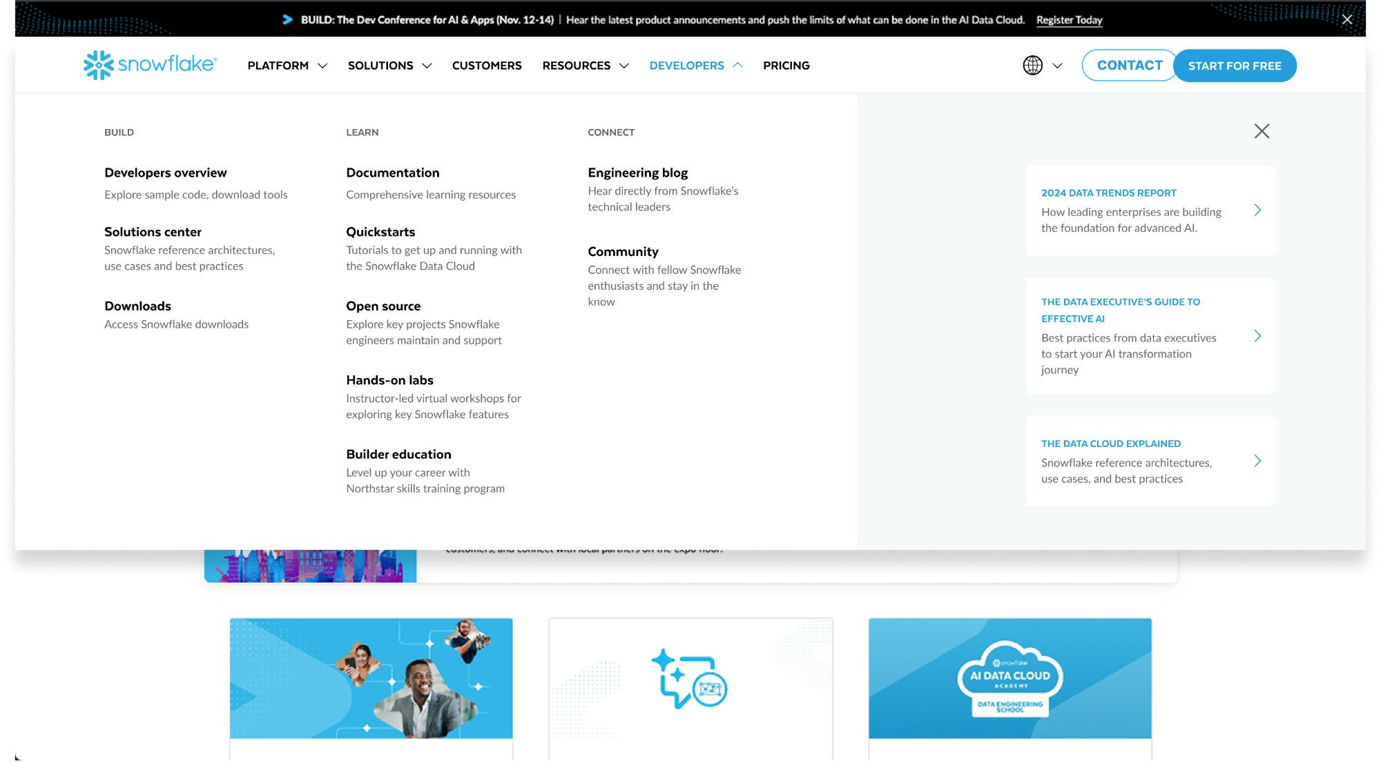
User testing was performed with developers to determine their sentiment about adding “Developers” to the global header navigation. Testing probed on:
- What do developers expect to find in the navigation drop-down?
- Are the labels intuitive?
- Is anything missing from the menu?
- What does this say to you about Snowflake as a company?
This research validated our assumption that the menu update is viewed positively by this audience — and signals to all users that Snowflake is developer-focused.
05 — Final design prototype
06 — Results
- 94%
- Increase in page views per month
- 11.3%
- Decrease in bounce rate
- 5
- New templates designed for scale